
A fresh coat of paint is the fastest, cheapest way to transform a boy’s bedroom. These 23 boys’ bedroom paint ideas cover everything from bold navy accent walls to calm sage greens, with practical tips for every age, room size, and skill level.
If you are decorating for an older kid, pair these paint colors with bedding and wall art in the same color family for a room that feels cool and pulled together.
This guide is packed with visually inspiring, practical ideas that are easy to imagine and even easier to try. Whether you want something bold, calm, modern, or playful, you’ll find options that actually work in real homes. Each idea is designed to help you create a space that feels fresh, functional, and worth showing off—and yes, worth saving for later too.
Navy Accent Wall
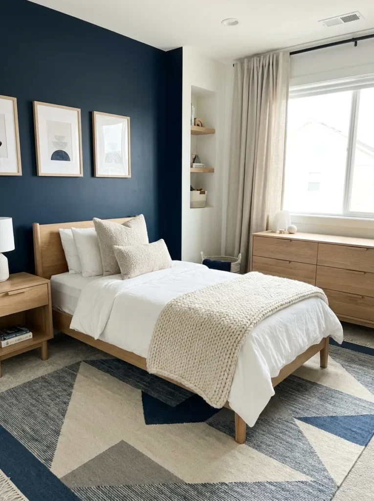
- Instantly adds depth without overwhelming the room
- Pairs well with white, gray, and wood tones
- Creates a calm and grounded atmosphere
- Easy upgrade without repainting the whole room
A bold navy accent wall can completely shift how a bedroom feels the moment you walk in. This idea works especially well when the rest of the room stays light and simple, allowing the darker wall to stand out naturally. I’ve noticed that pairing navy with soft neutrals like white bedding or beige rugs keeps the space balanced and not too heavy. It’s a great way to introduce color without committing to all four walls, making it perfect for growing boys whose tastes may change over time.
Of all the boys’ bedroom paint ideas here, navy is the safest bold choice: one accent wall costs a single gallon, and shades like Sherwin-Williams Naval (SW 6244) pair beautifully with white bedding and warm wood.
Two-Tone Walls
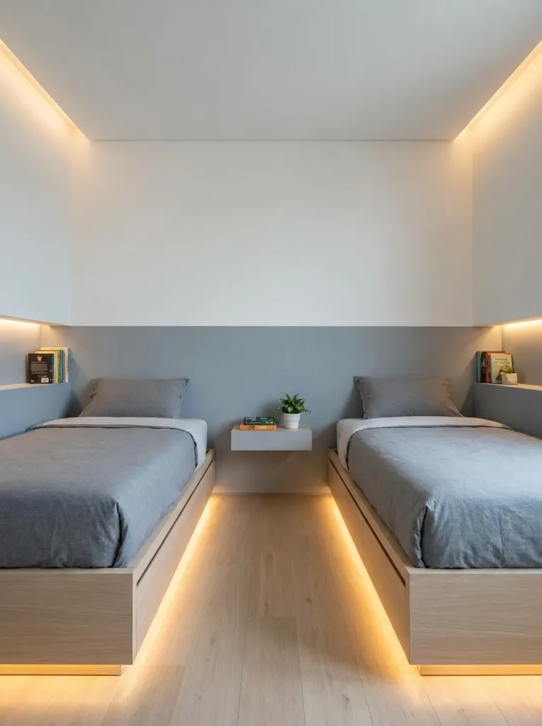
- Visually expands wall height and space
- Adds structure without needing decor clutter
- Easy to customize with different color combos
- Works in both small and large rooms
Two-tone walls instantly make a room feel more designed and intentional without requiring complex patterns. The horizontal split draws the eye across the space, which can make walls appear wider and ceilings feel higher. I’ve seen this work especially well in smaller bedrooms where visual tricks matter. Choosing a slightly darker shade on the bottom helps hide scuffs and wear, while the lighter top keeps the room feeling open and airy, creating a perfect balance between style and practicality.
Split the wall at chair-rail height, around 32 to 36 inches, with the deeper tone below and a lighter shade above. It adds structure without any extra decor and works in rooms of any size.
Soft Sage Green
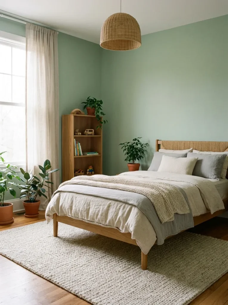
- Creates a calm and relaxing environment
- Works well with natural textures and wood
- Feels fresh without being too bold
- Great for all age groups
Soft sage green brings a peaceful and grounded feeling that instantly makes a bedroom more relaxing. This shade works beautifully with natural materials like wood, linen, and cotton, creating a space that feels warm yet refreshing. I’ve noticed that this color tends to reduce visual noise, which is helpful in rooms where kids both play and sleep. It doesn’t feel too childish or too mature, making it a smart long-term choice that adapts as styles evolve over time.
Sage green also sits well with the natural, earthy palettes trending this year, so this pick will look current for a long time.
Sage works from toddler years through the teens because it reads calm rather than babyish. Try Sherwin-Williams Clary Sage (SW 6178) with linen bedding and rattan baskets for a relaxed, natural feel.
Geometric Paint Patterns
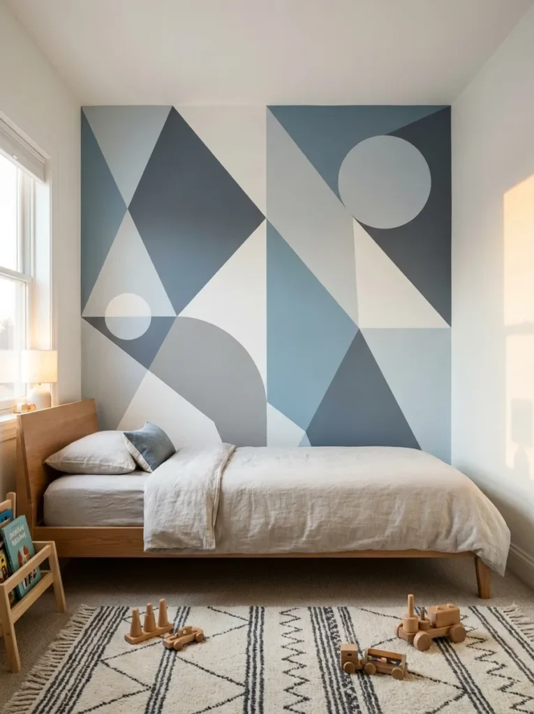
- Adds personality without extra decor
- Creates a playful but modern vibe
- Can be customized with simple tape techniques
- Works as a focal wall
Geometric paint patterns bring energy and creativity into a bedroom without needing extra decorations. Simple shapes like triangles, stripes, or abstract blocks can completely transform a plain wall into a design feature. I’ve seen this work really well when using muted tones instead of overly bright colors, as it keeps the space stylish rather than overwhelming. The clean lines also give the room a modern edge, making it feel more curated and intentional without requiring expensive materials or furniture upgrades.
Use painter’s tape to map out triangles or chevrons, then fill in with two or three coordinating colors. It is a weekend project that needs nothing more than tape, a level, and sample pots.
Sky Blue Ceiling
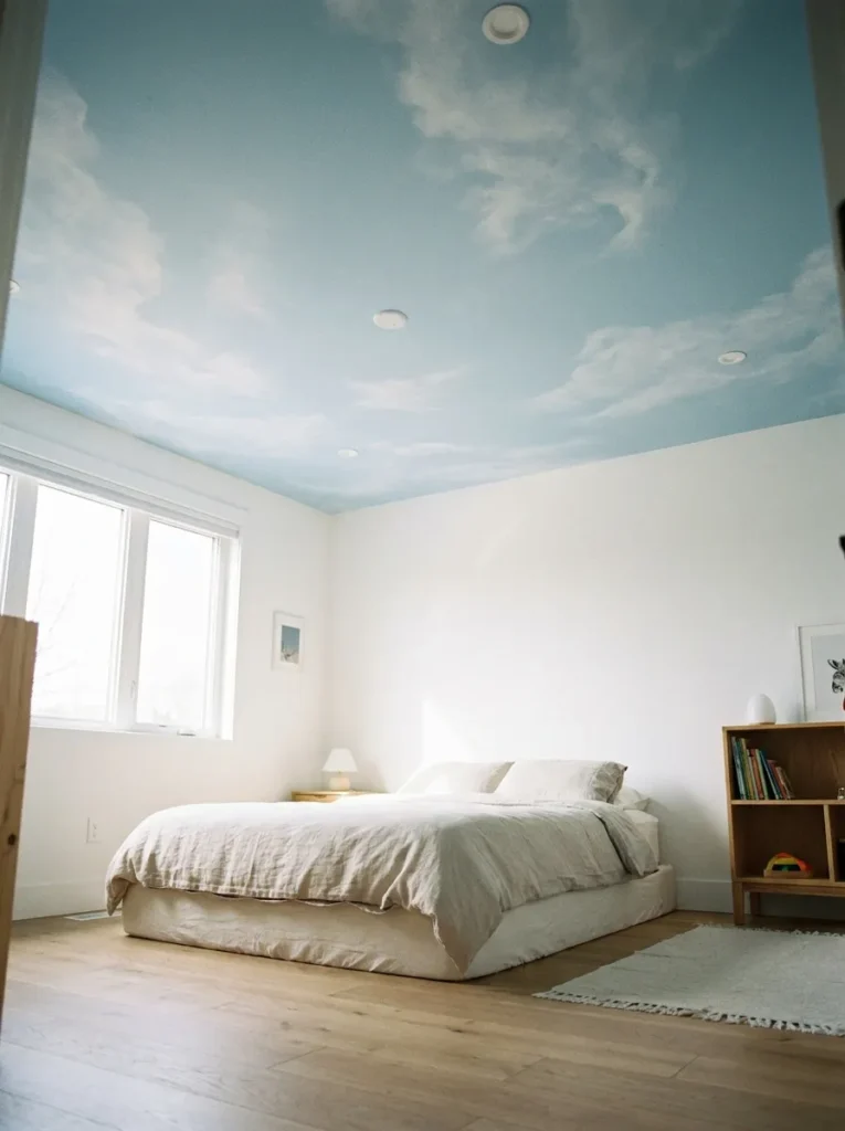
- Adds unexpected visual interest
- Makes the room feel more open and airy
- Keeps walls neutral and flexible
- Creates a calming atmosphere
A sky blue ceiling instantly changes how a room feels without touching the walls. This subtle design choice draws the eye upward, making the space feel larger and more open. I’ve noticed that even in smaller rooms, this trick creates an airy effect that’s hard to achieve with wall paint alone. It’s especially effective when paired with white or neutral walls, allowing the ceiling color to gently stand out without overwhelming the overall design.
Keep the walls a warm white and let the ceiling carry the color; it draws the eye up and makes the room feel taller. A soft sky blue like Benjamin Moore Breath of Fresh Air (806) keeps it airy, not childish.
Charcoal Gray Walls
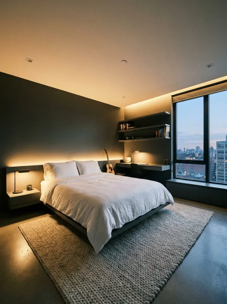
- Creates a bold and modern look
- Makes lighter furniture stand out
- Adds depth and sophistication
- Works well with warm lighting
Charcoal gray walls bring a strong, modern feel that instantly elevates a bedroom’s style. This darker shade creates a dramatic backdrop that makes lighter elements like bedding, rugs, and furniture pop beautifully. I’ve seen this work especially well when paired with warm lighting, which softens the intensity of the color and keeps the room from feeling too dark. It’s a great option for older kids who want something more mature without losing comfort.
Charcoal looks best with warm lighting (2700K bulbs) and plenty of texture to keep it from feeling flat. Limit it to two or three walls if the room is small or gets little natural light.
Striped Feature Wall
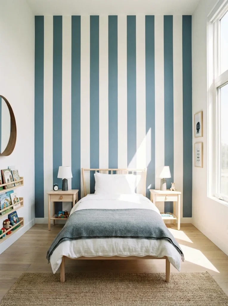
- Makes ceilings appear taller
- Adds movement and visual rhythm
- Works with both bold and subtle colors
- Easy to customize stripe width
Striped feature walls are a simple yet powerful way to add movement and structure to a bedroom. Vertical stripes, in particular, draw the eye upward, making ceilings appear taller and the room feel more spacious. I’ve noticed that using softer shades instead of high-contrast colors keeps the look clean and timeless. This approach works well in both small and large rooms, offering flexibility while still delivering a noticeable visual upgrade without overwhelming the space.
Vertical stripes in two tones of the same color add height without any risk of clashing. Space 6 to 12 inch stripes evenly using a level and painter’s tape for crisp lines.
Olive Green Walls
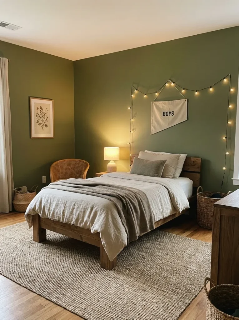
- Brings a warm, earthy feel into the room
- Pairs beautifully with wood and neutral tones
- Feels cozy without being too dark
- Works well for both playful and mature styles
Olive green walls instantly create a grounded and cozy atmosphere that feels both modern and timeless. This shade sits perfectly between bold and neutral, making it a safe yet stylish choice. I’ve noticed that when paired with natural materials like wood and soft fabrics, the space feels warmer and more inviting without needing extra decoration. It’s especially useful for rooms that need a calming tone while still having personality, helping balance energy and comfort in a very natural way.
Explore our bedroom mirror ideas for the perfect styles that complement this dreamy aesthetic.
Olive sits between green and brown, so it plays well with wood furniture, leather accents, and warm metals like brass. It is dark enough to feel cozy but light enough for rooms with average daylight.
Black And White Contrast
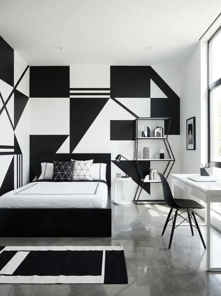
- Creates a bold, high-contrast visual impact
- Keeps the design clean and modern
- Easy to style with simple decor
- Works well in minimalist spaces
Black and white contrast is one of those timeless combinations that instantly feels modern and sharp. This approach works by using strong contrast to define space and structure without adding clutter. I’ve seen this style perform best when the layout stays simple, allowing the color contrast to become the main feature. It creates a clean, organized look that feels intentional, making even a basic room appear more styled and put together without needing excessive decoration.
Explore our small bedroom ideas 2026 for smart layout tips that maximize every inch
Keep the ratio around 70 percent white to 30 percent black so the room stays bright. Black window frames or a single black wall plus white bedding nails the look without repainting everything.
Pastel Blue Walls
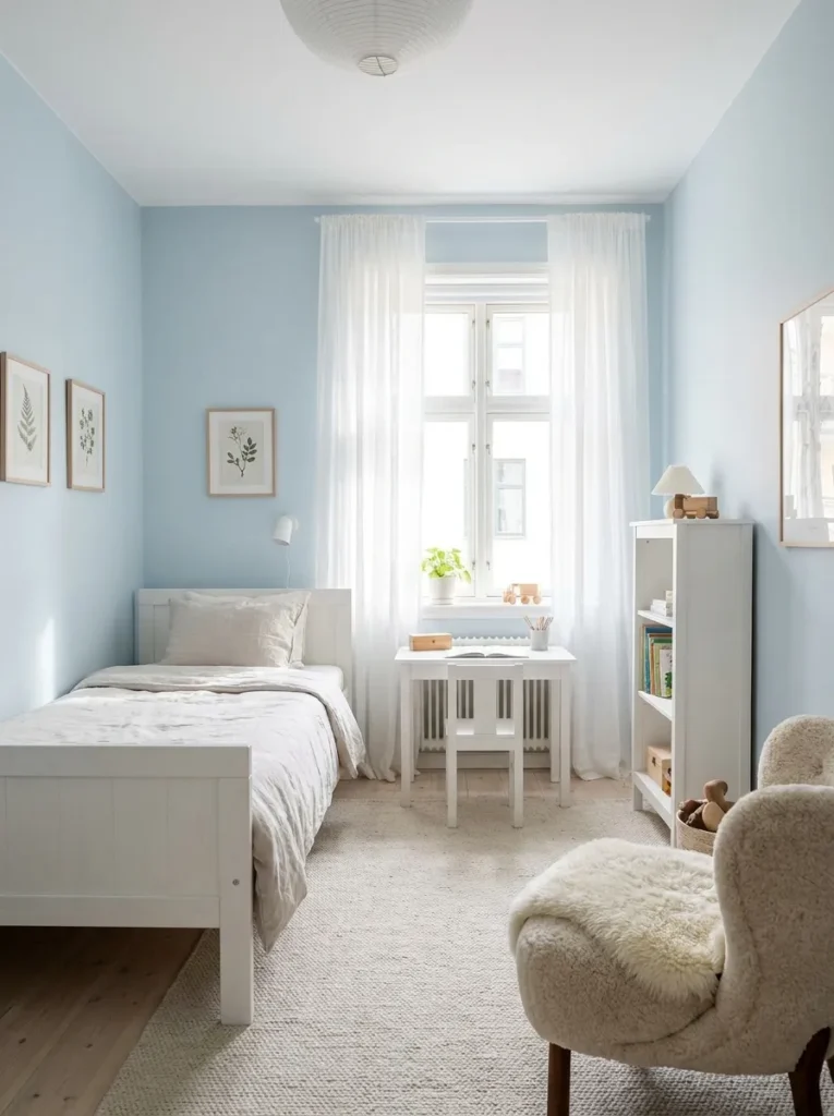
- Creates a light and calming environment
- Reflects natural light beautifully
- Perfect for smaller or darker rooms
- Easy to combine with neutral decor
Pastel blue walls bring a soft and refreshing energy that instantly brightens a bedroom. This gentle shade reflects natural light beautifully, making the room feel more open and airy. I’ve noticed that it works especially well in spaces that don’t get much sunlight, as it helps lift the overall mood without being overpowering. The subtle tone keeps the design simple while still adding enough color to make the room feel alive and thoughtfully styled.
Pastel blue reflects natural light beautifully, which makes it a smart pick for smaller or north-facing rooms. Pair it with white trim and light wood for a fresh, clean finish.
Color Block Corners
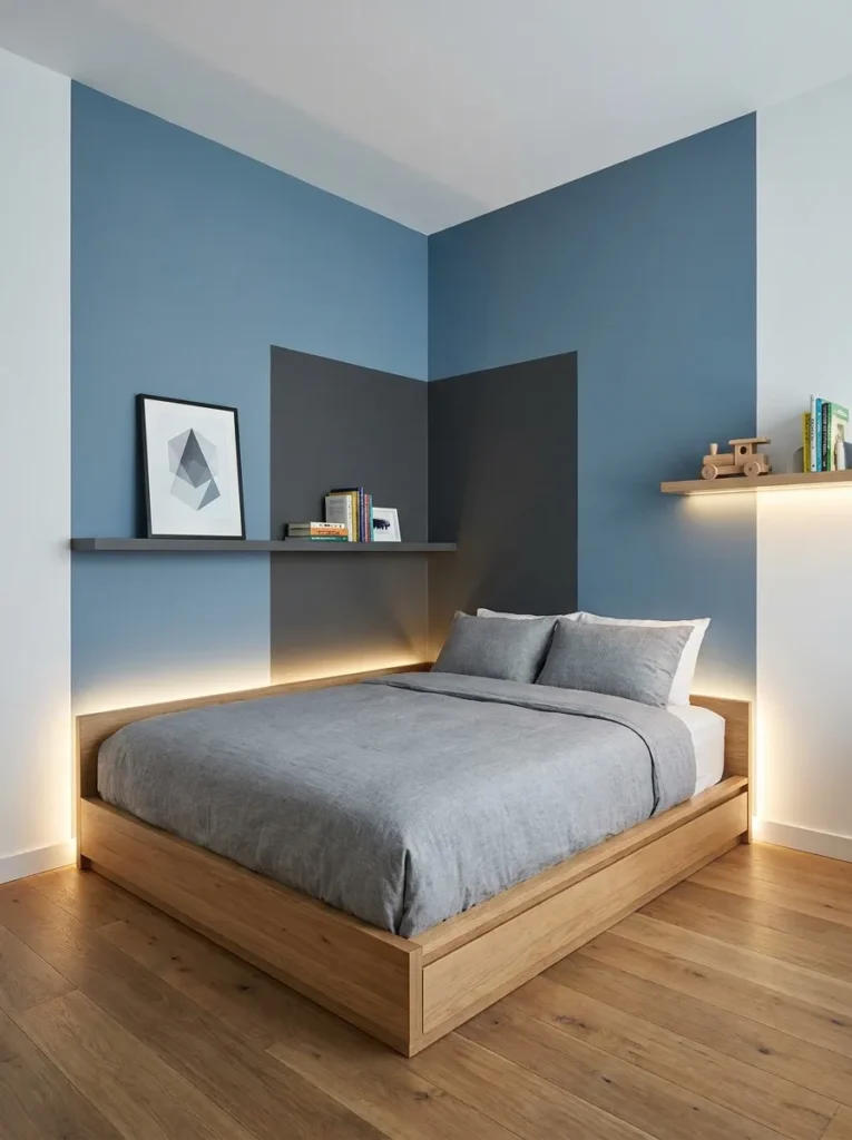
- Adds a unique design without overwhelming walls
- Highlights specific areas like beds or desks
- Easy to apply with simple painting techniques
- Creates a modern, playful look
Color block corners offer a creative twist that feels both subtle and eye-catching at the same time. Instead of painting full walls, this idea focuses on specific sections, adding visual interest without overwhelming the room. I’ve seen this work especially well behind beds or desks, where it naturally frames the space. It gives the room a modern, designed feel while still keeping most of the walls neutral and easy to update later.
Pick one corner, usually around the bed or desk, and paint a large arch or rectangle in a muted tone. It defines a zone within the room with just a quart of paint.
Muted Earth Tones
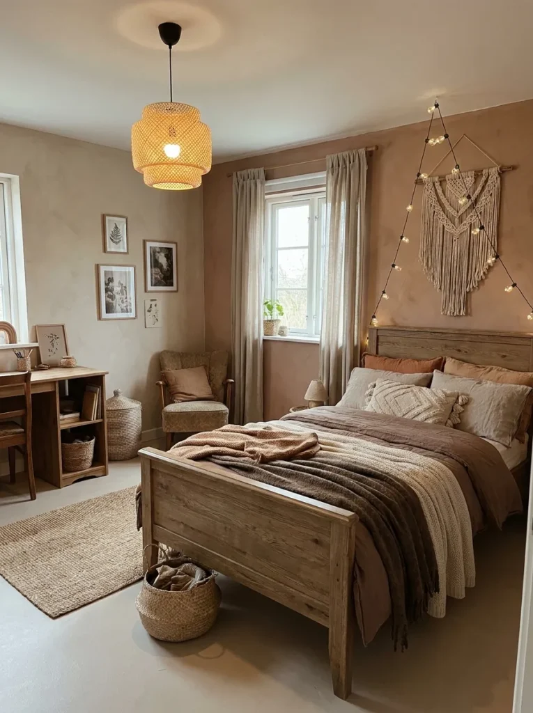
- Creates a warm and cozy environment
- Feels natural and easy on the eyes
- Works well with layered textures
- Suitable for long-term design
Muted earth tones bring a natural warmth that makes a bedroom feel instantly comfortable and inviting. Shades like beige, clay, and soft browns create a relaxed atmosphere that doesn’t overwhelm the space. I’ve noticed that these colors work particularly well when combined with textured elements like rugs, blankets, and wooden furniture. The overall effect feels calm and grounded, making the room a place where both play and rest can happen without visual distraction.
Warm taupes and clay shades hide scuffs better than stark white, a real plus in a kid’s room. Layer in textured bedding and wood tones to keep the palette from feeling flat.
Deep Forest Green
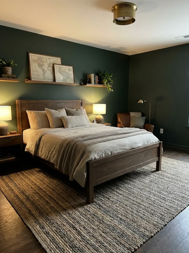
- Adds richness and depth to the space
- Creates a cozy and slightly dramatic feel
- Works well with warm lighting
- Pairs beautifully with wood elements
Deep forest green brings a bold yet calming presence that transforms a bedroom into a cozy retreat. This rich shade creates depth, making the space feel more layered and visually interesting. I’ve seen this color work best when paired with warm lighting and natural materials, which soften its intensity and create a welcoming balance. It’s a great choice for those who want a stronger color without sacrificing comfort or warmth.
Deep forest green is one of those boys’ bedroom paint ideas that works at any age, from a little boy’s room to a teen hangout. Benjamin Moore Essex Green (HC-188) with brass accents and warm lighting feels rich, not dark.
Half Painted Walls
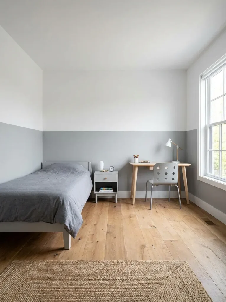
- Keeps the room feeling open and airy
- Protects lower walls from wear and marks
- Adds subtle visual structure
- Easy to update over time
Half-painted walls offer a clean and practical design that instantly makes a bedroom feel more structured. By keeping the upper half light and the lower half slightly darker, the room feels balanced without losing brightness. I’ve noticed this works especially well in active spaces where walls can get marked easily, as the darker lower section helps hide wear. It’s a simple idea that delivers both visual appeal and everyday practicality.
Paint the lower half in a durable satin or eggshell finish, which wipes clean more easily than the flat paint often used up top. It is a practical trick for younger kids’ rooms.
Warm Beige Walls
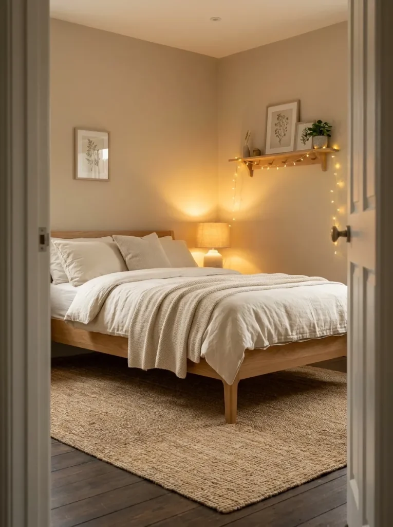
- Creates a soft and welcoming environment
- Works with almost any decor style
- Keeps the room feeling bright but cozy
- Easy to refresh with new accents
Warm beige walls offer a simple yet powerful way to make a bedroom feel comfortable and inviting. This neutral shade reflects light softly, helping the room stay bright without feeling cold or empty. I’ve noticed that beige works especially well in spaces where you want flexibility, since it blends easily with both bold and subtle decor choices. It creates a calm backdrop that allows furniture and textures to stand out naturally without overwhelming the overall look.
Not all beiges are equal: look for one with warm undertones like Sherwin-Williams Accessible Beige (SW 7036) to avoid a flat, gray cast. It works with nearly any bedding or decor you already own.
Bold Red Accent
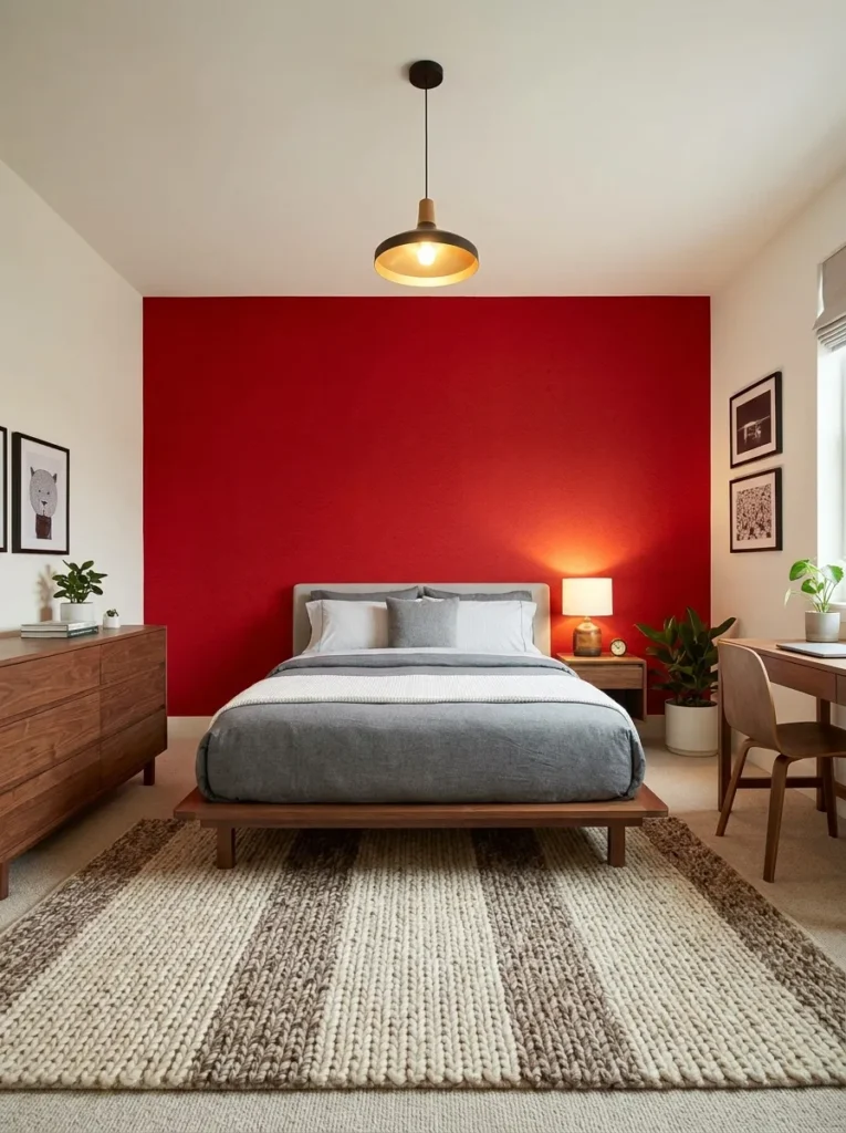
- Adds energy and excitement to the room
- Works best as a single accent feature
- Creates a strong focal point
- Pairs well with neutral surroundings
A bold red accent can instantly energize a bedroom and make it feel more dynamic. This color naturally draws attention, which is why it works best when limited to one wall or a specific area. I’ve seen this approach transform otherwise plain rooms into something much more engaging without adding clutter. Keeping the rest of the space neutral helps balance the intensity, allowing the red to stand out without overwhelming the overall design.
Red is best in small doses: one accent wall or even just the wall behind open shelving. Balance it with plenty of white and wood so the energy stays fun, not overwhelming.
Cool Gray Minimalism
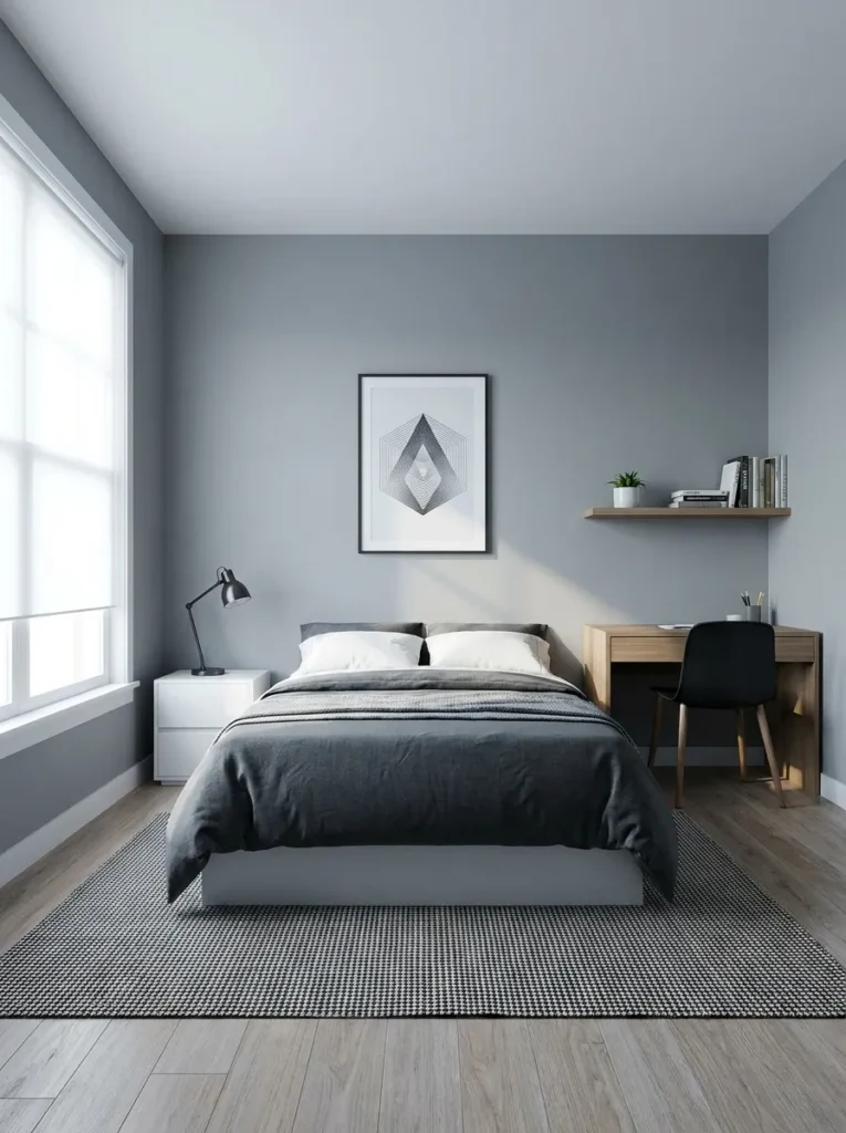
- Creates a clean and clutter-free look
- Works perfectly with minimalist decor
- Makes small spaces feel more open
- Easy to style with simple accents
Cool gray minimalism brings a clean and modern feel that instantly makes a bedroom look organized and calm. This shade works as a neutral base that doesn’t demand attention but quietly enhances everything around it. I’ve noticed that when paired with simple furniture and limited decor, the room feels more spacious and less overwhelming. It’s especially useful in smaller rooms where keeping things visually light can make a big difference.
Choose a gray with warm undertones to keep the room from feeling cold; cool grays can read icy in north-facing rooms. Layer different textures in bedding and rugs to add warmth.
Sunset Gradient Wall
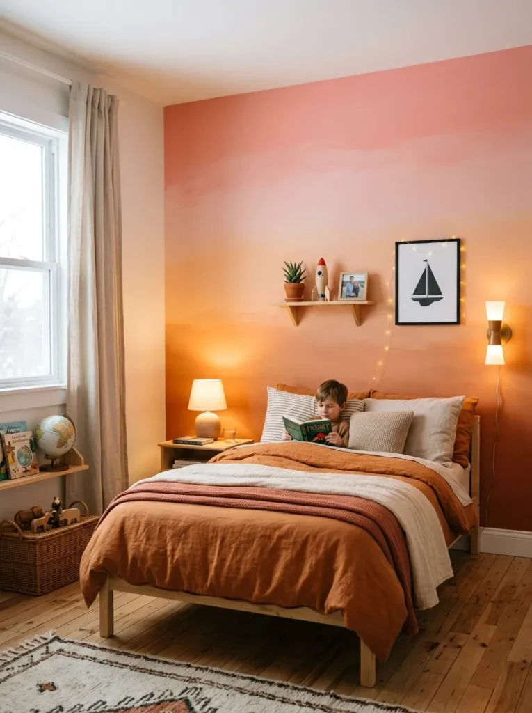
- Adds a unique artistic touch
- Creates a warm and dreamy atmosphere
- Works as a strong focal feature
- Brings soft color transitions into the space
A sunset gradient wall creates a visually stunning effect that feels both artistic and calming. The smooth transition between warm tones adds depth without needing patterns or extra decor. I’ve seen this idea work beautifully in rooms that need a focal point while still maintaining a soft, relaxing vibe. The blend of colors naturally draws attention, making the wall feel like a piece of art rather than just a painted surface.
Blend three close tones (peach, coral, soft pink) with a dry brush while the paint is still wet for a smooth gradient. It is the most artistic option here, so practice the blend on poster board first.
Dark Blue Walls
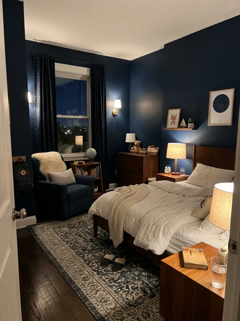
- Creates a cozy and restful environment
- Enhances contrast with lighter decor
- Works well with warm lighting
- Adds depth to the room
Dark blue walls bring a calming and slightly dramatic feel that transforms a bedroom into a cozy retreat. This shade works especially well in creating a restful environment, making it ideal for winding down at night. I’ve noticed that pairing it with lighter bedding and warm lighting helps balance the darkness, preventing the room from feeling too heavy. The contrast adds visual interest while keeping the overall atmosphere comfortable.
A dark blue wall makes a great backdrop for a reading corner: add a comfortable chair and a warm lamp and the moody color earns its keep.
Dark blue walls absorb light, so plan for layered lighting: a ceiling fixture plus a warm bedside lamp or two. White bedding and light curtains keep the contrast crisp.
White And Wood Combo
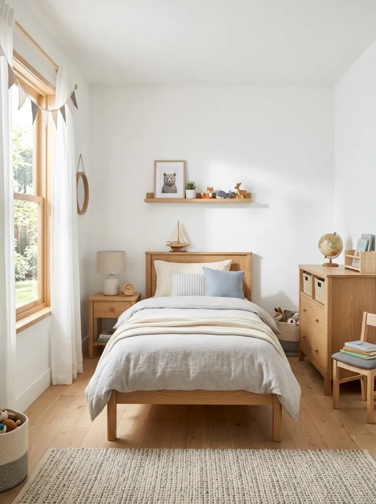
- Keeps the room bright and open
- Highlights natural wood textures
- Feels clean and timeless
- Easy to decorate and update
White and wood are a classic combination that never feels outdated. Crisp white walls reflect light beautifully, making the room feel open and fresh, while wooden elements add warmth and texture. I’ve noticed that this pairing works especially well in rooms that need a clean and simple foundation. It creates a balanced look that feels both modern and comfortable without requiring bold colors or complex designs.
Crisp white walls make natural wood grain the star, so put the paint savings toward one nice wood piece like a solid headboard or desk. It is the easiest look to update as tastes change.
Teal Feature Wall
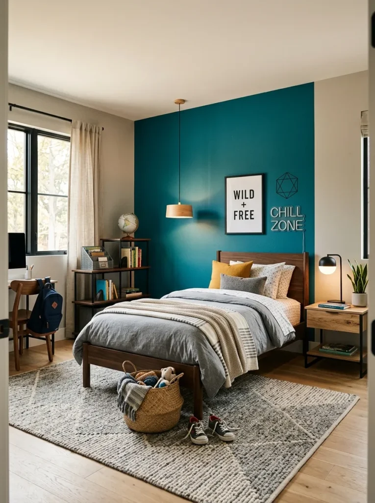
- Adds color without overwhelming the room
- Creates a fresh and modern look
- Works well with neutral tones
- Easy to highlight specific areas
A teal feature wall brings a refreshing pop of color that feels both modern and balanced. This shade sits between blue and green, giving it a unique vibrancy without being too bold. I’ve seen this work especially well when the rest of the room stays neutral, allowing the teal to stand out naturally. It adds personality while still keeping the overall design calm and easy to live with.
Teal sits between blue and green, so it works with both warm and cool accent colors. Use it on one wall and echo it in small doses, like throw pillows or a desk chair.
Monochrome Blue Layers
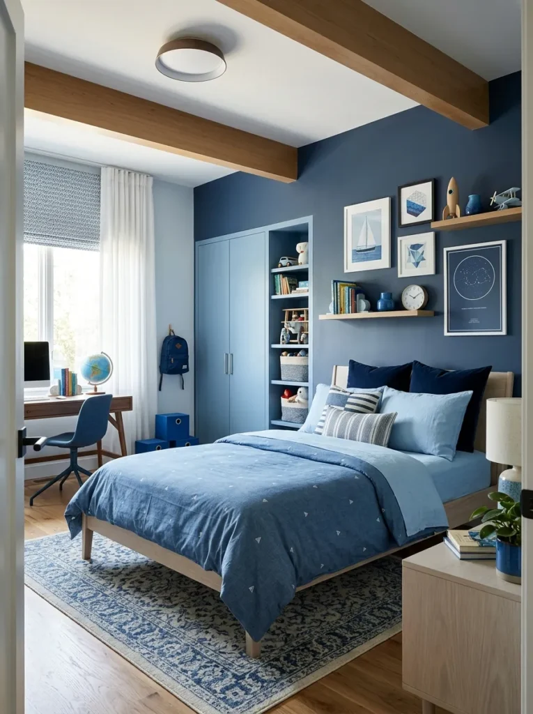
- Creates a cohesive and layered look
- Uses one color in multiple shades
- Feels calm but visually interesting
- Easy to style with matching decor
Monochrome blue layers create a beautifully cohesive space that feels both calm and visually rich. By using different shades of the same color, the room gains depth without becoming overwhelming. I’ve noticed that combining lighter blues with deeper tones like navy helps balance brightness and coziness. This approach keeps everything connected, making the room feel thoughtfully designed rather than random. It’s especially useful for creating a peaceful environment while still adding subtle visual variation through layering.
Pick one blue and use it in three strengths: deepest on one wall, mid-tone in textiles, palest in small accents. Sticking to a single color family keeps the layering calm instead of busy.
Chalkboard Paint Wall
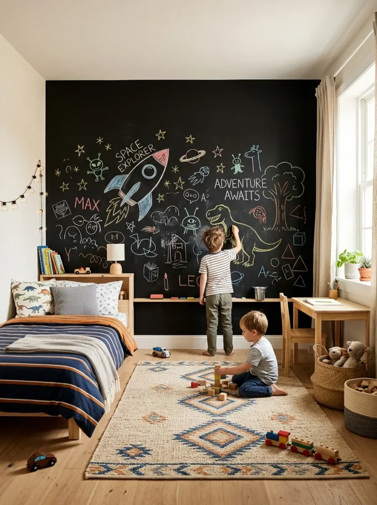
- Encourages creativity and daily interaction
- Doubles as decor and activity space
- Easy to update without repainting
- Adds a playful and functional element
A chalkboard paint wall instantly turns a bedroom into a creative and interactive space. Instead of static decor, the wall becomes something that can change every day. I’ve seen this work especially well for kids who enjoy drawing or writing, as it gives them a dedicated space to express themselves freely. It also reduces the need for extra wall decorations, since the drawings themselves become part of the room’s personality.
Chalkboard paint has come a long way: tintable versions now come in colors beyond black, and magnetic primer underneath lets kids hang art with magnets. It is the most fun pick here for younger kids.
People also ask
What is a good color for a boy’s bedroom?
Soft blues, sage green, and warm neutrals are great choices because they feel calm, versatile, and easy to style.
What is the trend in kids’ bedrooms in 2026?
Natural tones, minimal designs, and creative paint features like accent walls or color blocking are trending in 2026.
What should a 12-year-old boy’s room look like?
A 12-year-old boy’s room should feel modern, slightly mature, and personalized with simple colors, functional space, and subtle style.
What are the top 3 bedroom colors?
Blue, gray, and beige are the top bedroom colors because they are calming, timeless, and easy to decorate around.
Conclusion
The right paint color can completely change how a bedroom feels, often for less than the cost of a new piece of furniture. For more ideas, browse our teen boy bedroom ideas for age-appropriate styling, and bedroom decor trends in 2026 to see which colors designers are reaching for this year.
Now it’s your turn: save your favorite ideas on Pinterest, try one that fits your style, and share this with someone who could use a room upgrade. A better space is just one paint idea away.

Muhammad Israr is a home decor enthusiast and the writer behind Homely Crafter. He spends his days researching paint colors, layouts and budget-friendly styling ideas, then breaks them down into practical, easy-to-follow guides so you can decorate with confidence.
1 thought on “23 Genius Boys’ Bedroom Paint Ideas You’ll Wish You Tried Sooner”