
Lighting specialists at the American Lighting Association recommend three distinct layers of light in every living room, yet most homes rely on a single harsh overhead fixture. That gap between pro practice and everyday rooms is exactly what this guide closes. Learning how to decorate a living room like a pro is less about budget and more about the repeatable techniques designers use on every project.
Below are 22 of those techniques, each broken into why it works, exact measurements, honest trade-offs, and a pro tip with real numbers. Work through them in order, and your room will start making the same quiet, confident decisions a designer’s would.
How to Decorate a Living Room Like a Pro With the Right Rug
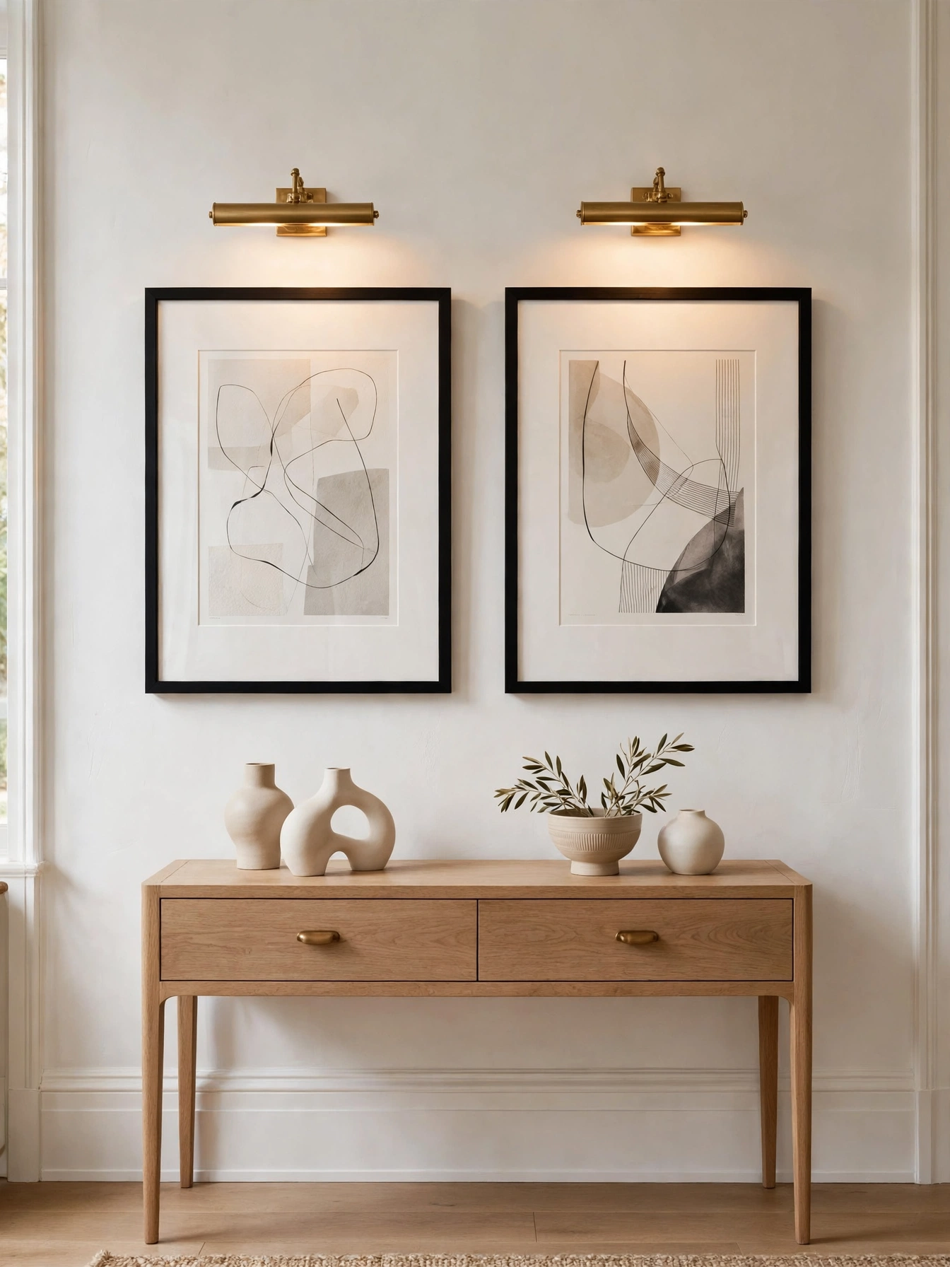
Why This Works:
- A rug sized to catch all front legs unifies scattered furniture instantly.
- Designers call the rug the room’s foundation; everything else references it.
- The right size makes the seating group read as one intentional zone.
- A too-small rug is the single most common amateur mistake pros spot first.
Size up: an 8×10 foot rug suits most standard seating groups, while 9×12 fits large rooms over 300 square feet. Position it so the front legs of the sofa and chairs sit 6 to 12 inches onto the rug, never floating entirely off it. Leave 12 to 18 inches of bare floor between the rug edge and the wall for a framed look. Budget wool rugs run $300 to $800 for 8×10, quality hand-tufted reaches $1,200, and premium hand-knotted starts at $2,500. Never buy a 5×7 for a full seating group; designers consistently flag undersized rugs as the fastest tell of a DIY room.
Open-plan rooms gain the most, since the rug draws the boundary no walls provide. The practical catch is cleaning: an 8×10 wool rug needs professional cleaning every 12 to 18 months at $150 to $300. Against bare floors, the rug wins on acoustics and warmth but demands the maintenance. Measure your seating footprint with painter’s tape before ordering, since rug sizes vary 2 to 3 inches between manufacturers.
Pro Tip: Tape the rug outline on the floor for 48 hours; living with the footprint beats guessing the size.
Float The Sofa
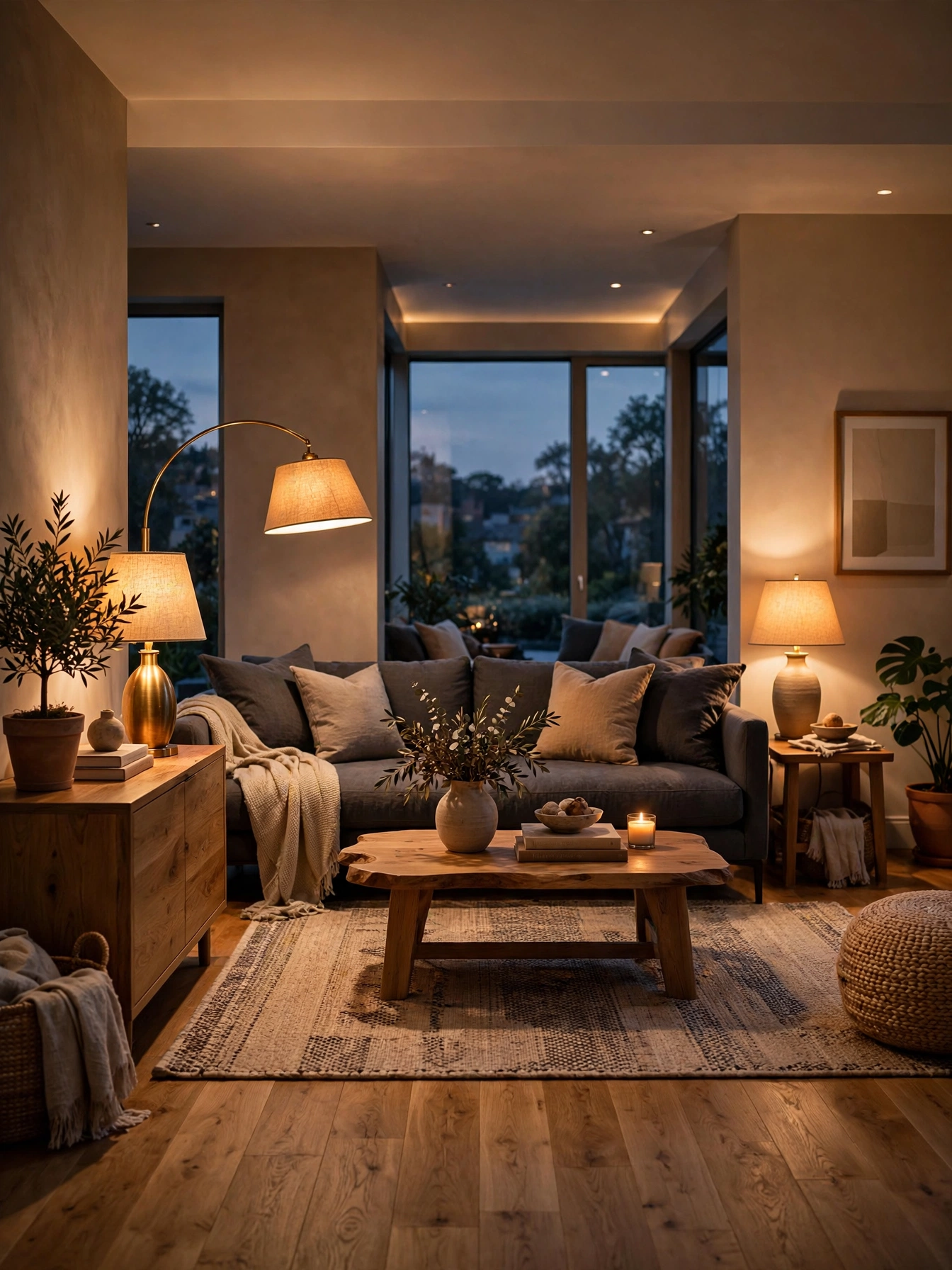
Why This Works:
- Pulling the sofa off the wall creates depth the room never had.
- The gap behind fits a console, which doubles styling space.
- Floating furniture defines zones instead of lining the perimeter like a waiting room.
- Even 12 inches of breathing room changes the whole feeling.
Pull the sofa 12 to 36 inches off the wall, enough to walk behind or fit a 10 to 12 inch deep console table. Keep 30 to 36 inches of passage behind it if the space serves as a walkway. A slim console ($120 to $400) styled with two lamps and a small plant turns the dead gap into a feature. Rooms need at least 12 feet of depth for floating to work; under that, the sofa eats the walkway. Avoid floating in narrow galley rooms under 10 feet wide, where every inch of passage counts.
People who have always pushed furniture to walls feel the biggest transformation here. The styling risk: the sofa back becomes visible, so it must look finished (no exposed backs or tags). Against wall-hugging layouts, floating costs nothing and adds a designer layer instantly. Slip a rug under the front legs to lock the floated arrangement in place visually.
Pro Tip: Place the console 1 inch lower than the sofa back so the sightline stays clean from across the room.
Layer Light Temperatures
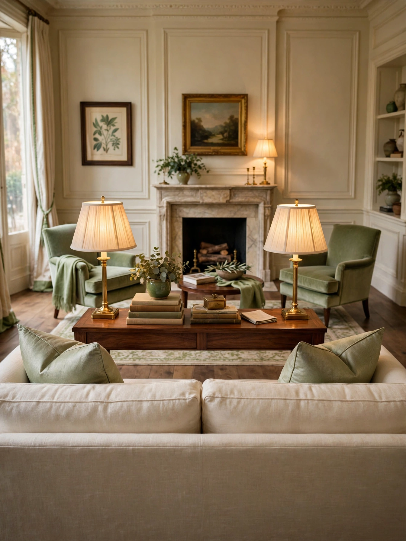
Why This Works:
- Three light layers (ambient, task, accent) let a room shift moods on demand.
- Warm 2700K bulbs flatter skin and wood; cool bulbs flatten both.
- Matching color temperature across lamps stops the patchy motel look.
- Dimmers on every switch give pros their signature evening glow.
Install dimmers ($25 to $45 per switch) on overheads first, then add a floor lamp (800 to 1,100 lumens) and two table lamps (400 to 800 lumens each), all at 2700K. Aim for 10 to 20 lumens per square foot total; a 200 square foot room wants 2,000 to 4,000 lumens across all sources. Keep every bulb the same temperature, since one 5000K bulb in a 2700K room looks like a mistake. When to hire a professional: an electrician should install dimmers and any new fixtures, since mismatched dimmer types cause flicker and buzzing.
Evening-heavy households notice this change the very first night. The budget catch: quality dimmable LEDs cost $8 to $15 each versus $3 for basic bulbs. Against a single overhead fixture, layered light costs under $300 total and transforms the room more than new furniture. Put lamps on smart plugs ($15 each) so the whole scene runs on one sunset routine.
Pro Tip: Dim overheads to 30 percent and let lamps carry the room; pros rarely run ceiling lights above half.
Hang Art Low
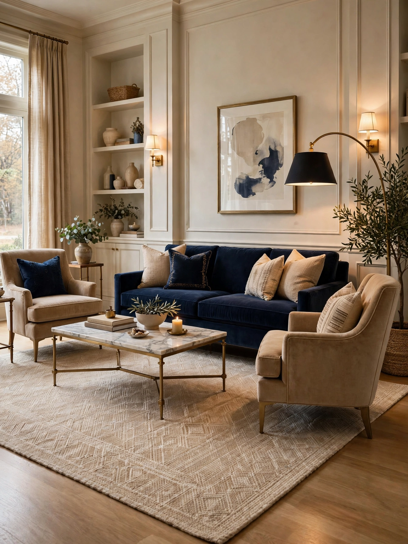
Why This Works:
- Art hung at eye level (57 inches to center) connects with the viewer instantly.
- High-hung art disconnects from furniture and floats awkwardly.
- The 6 to 8 inch gap between frame bottom and console top reads as one unit.
- Gallery height is the museum standard pros never debate.
Measure 57 inches from the floor to the art’s center, then hang so the frame bottom sits 6 to 8 inches above the console or sofa back. For pieces over 36 inches wide, use two D-rings and wire rated for twice the weight. Budget framing for a 24×36 print runs $80 to $150, while gallery acrylic reaches $300. Above a sofa, keep the art 8 to 10 inches above the back cushions so sitters never bump it. Never eyeball height from a ladder; mark the 57 inch line on the wall with painter’s tape first.
Almost every DIY room hangs art too high, so this fix feels revelatory. The exception: above a fireplace, art goes higher by necessity (mantel plus 6 inches minimum). Against salon-style clusters, a single properly hung piece looks calmer and more expensive. Step back 10 feet after hanging; the right height looks inevitable from across the room.
Pro Tip: Cut paper templates of each frame and tape them up for a day before driving a single nail.
Odd Number Styling

Why This Works:
- Odd groupings (3 or 5) look collected; even ones look like a store display.
- Varying heights by 4 to 6 inches creates the rhythm the eye finds pleasing.
- The rule works on shelves, mantels, and tables without exception.
- Three objects is the pro default for any single surface.
Group three objects with heights stepping at least 4 inches apart (for example, 8, 12, and 16 inches) and space them 3 to 6 inches apart. Mix materials within the trio: one ceramic, one metal, one organic like wood or plant. Budget styling objects run $15 to $40 each at home stores; vintage pieces add character for similar prices. Keep the total footprint under one-third of the surface so the table still functions. Avoid lining objects in a straight row; a loose triangle arrangement reads far more natural.
Styling skeptics find this the easiest pro rule to adopt immediately. The failure mode is over-styling: five objects where three would do. Against symmetrical pairs, odd groupings feel relaxed and editorial. Photograph the grouping from your usual seat; the camera exposes awkward spacing instantly.
Pro Tip: Style in threes, then remove the weakest piece; the pair-plus-one tension is what makes it work.
Vary Lamp Heights
Why This Works:
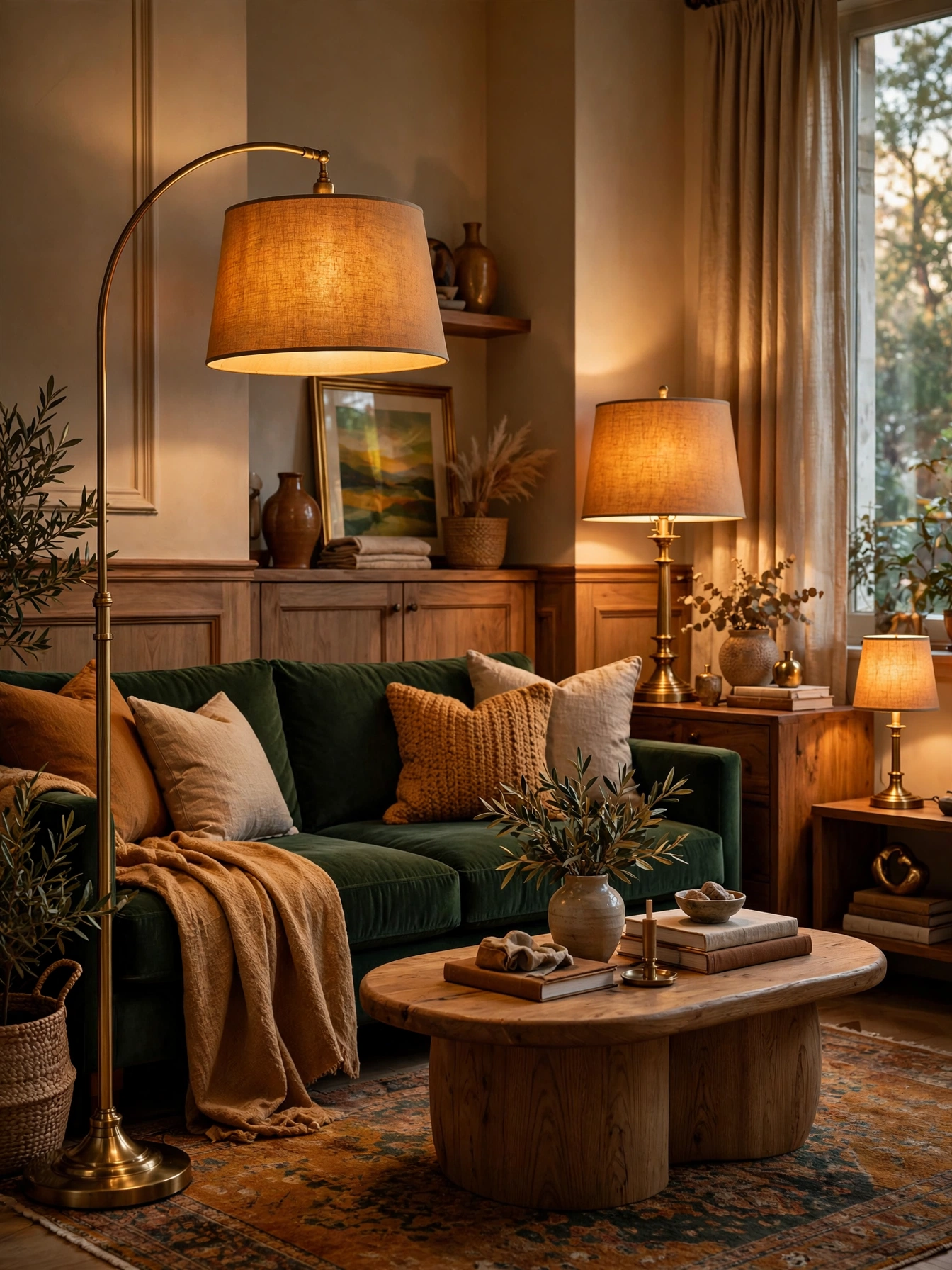
- Light at three heights (high, mid, low) builds the dimension flat rooms lack.
- Varied heights draw the eye around the room instead of to one spot.
- Pros never place two matching lamps at identical heights side by side.
- Height variation makes even budget lamps look deliberately chosen.
Plan one tall source (60 to 72 inch floor lamp), one mid source (26 to 32 inch table lamp), and one low accent (12 to 18 inch small lamp or candles). Keep shade bottoms at staggered levels with at least 12 inches between each tier. Budget lamp trios run $120 to $300 total; mixing one investment piece ($150) with two budget finds works beautifully. Place the tallest lamp in the darkest corner, since height plus light doubles its impact. Avoid clustering all three on one side; spread them in a triangle across the room.
Renters love this because every piece is plug-in with zero installation. The cord catch: three lamps mean three cords, so route them along baseboards with $10 cord covers. Against a single overhead light, the trio costs little and adds the depth designers are paid for. Dim the tallest lamp lowest in the evening for the signature pro glow.
Pro Tip: Match all three shades in the same fabric; unified shades make varied heights look intentional.
How to Decorate a Living Room Like a Pro With Spacing Rules

Why This Works:
- Pros memorize clearance numbers; amateurs guess and crowd.
- Generous walkways (30 to 36 inches) make rooms feel expensive.
- Correct gaps keep furniture from looking shoved together.
- Spacing is free to fix and changes everything.
Memorize the pro numbers: 18 inches between coffee table and sofa, 30 to 36 inches for main walkways, 24 inches minimum behind chairs, and 7 to 9 feet between facing seats for conversation. Measure with a tape, not your eye; eyes lie by 20 percent in furnished rooms. Shift pieces 2 to 3 inches at a time until clearances land. Never accept under 24 inches for any walkway people use daily, since hips and laundry baskets need real room. Rooms under 150 square feet should favor the low end of each range to preserve openness.
Cramped rooms feel the biggest relief from this zero-cost fix. The hard truth: correct spacing sometimes means removing a piece, which stings. Against buying new furniture, re-spacing costs nothing and often solves the “something feels off” complaint. Designers at Houzz list poor traffic flow among the top regrets in reader surveys, so this numbers game pays off.
Pro Tip: Walk every path with a laundry basket; if it fits, your guests will move comfortably too.
Edit Before Buying

Why This Works:
- Pros subtract before they add; amateurs shop first and wonder why it still feels off.
- Removing one piece often solves what new purchases cannot.
- Editing reveals the room’s actual needs instead of assumed ones.
- The 30-day box test separates keepers from clutter without regret.
Pull out every movable piece, then add back only what serves a daily purpose; most rooms lose 20 to 30 percent of their contents. Box questionable items for 30 days and donate whatever you never retrieve. Live with the edited room for two weeks before buying anything, since needs surface slowly. Budget: editing saves the $500 to $2,000 people typically spend filling rooms blindly. Avoid the “maybe” pile limbo; decide keep, box, or donate in one pass.
Sentimental decorators find this the hardest pro habit to build. The payoff compounds: every future purchase lands in a room with actual space for it. Against the shop-first approach, edit-first costs nothing and prevents the crowded rooms that trigger the next shopping trip. Photograph the edited room; the breathing space usually surprises.
Pro Tip: Remove one more piece than feels comfortable; pros call this the 10 percent braver rule.
Repeat One Metal
Why This Works:
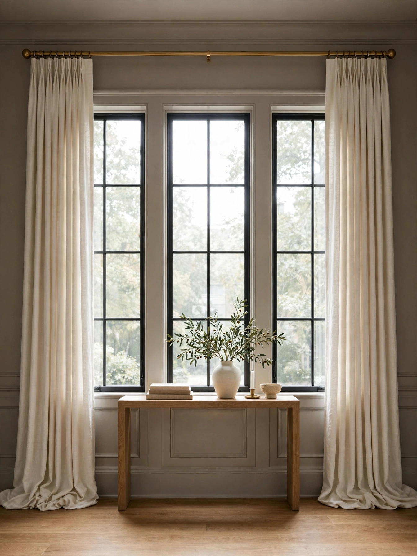
- One repeated metal finish ties a room together like a signature.
- Pros limit metals to one dominant plus one accent at most.
- Repetition (3 to 5 touches) makes the choice look deliberate.
- Mixed-everything metals read as indecision, not eclecticism.
Pick one metal (brushed brass, matte black, or polished nickel) and repeat it in 3 to 5 spots: lamp base, frame, table legs, hardware. Keep finishes consistent within the family; brushed and polished brass clash when adjacent. Budget metal swaps (new lamp, spray-painted frame) run $50 to $150 total. If you love two metals, assign one 80 percent dominance and the other 20 percent accent. Never mix chrome, brass, and black equally; three competing metals with no hierarchy looks accidental.
Rooms with hand-me-down pieces benefit most, since a unifying metal disguises mismatched origins. The spray-paint shortcut works: a $8 can of metallic paint unifies frames and small objects in an afternoon. Against the matchy showroom set, the repeated-metal trick achieves cohesion while keeping collected character. Count your current metals; most rooms have four or more without realizing it.
Pro Tip: Shoot the room in black and white; mismatched metal tones jump out when color is removed.
Scale Art Right

Why This Works:
- Art at two-thirds the furniture width looks made for the spot.
- Oversized art is the pro shortcut to an expensive-looking room.
- Tiny art over a big sofa is the fastest way to look tentative.
- Scale confidence matters more than the art’s price tag.
Measure the furniture width and multiply by 0.66 to 0.75 for the ideal art width; a 72 inch sofa wants 48 to 54 inches of art. For gallery walls, the total arrangement should hit the same 66 percent width. Budget oversized prints in simple frames run $150 to $400; canvas wraps skip framing costs entirely. Hang the center at 57 inches regardless of size. Avoid 8×10 frames floating alone over a sofa; cluster small pieces to reach the target width instead.
Timid decorators consistently undersize art, so this rule feels bold at first. The cost myth: big art need not be expensive, since large prints and tapestries cover width cheaply. Against a scattering of small frames, one bold piece anchors the wall with authority. The Spruce’s design guides list the two-thirds rule among their most-shared sizing tips.
Pro Tip: When torn between two sizes, pros always choose the larger; nobody ever regretted going bigger.
Ground With Drapes

Why This Works:
- Drapes hung high and wide make windows (and ceilings) look larger.
- Fabric panels add the softness hard rooms need to feel finished.
- Pros hang rods 4 to 6 inches above the frame, never right on it.
- Full-length panels ground the room like a tailored suit grounds an outfit.
Mount the rod 4 to 6 inches above the window trim and extend it 8 to 12 inches beyond each side so panels stack off the glass. Choose panels 2 to 2.5 times the window width for proper fullness, in 96 inch length for 8 foot ceilings. Budget ready-made linen-look panels run $40 to $80 per pair; custom drapes reach $400 to $800 per window. Hem panels to kiss the floor or puddle 1 to 2 inches. Avoid sill-length curtains in living rooms; pros consider them the hallmark of an unfinished window.
Standard 8 foot ceilings gain the most vertical drama from this trick. The ironing myth stops many people, but linen’s natural wrinkle is the look. Against bare windows or blinds alone, drapes add the softness that makes a room feel decorated. Close the panels at night and the room instantly feels cozier and more private.
Pro Tip: Train new drapes with loose ties for 2 weeks so the pleats memorize their folds permanently.
Mix Wood Tones

Why This Works:
- Mixed woods look collected over time; matchy woods look like a furniture set.
- Pros mix 2 to 3 wood tones united by the same undertone (all warm or all cool).
- Variety adds the depth single-finish rooms lack.
- The undertone rule keeps the mix harmonious instead of chaotic.
Choose 2 to 3 wood tones sharing warm undertones (walnut, white oak, honey pine) or cool ones (ash, gray stain, ebonized). Distribute each tone at least twice around the room so no finish looks accidental. Keep the floor as the dominant tone and let furniture provide the contrast. Budget: mixing costs nothing extra when buying, since varied finishes price similarly. Avoid pairing orange pine with gray wash; clashing undertones are the one mix that never works.
People who bought matching sets find this liberating. The 2-foot test: hold finish samples together at arm’s length; if the undertones fight, you will see it. Against the single-finish showroom look, mixed woods photograph with more character. When in doubt, black-stained wood bridges any two tones as a neutral.
Pro Tip: Repeat the darkest wood tone in small doses (frames, legs) to anchor the lighter pieces.
Zone Open Plans
Why This Works:
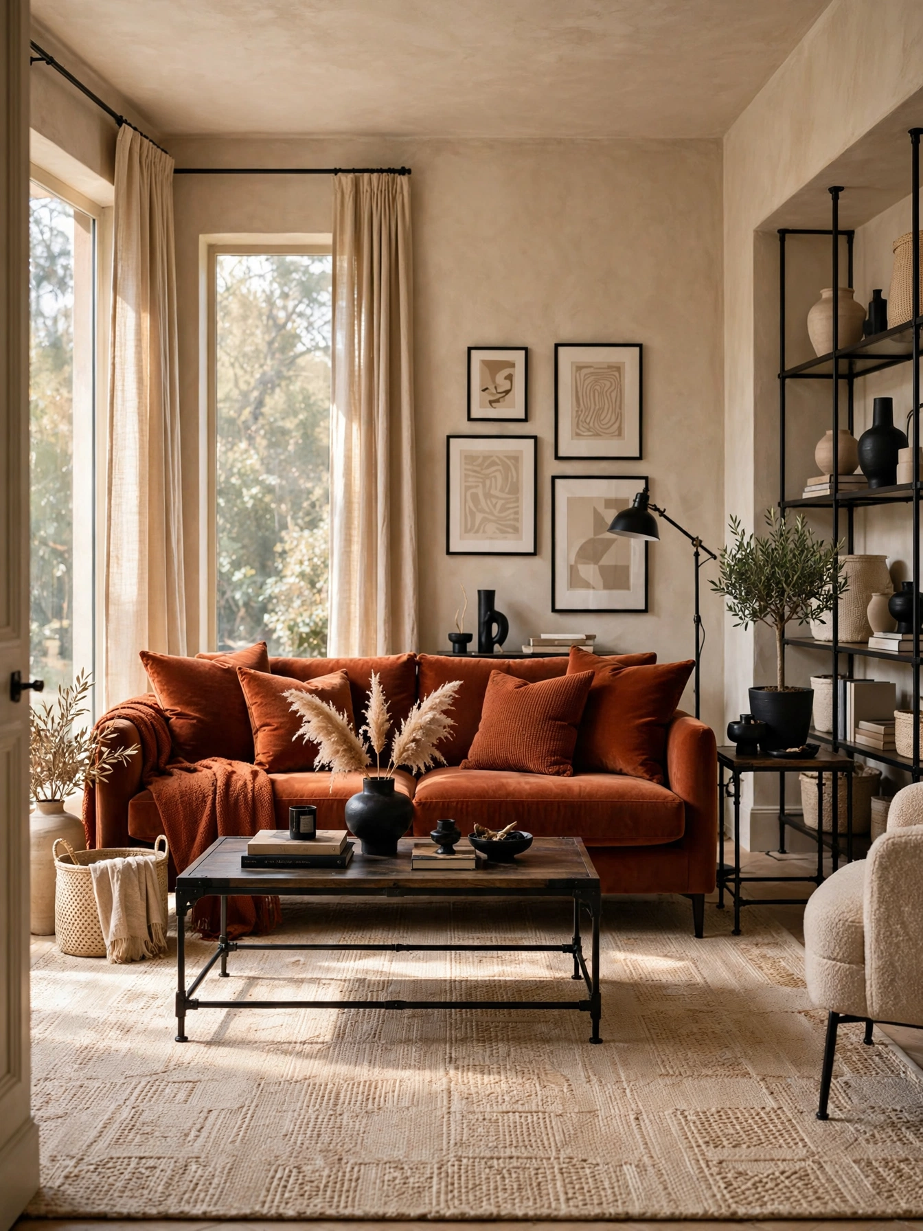
- Open plans need invisible walls; pros build them with rugs and furniture backs.
- A sofa with its back to the dining area draws the clearest boundary.
- Distinct lighting per zone (pendant here, lamps there) reinforces the split.
- Zoning stops the big-room drift where furniture floats aimlessly.
Define the living zone with an 8×10 rug and a sofa facing inward, backs to the adjacent space. Keep 36 to 42 inches of passage between zones so traffic flows without cutting through conversation. Give each zone its own light source: a pendant over dining, lamps in the living area. Budget: zoning uses furniture you own, plus one rug ($200 to $500). Avoid pushing all furniture to the outer walls; the empty middle is what makes open plans feel cavernous.
New-build open plans need this most, since builders leave the space undefined. The sightline rule: from the entry, each zone should read as a distinct destination. Against one giant furniture scatter, zoned layouts feel twice as intentional. A console table behind the boundary sofa doubles as the divider’s finished back.
Pro Tip: Align zone edges with ceiling features (beams, light positions) for boundaries that feel architectural.
Style In Triangles

Why This Works:
- The triangle (tall center, stepping down) is the composition pros default to.
- Triangular arrangements guide the eye in a satisfying arc.
- The shape works on mantels, consoles, and shelves identically.
- One tall anchor plus descending sides never looks accidental.
Build the triangle: one tall piece (18 to 24 inches) at or near center, medium pieces (12 to 16 inches) flanking, low pieces (under 8 inches) at the edges. Keep the total width within two-thirds of the surface. Vary materials across the three tiers for texture interest. Budget: triangle styling uses objects you own; one tall vase ($30 to $60) anchors most mantels. Avoid perfect symmetry; offset the tall piece 6 inches off-center for an editorial feel.
Mantel owners get the most mileage from this single composition. The stiffness trap: identical pairs at each level kill the organic feel. Against a straight lineup of same-height objects, the triangle adds the movement designers charge for. Squint at the arrangement; the silhouette should read as a soft mountain.
Pro Tip: Add one trailing plant at the triangle’s edge; the organic line softens the geometry perfectly.
How to Decorate a Living Room Like a Pro With the 60-30-10 Rule

Why This Works:
- The 60-30-10 rule (dominant, secondary, accent) is the pro color safety net.
- Ratios remove the guesswork that leads to chaotic rooms.
- 60 percent neutral walls and rug, 30 percent upholstery, 10 percent accents.
- The formula works with any three colors, bold or quiet.
Assign 60 percent to walls and large rug (neutrals), 30 percent to upholstery and drapes (your main color), and 10 percent to pillows, art, and small accents (the punch). Count roughly by visual area, not item count; one rust sofa is more 30 percent than five rust pillows. Test the trio on a single board before committing paint. Budget: the formula costs nothing, it only organizes spending. Avoid 33-33-33 splits; equal thirds fight for attention with no clear winner.
Color-timid decorators find this the safest path to a non-beige room. The 10 percent accent is where personality lives, so spend it boldly. Against random color accumulation, the formula produces rooms that photograph cohesively. Designers cite 60-30-10 in nearly every color consultation, which tells you how universal it is.
Pro Tip: Pull your 10 percent accent from the smallest pattern in your rug for a guaranteed match.
Karate Chop Pillows
Why This Works:
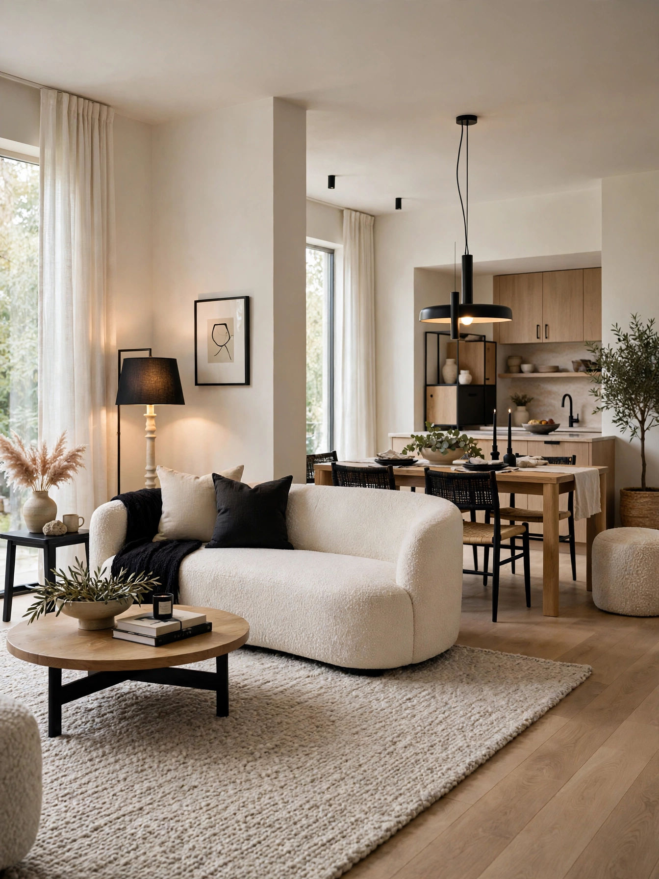
- The center crease (the “karate chop”) makes pillows look plump and styled.
- Down-blend inserts hold the chop; cheap polyfill springs back flat.
- Chopped pillows signal intentional styling in one 5-second move.
- The dent catches light and shadow, adding dimension to the sofa.
Buy inserts 2 inches larger than the cover (a 22 inch insert in a 20 inch cover) in a 50-50 feather-down blend ($25 to $45 each). Fluff by gripping opposite corners and shaking, then karate-chop the top center firmly with the side of your hand. Budget polyfill inserts ($10) will not hold the crease; the down blend is non-negotiable for this trick. Replace inserts every 2 to 3 years, since feathers break down and lose loft. Avoid chopping outdoor pillows, where the dent collects rainwater.
Sofa stylists call this the fastest upgrade in the business. The allergy note: down blends bother sensitive sleepers, though sofa pillows rarely cause issues. Against flat sad pillows, chopped down inserts cost $30 more per pillow and look triple the price. Mix 20, 22, and 24 inch pillows for the layered pro arrangement.
Pro Tip: Chop, then pinch the top corners upward; the ears add the tailored finish showrooms use.
Hide The Cords

Why This Works:
- Visible cords are the fastest way to undo an otherwise polished room.
- Pros hide every cable; amateurs accept them as inevitable.
- Paintable raceways ($10 to $15) disappear against baseboards.
- A cord-free room photographs cleaner and feels calmer.
Run lamp and charger cords along baseboards in paintable raceways, then paint to match the wall. Bundle behind-console cables with $8 velcro ties and a $20 cable box. Go wireless where possible: rechargeable lamps and bluetooth speakers cut cords at the source. Budget the full cleanup at $30 to $60 per room. Never run power cords under rugs, since trapped heat and foot traffic create a genuine fire risk.
Renters achieve this with adhesive raceways that remove cleanly. The maintenance catch: new devices bring new cords, so re-audit every 6 months. Against the “cords are fine” mindset, hidden cables deliver the seamless look designers are hired for. Label plugs at the power strip; the labeled strip saves hours during troubleshooting.
Pro Tip: Mount the power strip under the console with adhesive brackets so plugs stay invisible and reachable.
Balance Visual Weight

Why This Works:
- Every heavy piece needs a counterweight or the room feels lopsided.
- Pros distribute dark, tall, and bulky items across the room’s axis.
- Balance works diagonally too, not just mirror symmetry.
- A lopsided room creates unease viewers feel but cannot name.
Map your heavy pieces (bookcases, dark chairs, TV wall) and ensure each has a visual counterweight on the opposite side or diagonal. A tall bookcase on the left wants a tall plant or floor lamp on the right. Keep the heaviest item within the middle third of the wall, never jammed in a corner. Budget: rebalancing uses existing pieces, costing nothing. Avoid clustering all dark pieces on one side; the “heavy corner” is the classic amateur layout.
Rooms with one statement piece (piano, large TV) need this most. The squint test reveals imbalance: blur your eyes and check whether dark masses distribute evenly. Against perfect symmetry, diagonal balance feels more natural and less formal. Move one piece at a time and re-squint; balance emerges in small shifts.
Pro Tip: Take a photo and flip it horizontally; imbalance you missed becomes obvious mirrored.
Bookcase Breathing Room
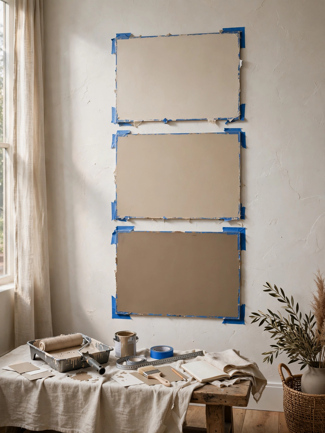
Why This Works:
- Pros leave 30 percent of shelf space empty; full shelves read as storage units.
- Breathing room lets each object be seen instead of lost in clutter.
- Horizontal book stacks break the vertical monotony beautifully.
- Edited shelves make the whole room feel more expensive.
Remove books until shelves sit at 70 percent full, then style the gaps: horizontal stacks of 3 to 5 books topped with one object. Vary shelf contents: books on one shelf, objects on the next, a mix on the third. Leave at least one completely empty shelf section per bookcase. Budget: editing is free; bookends ($15 to $30) tidy the remaining rows. Avoid the rainbow spine arrangement; group by height or tone for calm.
Book lovers resist this hardest, and honesty requires saying so. The compromise: keep the full library in another room and curate the living room shelves. Against crammed shelves, breathing room showcases your best pieces instead of burying them. Dust the empty sections monthly; visible dust on bare shelves betrays the whole effect.
Pro Tip: Turn one shelf’s books backward (pages out) for a textural neutral block pros use often.
Test Paint Large
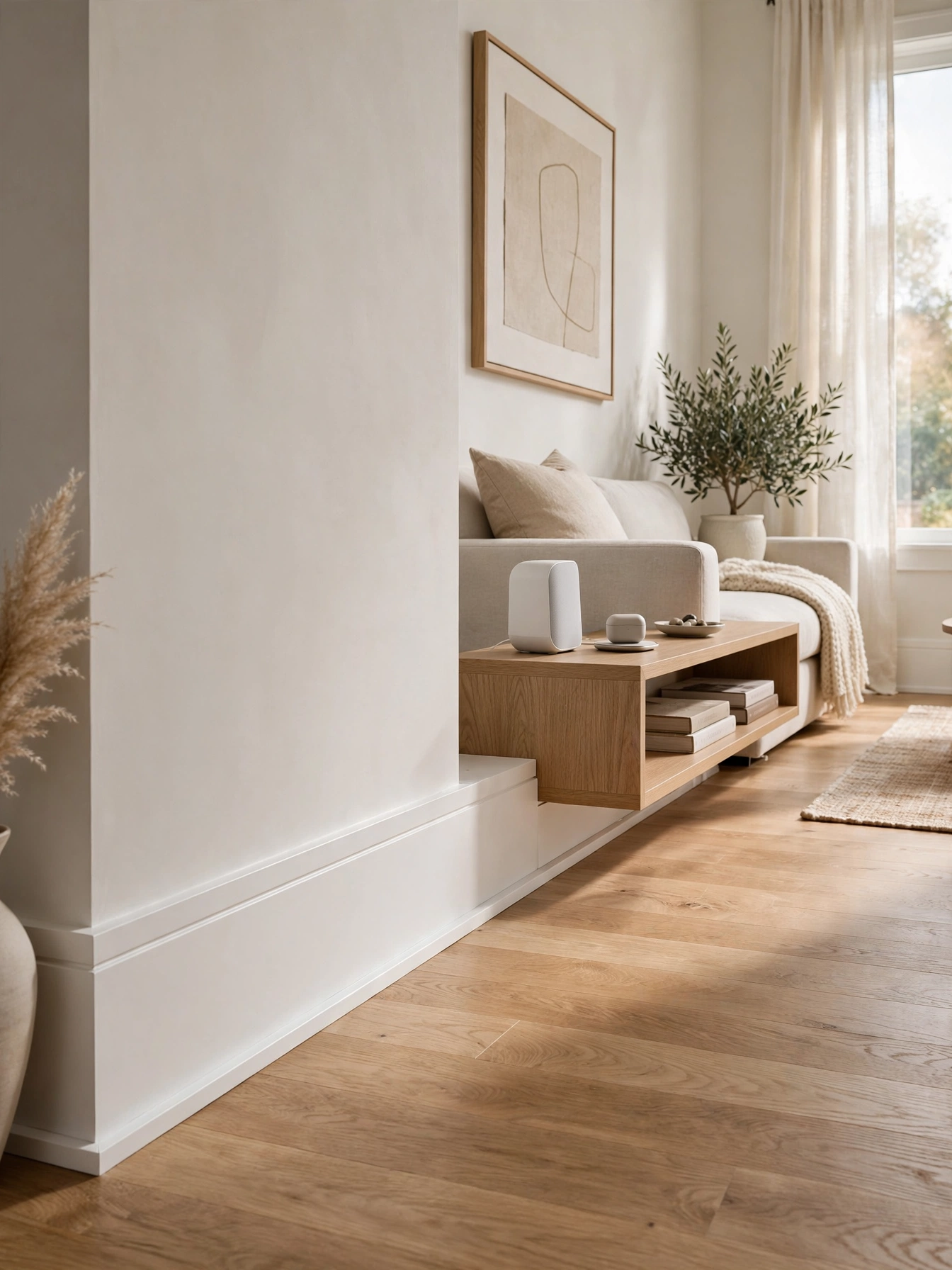
Why This Works:
- Pros never choose paint from a 2 inch chip; they test 2×2 foot samples.
- Large samples reveal undertones that tiny chips hide completely.
- Testing on the actual wall accounts for your room’s unique light.
- The $15 sample habit prevents $500 repaint regrets.
Paint 2×2 foot boards (not the wall) with 2 coats of each finalist, then move them around the room for 48 hours. View each board in morning, noon, and evening light, since undertones shift dramatically. Budget $12 to $18 per sample quart; testing 3 colors costs under $50. Note the LRV (light reflectance value) on the chip; rooms under 150 square feet generally want LRV above 60. Avoid choosing under store fluorescents; take the chip home before deciding anything.
Repaint regretters wish they had known this rule sooner. The board method beats painting the wall directly, since boards move and walls do not. Against the chip-only gamble, large testing takes a weekend and saves a full repaint. The NKBA guidelines echo this: always evaluate color in the finished space before committing.
Pro Tip: Snap each board at 9 AM, 1 PM, and 7 PM; the photo series exposes undertone shifts clearly.
Finish With Scent

Why This Works:
- Pros style all five senses; scent is the invisible finishing layer.
- A signature scent makes guests remember the room emotionally.
- One scent per home prevents the clashing-candle chaos.
- Scent completes the “designed” feeling that visuals alone cannot.
Choose one signature scent (cedar, fig, or linen are safe designer favorites) and use it in a reed diffuser for constant background plus a candle for occasions. Budget reed diffusers run $20 to $40 and last 3 to 4 months; quality soy candles cost $25 to $45 with 50-plus hour burn times. Place the diffuser near the entry so the scent greets visitors. Keep candles 12 inches from fabrics and never leave them burning unattended. Avoid mixing three different scented products; one scent, two formats is the pro formula.
Pet owners should check pet-safe scents, since some essential oils harm cats and dogs. The subtlety rule: visitors should notice the scent within 30 seconds but never be hit by it. Against the unscented room, a signature scent adds the luxury-hotel layer designers swear by. Flip diffuser reeds monthly to refresh the throw.
Pro Tip: Light the candle 30 minutes before guests arrive; the room smells styled before they see it.
Photograph The Room

Why This Works:
- Pros photograph every room; the camera catches what eyes normalize.
- Photos reveal crooked art, clutter creep, and awkward gaps instantly.
- The 48 inch lens height mimics natural eye level for honest review.
- A final photo check is the cheapest quality control in design.
Shoot the finished room from the doorway at 48 inches high (prop the phone on a stack of books if needed), capturing all four walls. Review each photo for the pro checklist: art level, cord visibility, surface clutter, and balance. Fix what the photo flags, then re-shoot. Budget: free with the phone you own; a $25 tripod makes it repeatable. Never skip this step after styling; even pros miss things until the photo shows them. Repeat quarterly, since rooms drift back toward clutter.
DIY decorators find this the most revealing 5 minutes of any project. The mirror trick works too: a hand mirror shows the room reversed, exposing imbalance. Against the “looks fine to me” trap, the photo is the objective judge designers trust. Save before-and-after shots; the transformation motivates the next room.
Pro Tip: Shoot in black and white once; value imbalances hide behind color every time.
FAQs
How can I learn how to decorate a living room like a pro on a budget?
Start with the free techniques: re-spacing furniture to pro clearances, editing out 20 percent of decor, and hiding cords ($30 to $60). These three steps cost under $100 total and deliver the biggest visual upgrade before you spend on anything new.
What is the biggest mistake beginners make when decorating?
Buying furniture before planning the layout. Pros measure first and shop second, while beginners fill carts first. A $25 tape measure and a sketched floor plan prevent the wrong-size sofa, which is a $1,000-plus mistake to fix.
How do pros make a living room look expensive without spending a lot?
They master scale and light: oversized art at two-thirds furniture width, layered 2700K lighting with dimmers, and the 60-30-10 color formula. Designers at The Spruce note these three moves read as expensive regardless of what the pieces actually cost.
How long does it take to learn how to decorate a living room like a pro?
A focused weekend covers editing, re-spacing, and styling (12 to 16 hours of work). Adding paint stretches it to two weekends, and full furniture replacement runs 4 to 8 weeks including delivery times of 2 to 6 weeks per piece.
Should I hire a designer or learn how to decorate a living room like a pro myself?
Learn the techniques in this guide first; most living rooms transform with them. Consider a designer for structural changes or whole-home cohesion, where the NKBA notes professional space planning prevents costly layout mistakes worth 5 to 10 times the design fee.
Conclusion
Knowing how to decorate a living room like a pro comes down to repeatable techniques, not talent or budget: anchor with the right rug, float the sofa, layer warm light, and let the 60-30-10 formula handle color. Start this weekend with the free fixes (spacing, editing, cord-hiding), then invest in lighting and art. Your first action: photograph your room today from the doorway, since the photo shows exactly where to begin. Follow HomelyCrafter on Pinterest for more ideas. Save this to your Pinterest boards so you can refer back to it!

Muhammad Israr is a home decor enthusiast and the writer behind Homely Crafter. He spends his days researching paint colors, layouts and budget-friendly styling ideas, then breaks them down into practical, easy-to-follow guides so you can decorate with confidence.