
Every Benjamin Moore paint color carries a number that predicts how it will look on your walls, and most shoppers never read it. It is called LRV, Light Reflectance Value, printed on every color page, and it tells you whether that perfect gray will glow soft or turn into a cave once it hits your living room. These clever living room color ideas start from facts like that one, not from vibes.
Below are 22 ideas covering color theory made practical, the 60-30-10 rule, undertone matching, paint testing that actually works, and palettes that flatter furniture you already own. Each idea includes exact measurements, real price ranges and honest trade-offs. You will finish knowing how to choose a whole-room palette with confidence instead of repainting twice.
Test Paint Swatches

Why This Works:
- A 2×2 ft board shows the true color; a 2-inch chip lies to you
- Observing for 3 full days catches morning, noon and lamplight shifts
- Boards move room to room, unlike paint dabbed straight on the wall
- Testing costs $15 to $30 in samples versus $800 to repaint a room
Buy sample pots (8 oz covers about 16 square feet) and paint two coats onto 24×24 inch foam boards, one board per finalist color. Tape boards to the wall at eye level and check them at 8 AM, 1 PM and 8 PM under lamps for 3 days; colors shift 2 to 3 shades between cool morning and warm evening light. Photograph each board next to your sofa fabric and rug, since phone cameras reveal undertone clashes the eye misses. Avoid testing on a tiny patch of the old wall color, because the surrounding color distorts your perception by up to 30%. Benjamin Moore and Sherwin-Williams both publish LRV for every color: values above 60 read light, below 35 read dark.
Most of us pick wall color without a designer, and this method was built for exactly that. Renters can use peel-and-stick samples ($6 to $10 each) that remove cleanly. The price you pay is patience: the 3-day wait feels slow when you want to paint this weekend, but it prevents the $800 repaint. Budget $20 to $40 total for 3 to 4 sample boards. Never skip testing in north-facing rooms, where cool light exaggerates blue and gray undertones dramatically.
Pro Tip: Prime each sample board with white first; a gray board base darkens light samples by nearly a full shade.
Sixty Thirty Ten
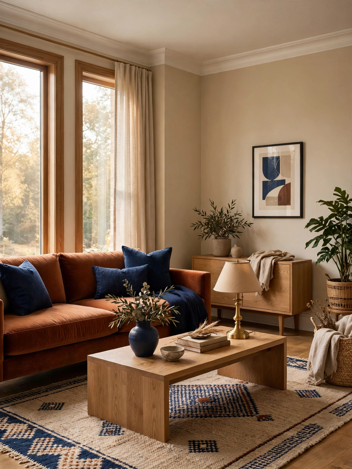
Why This Works:
- The 60-30-10 split is the classic proportion designers cite for balanced rooms
- 60% dominant color (walls) sets the mood without overwhelming
- 30% secondary (upholstery) adds depth, 10% accent (pillows, art) adds spark
- The rule works in any palette, from all-neutral to bold and colorful
Assign 60% to walls and large rugs, 30% to the sofa and curtains, and 10% to pillows, throws and small art. In a 15×17 ft room, that means roughly 250 square feet of wall color, 80 to 100 square feet of upholstery, and 15 to 25 square feet of accent. Keep the 10% accent truly small: two pillow covers and one throw, not a whole accent chair, or the ratio collapses. Avoid splitting 50-50 between two strong colors; equal rivals fight, while a clear dominant color lets the others support. The Spruce and HGTV both reference this proportion as the starting point for palette planning.
Beginners who freeze at the paint aisle get the most from this ratio, because it turns taste into math. Maximalists can bend it to 60-25-15 without breaking the balance. Trade-off: strict ratios can feel formulaic, so treat 60-30-10 as training wheels for your first palette, then trust your eye. Cost impact is zero; it is a planning tool, not a purchase.
Pro Tip: Snap your room, then use a free color-picker app to measure the actual percentage split; most rooms fail at 80-10-10.
Warm Greige Walls
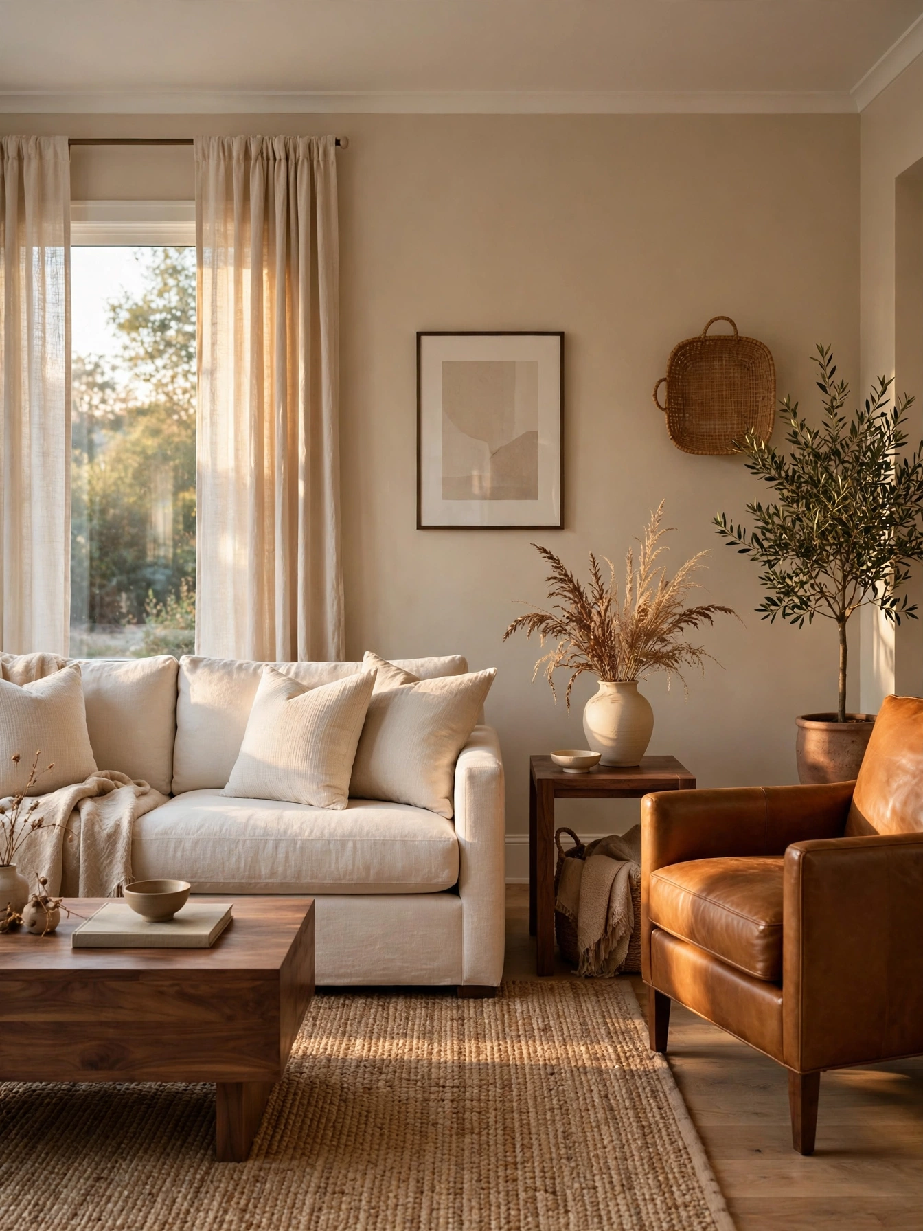
Why This Works:
- Greige (gray plus beige) flatters both warm and cool furnishings
- An LRV of 55 to 65 keeps rooms bright without the glare of pure white
- Warm undertones hide scuffs and dust better than cool grays
- It is the most forgiving backdrop for art of any color
Choose a greige with a visible warm undertone (look for names with “warm” or “khaki” in the description) at LRV 55 to 65. Paint two coats of eggshell over a tinted primer; a 15×18 ft room needs 3 to 4 gallons at $45 to $70 per gallon for quality paint. Keep trim 2 shades lighter in the same warm family to avoid the classic warm-wall/cool-trim clash. Avoid greiges with a purple undertone in north-facing rooms, where cool light pulls the purple forward. Standard coverage: one gallon covers 350 to 400 square feet per coat.
One paint color across the whole main floor is where greige earns its keep, since it flows room to room. If your furniture is all cool gray, pick a cooler greige instead of fighting it. Budget: DIY $150 to $280; a pro charges $800 to $1,800 for the room. One drawback is personality: greige is a backdrop, not a statement, so add color through art and textiles.
Pro Tip: Roll a 4×4 ft test patch and judge it beside your largest rug; the rug is the color you must please, not the paint chip.
Navy Focal Wall
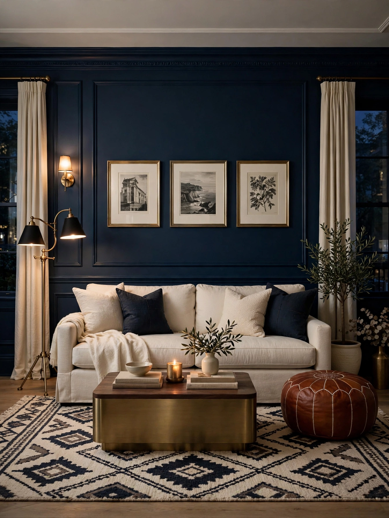
Why This Works:
- One dark wall adds depth without the cave effect of four dark walls
- Navy (LRV 8 to 15) makes brass, cream and wood glow by contrast
- A focal wall costs one gallon of paint, about $60, for maximum drama
- Dark blue reads as neutral in practice, pairing with almost everything
Pick the wall with the fireplace or the sofa wall as the focal point; never the wall with the most windows, which wastes the effect. Use a saturated navy with LRV between 8 and 15, in eggshell or matte finish to avoid sheen hotspots. Paint the trim on that wall the same navy for a wrapped, intentional look, a trick designers call color drenching. Avoid navy in rooms under 120 square feet with low ceilings; the compression feels tight rather than cozy. Coverage note: dark colors need a tinted gray primer and 2 to 3 finish coats.
Drama on a budget starts here, and renters with one paintable wall can play too. Pair with warm metals (brass, not chrome) to keep the navy from feeling cold. Budget: $60 to $120 DIY for one wall. The compromise is reversibility: repainting dark walls back to light takes 3 coats plus primer, so commit for at least 2 years.
Pro Tip: Hang art with wide white mats on the navy wall; the white border pops like a gallery and breaks up the dark field.
Sage Green Upholstery

Why This Works:
- Sage sits between gray and green, so it behaves like a neutral with life
- Muted greens lower perceived stress; color psychology studies consistently link green to calm
- It pairs with cream, brass, walnut and terracotta without a single clash
- A colored sofa in a muted tone dates far slower than one in a bright tone
Choose a sage with gray undertones (not yellow) in a performance velvet or linen with a Martindale rub count above 30,000. An 84 to 96 inch sofa in sage anchors a 14×16 ft room; seat depth 22 to 24 inches. Pair walls in warm white (LRV 75+) so the sage reads as the room’s color moment. Avoid bright kelly or emerald if longevity matters; muted sage has a 15-year track record in interiors, brights cycle every 3 to 5 years. Standard upholstery care: vacuum weekly with an upholstery attachment, professional clean every 18 to 24 months.
Nature lovers bored of beige but scared of bold color will feel at home with sage. Pet owners should pick a patterned or textured sage that hides hair. Price: $900 to $1,800 mid-range; $2,500+ custom. The catch is commitment: sage commits the room’s palette, so future rug and art choices must harmonize with green.
Pro Tip: Order 3 fabric swatches in different sage tones and live with them on the sofa spot for a week; undertones reveal themselves slowly.
White Ceiling Contrast
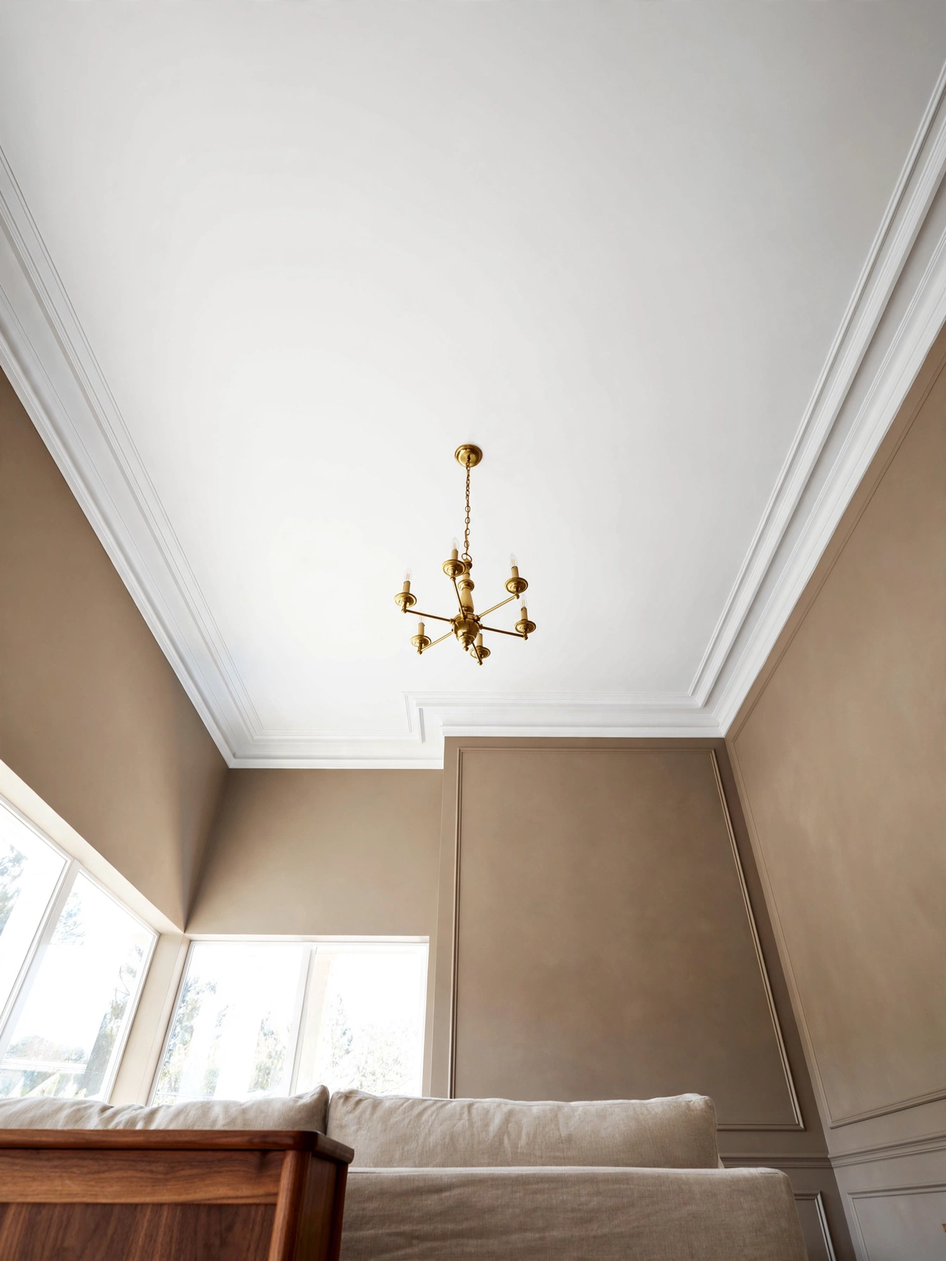
Why This Works:
- A ceiling 2 to 3 shades lighter than walls lifts the perceived height
- Flat white ceilings bounce light downward, brightening the whole room
- The contrast edge makes crown molding and wall color look intentional
- No ceiling treatment costs less: one gallon, one afternoon
Use a true ceiling white (LRV 88 to 92) in flat finish; flat hides roller marks and drywall flaws that eggshell would spotlight. For 8-foot ceilings in a 15×15 ft room, one gallon covers it in two coats. Cut the line crisply at the wall-ceiling joint with painter’s tape, or paint the ceiling 6 inches down the wall in rooms with uneven joints. Avoid stark blue-white in warm rooms; a slightly warm white (like a soft chalk) keeps the contrast from feeling clinical. Standard practice: paint ceilings before walls to avoid splatter on finished wall paint.
Nearly every living room benefits, and low 8-foot ceilings need the visual lift most. In rooms with 10-foot+ ceilings, consider painting the ceiling a soft tint of the wall color to feel cozier. Budget: $40 to $70 DIY. The only real trade-off is neck strain for a day; use a roller with an extension pole and take breaks.
Pro Tip: In rooms with ceiling fans, paint the fan blades the ceiling white too; dark blades chop up the contrast you just created.
Living Room Color Ideas

Why This Works:
- Analogous schemes (neighbors on the color wheel) feel calm and are nearly foolproof
- Complementary pairs (opposites) add energy when used at 80-20 ratios
- Understanding the wheel turns color shopping from guessing to choosing
- One scheme carried through pillows, art and rug reads as designed, not random
Start with analogous: pick 3 neighbors on the wheel, such as blue, blue-green and green, and assign them to walls, sofa and accents. For contrast lovers, use complementary pairs at 80-20: 80% warm beige room with 20% navy accents, never 50-50. Test the scheme by gathering 5 to 7 fabric and paint swatches on one board; if one swatch fights, remove it before buying anything. Avoid triadic schemes (3 evenly spaced colors) unless you are experienced; they need careful muting to avoid a circus feel. Color theory references, including the classic Itten wheel taught in design schools, back this approach.
Building a palette from scratch, or unifying hand-me-down furniture, is exactly what this scheme handles. If your room already has a fixed element (brick fireplace, patterned rug), pull 3 colors from it and build the scheme outward. Cost: $0 for the theory, since it guides purchases you were making anyway. The downside is discipline: the wheel only helps if you edit out the swatch that does not belong.
Pro Tip: Take a photo of your swatch board and apply a black-and-white filter; if the values (light to dark) vary nicely, the scheme has depth.
Terracotta Clay Accents
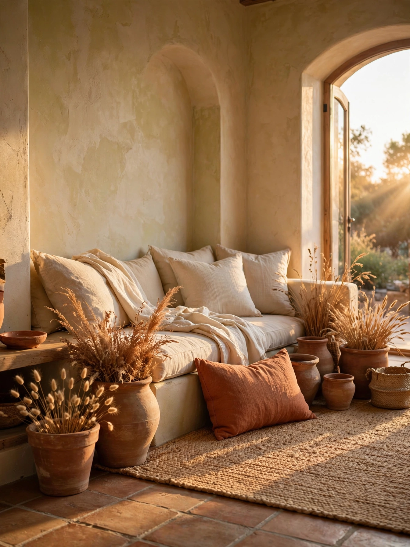
Why This Works:
- Terracotta’s orange-brown sits opposite blue on the wheel, so it energizes calm rooms
- As an accent (not a wall), it adds warmth with zero repaint risk
- Clay tones flatter wood floors and leather, the two warmest common materials
- It reads artisanal and hand-made, softening mass-produced furniture
Limit terracotta to the 10% accent role: two 12×20 inch lumbar pillows, one 10 to 14 inch planter, and one throw. Choose muted, dusty terracotta (not bright orange); the dusty version has a 10-year shelf life in interiors, the bright one dates in 2. Pair with cream walls and natural textures so the clay reads earthy, not loud. Avoid terracotta overload: more than 4 to 5 pieces tips the room into theme territory. Standard styling: odd numbers and varied heights keep accent groups natural.
Flat neutral rooms wake up with this, and it asks zero commitment from the nervous. It is the easiest seasonal accent to swap: terracotta in fall, sage in spring. Budget: $60 to $150 total for pillows and pots. One drawback is low light: in dark north rooms terracotta can read muddy, so keep pieces small there.
Pro Tip: Mix one matte and one glazed terracotta finish; the sheen contrast makes a $12 pot look like studio pottery.
Black Painted Doors
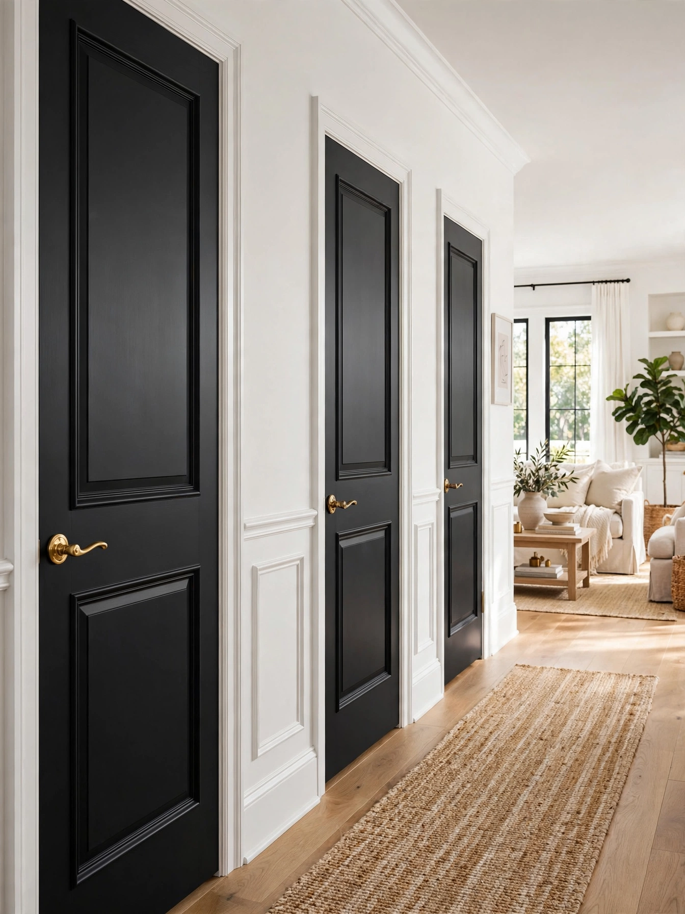
Why This Works:
- Black doors act as punctuation marks, giving white rooms rhythm and structure
- Matte black (LRV under 10) recedes visually, so doors feel slimmer, not heavier
- One quart of paint ($20) transforms every door in the room
- Black pairs with every wall color, so future repaints never clash
Use a scuff-resistant matte or satin enamel in true black or soft black (LRV 5 to 8); one quart covers 2 to 3 standard doors with two coats. Remove hardware and sand with 220-grit between coats for a furniture-smooth finish. Paint both sides and all 6 edges to prevent moisture warping and the amateur look of half-painted edges. Avoid high-gloss black on old doors; gloss magnifies every dent and brush mark. Standard prep: clean with TSP substitute, prime with bonding primer, then 2 topcoats.
Washed-out white and light-gray rooms gain instant structure; rentals qualify where the landlord allows paint (get it in writing). In very dark rooms, black doors can disappear into shadow; use deep charcoal instead. Budget: $20 to $40 per door DIY. What you give up is a dust-forgiving finish: black shows dust, so a monthly wipe-down joins your routine.
Pro Tip: Paint the door frame the wall color and only the door slab black; the floating black rectangle looks far more custom.
Blush Pink Pillows
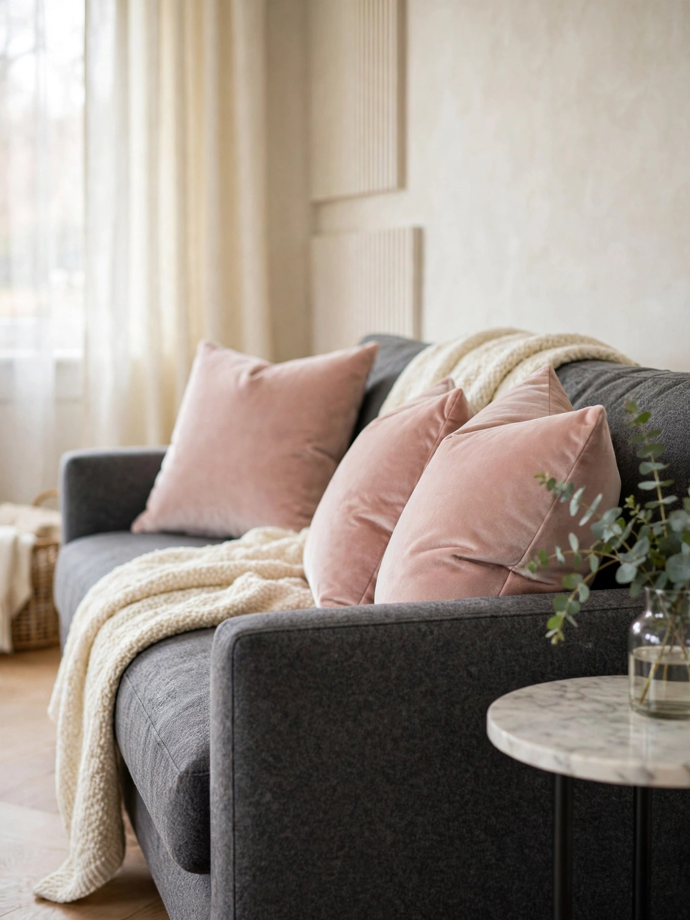
Why This Works:
- Blush is pink with the saturation removed, so it reads as a warm neutral
- Against charcoal or navy, it adds softness without sweetness
- Pillows are the lowest-risk color test: $25 each, swappable in minutes
- Dusty pink has cycled through interiors for a decade without dating
Choose 18×18 or 20×20 inch covers in a dusty blush (think dried rose, not bubblegum) with a hidden zipper. Use the 2-2-1 pillow formula on a standard sofa: two 20-inch, two 18-inch, one 12×20 lumbar in the accent color. Pair blush with charcoal, navy or warm gray; avoid pairing it with beige, which turns the combination muddy. Standard fill: feather-blend inserts 2 inches larger than the cover for a plump, high-end look. When to hire a professional: an upholsterer is only needed if you want custom welted covers; ready-made covers need no help.
Pink without commitment is the whole pitch here, and cold gray sofas warm up fast. Households with light-shedding pets should choose a textured blush that hides hair. Budget: $20 to $40 per quality cover. The catch is that blush plays support, not lead: it needs a stronger partner like charcoal to avoid a washed-out room.
Pro Tip: Karate-chop the pillow tops (a firm press down the center); the dented crown is what makes pillows look styled, not stuffed.
Living Room Color Ideas With Matched Undertones
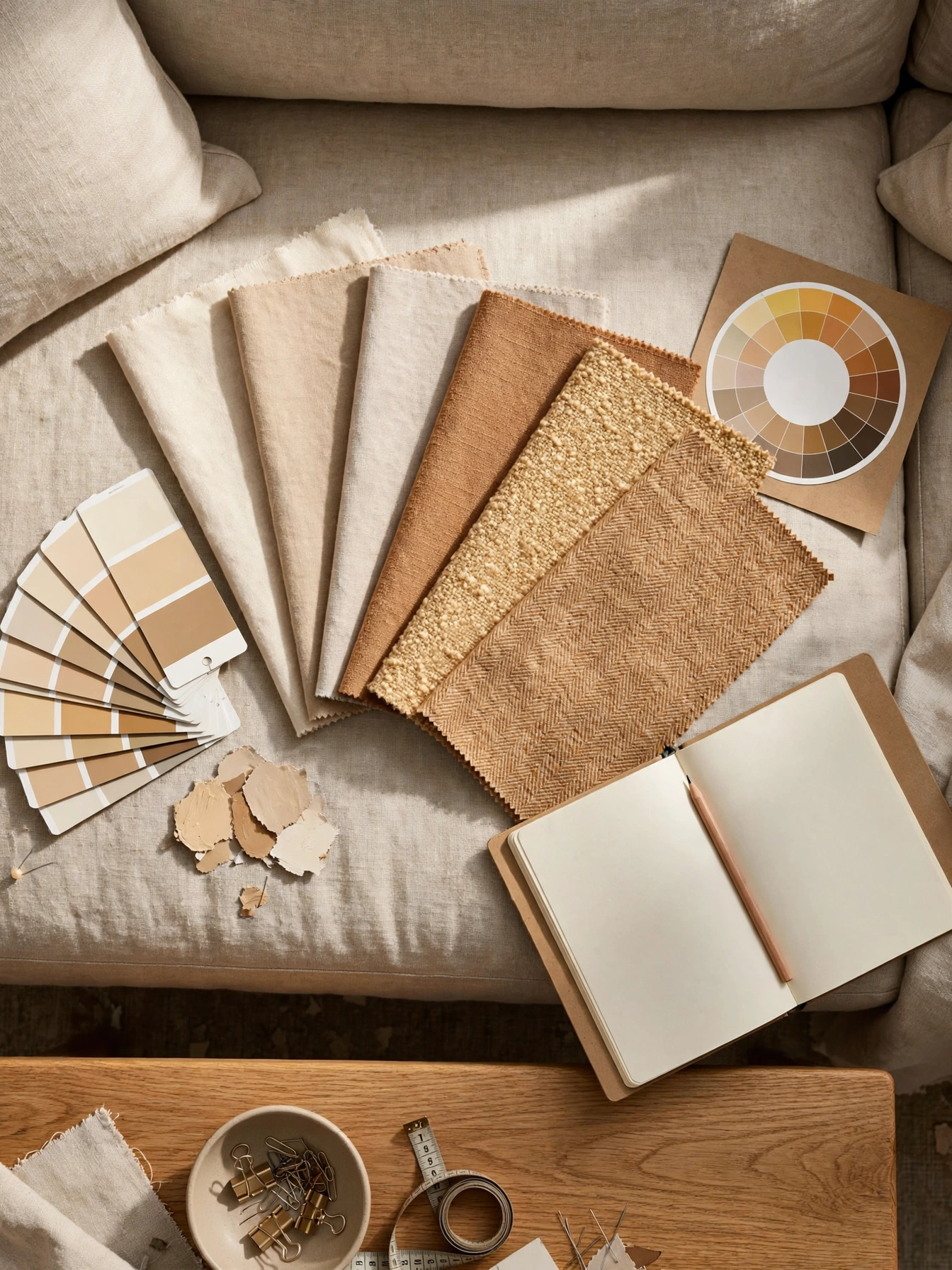
Why This Works:
- Matching undertones (all warm or all cool) is the single rule behind “pulled together” rooms
- Undertone clashes cause 90% of “something feels off” color problems
- The rule is testable in 5 minutes with swatches side by side
- Once learned, it prevents every future mismatched purchase
Gather every fabric, rug and paint swatch for the room and lay them together in daylight; warm undertones (yellow, red, orange bases) group instantly apart from cool ones (blue, green, violet bases). Pick one temperature family for the big surfaces and allow the other only in tiny accents under 5% of the room. Check whites especially: compare your trim white against a pure white card, and the undertone reveals itself. Avoid the common trap of “greige” products that secretly lean lavender; hold them next to true gray to expose it. Design references from HGTV to The Spruce repeat this rule because it fixes more rooms than any other single tip.
A room that feels “off” despite nice furniture is the classic case; undertone clash is usually the culprit. It costs nothing and takes 20 minutes. Watch out for half-measures: very eclectic rooms intentionally mix temperatures, which works only when done boldly and consistently, not accidentally.
Pro Tip: View the swatches through a black-and-white filter too; matching values (lightness) matter as much as matching temperature.
Emerald Velvet Chairs
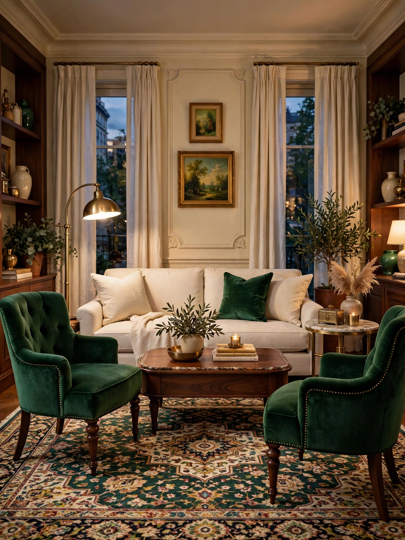
Why This Works:
- Jewel tones in small doses (chairs, not walls) give luxury without risk
- Emerald pairs with brass and cream in the classic high-contrast formula
- Velvet’s sheen makes deep colors glow instead of sitting flat
- Two matching chairs create symmetry, the easiest formal composition
Choose chairs 28 to 32 inches wide with a performance velvet (100,000+ double rubs) in a deep emerald with blue undertones. Place them 5 to 7 feet apart facing the sofa, angled 10 to 15 degrees inward for conversation. Keep walls neutral (warm white, LRV 75+) so the chairs stay the color story. Avoid emerald walls plus emerald chairs; doubling a saturated color shrinks rooms visually. Standard sizing: chair seat height 17 to 19 inches matches most sofas for a level sightline.
One bold move is all a formal living room needs, and emerald chairs deliver it. In small rooms under 150 square feet, one chair instead of two keeps the scale right. Price: $400 to $900 each mid-range; $1,200+ designer. The flip side is upkeep: velvet shows pressure marks; brush weekly with a soft clothes brush to keep the nap even.
Pro Tip: Add one small emerald object (a book, a vase) on the opposite side of the room; the echo makes the chairs look intentional, not random.
Cream Monochrome Layers

Why This Works:
- Monochrome cream is the calmest palette possible; nothing competes
- It makes small rooms feel larger by erasing visual boundaries
- Layering 4+ shades of cream creates depth without a single other color
- Every future colorful purchase will pop against it, nothing clashes
Work within 4 to 5 cream shades from warm white (LRV 85) to deep oatmeal (LRV 60), assigning the lightest to walls and the deepest to the rug. Vary textures aggressively: smooth linen, nubby boucle, shaggy sheepskin, woven jute, since texture is the only contrast in a monochrome room. Keep wood tones light (white oak, maple) to stay in the airy register. Avoid yellow-cream walls with pink-cream fabrics; even in monochrome, undertones must match. Standard approach: lay all fabrics together in daylight before buying, exactly like the undertone test.
Minimalists, small rooms, and anyone craving visual quiet get the most from cream. Families with young kids should choose washable slipcovers in mid-tone oatmeal, not white. Budget: a full cream refresh runs $800 to $2,000. The honest limitation: monochrome shows every stain, so it demands the washable-fabric discipline.
Pro Tip: Add one black or dark wood object (a frame, a tray); the single dark note sharpens the whole cream composition.
Charcoal Fireplace Wall
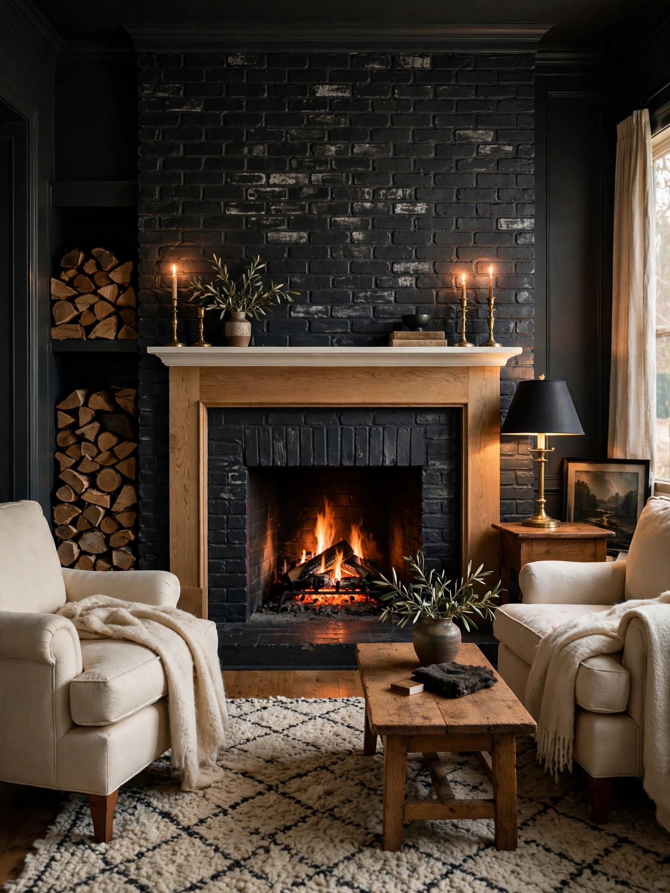
Why This Works:
- Charcoal (LRV 10 to 18) gives fireplace walls the depth of black with more softness
- It hides soot and wear around the firebox that white paint shows in months
- A white mantel on charcoal reads crisp, like a frame around art
- One dark wall anchors the room so lighter furniture floats calmly
Paint the chimney breast in a warm charcoal (brown-black, not blue-black) using heat-resistant paint rated to 200°F within 12 inches of the firebox. Use matte or eggshell finish; flat shows soot, gloss shows flaws. Extend the charcoal 6 to 12 inches beyond the breast onto the wall for a designed, not accidental, edge. Avoid painting actual firebrick inside the firebox; use proper high-heat paint there or leave it. Standard safety: keep the mantel shelf at least 12 inches above the firebox opening per most codes.
Working fireplaces deserve this backdrop, and it brings drama without reaching for navy or green. In rentals, a charcoal peel-and-stick wallpaper gives the effect removably. Budget: $60 to $120 DIY. The compromise is dusting: charcoal collects visible dust on the mantel line, so the shelf needs a weekly wipe.
Pro Tip: Style the mantel with light objects (cream candles, pale art); dark-on-dark decor disappears against charcoal.
Living Room Color Ideas for Open-Plan Flow
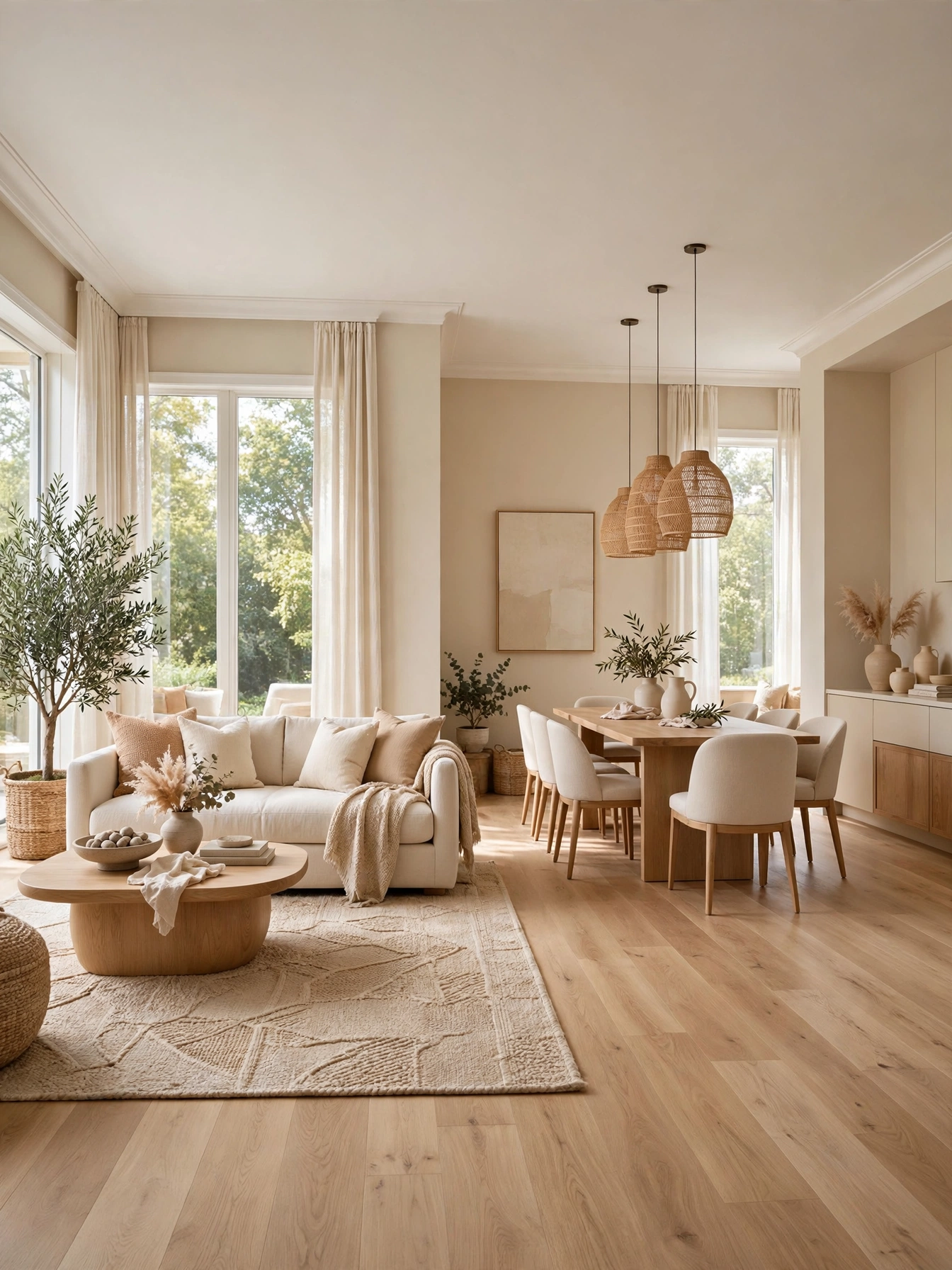
Why This Works:
- One wall color through connected spaces makes homes feel 15 to 20% larger
- Color flow eliminates the choppy “every room a different color” effect
- Rugs and furniture, not paint, define zones in open plans
- Future repaints cost one color, not four
Choose one neutral (warm greige or soft white, LRV 60 to 75) for all connected walls, then vary the 30% and 10% layers per zone: rust accents in the living area, sage in the dining nook. Use area rugs 8×10 ft or larger to anchor each zone visually without walls. Keep sightlines in mind: stand in the living room and confirm every visible wall shares the palette. Avoid abrupt color changes at cased openings; if you must shift, change at an inside corner, never mid-wall. Design guidance from Houzz consistently recommends whole-home palettes of 3 to 5 related colors maximum.
Open-plan homes and small houses, where rooms bleed together, are the natural fit. If you love distinct room colors, use them only in closed rooms with doors. Cost: same as painting normally, since it is a planning choice. The downside is limited variety: satisfy the craving for change with swappable textiles per zone.
Pro Tip: Carry one metal finish (brass) and one wood tone through every zone; repeated materials do as much flowing as repeated color.
Powder Blue Ceiling
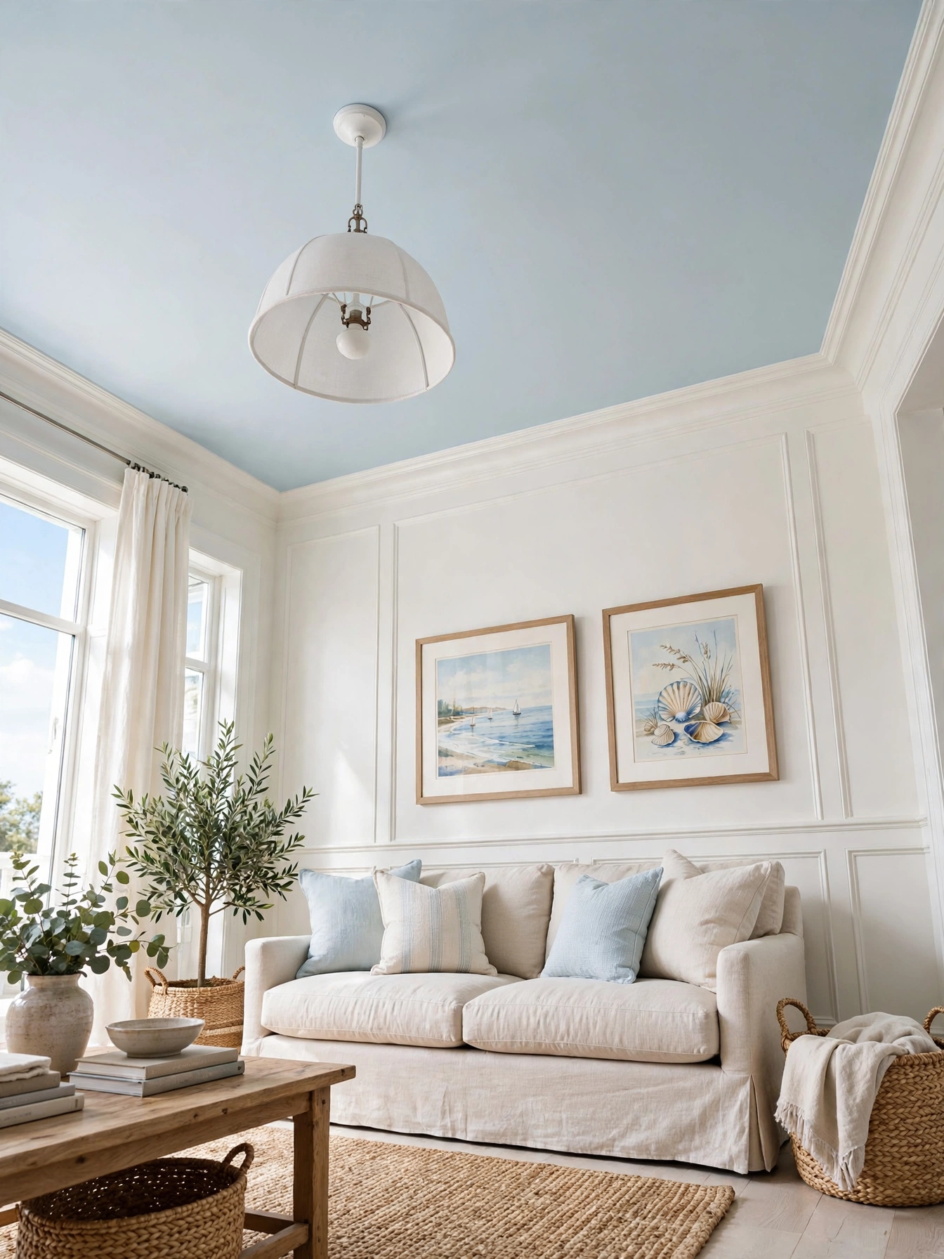
Why This Works:
- A pale blue ceiling (LRV 70+) reads as sky, lifting the room’s mood
- The Southern porch-ceiling tradition works indoors just as well
- It adds color without touching a single wall
- Blue overhead makes warm woods and brass below glow richer
Pick a powder blue at LRV 70 to 78, light enough to reflect light downward; deeper blues darken rooms. Paint in flat finish, two coats, and extend the color 2 to 3 inches down the wall as a border for a deliberate look. Pair with warm white walls (LRV 80+) so the ceiling reads as the accent. Avoid blue ceilings in rooms with blue-gray walls; the combination turns the whole room cold. Standard coverage: one gallon covers a 14×15 ft ceiling twice.
Traditional and coastal rooms wear this best, and it delivers color with zero wall commitment. In low 8-foot ceilings, keep the blue very pale or the sky effect becomes a lid. Budget: $40 to $70 DIY. The price you pay is permanence: repainting a ceiling is the most annoying paint job in the house, so be sure before you commit.
Pro Tip: Test the blue on a 4×4 ft ceiling patch and lie on the floor to view it; ceilings read 2 shades darker than the chip.
Rust Orange Art
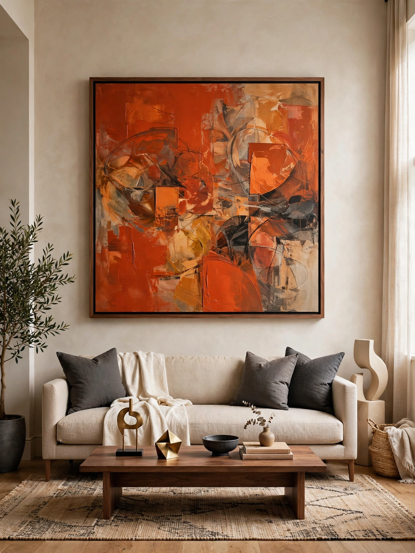
Why This Works:
- One large art piece delivers more color impact than a dozen small objects
- Rust orange flatters beige and gray rooms equally, a rare double duty
- Art is committable color: it moves rooms and homes with you
- A 36×48 inch piece anchors a sofa wall like architecture
Size art at 2/3 to 3/4 the sofa width: a 36×48 inch canvas suits an 84-inch sofa. Hang the center at 57 to 60 inches from the floor, or 6 to 8 inches above the sofa back. Choose rust, burnt sienna or paprika tones; avoid neon orange, which fights every neutral. Echo the color once more in the room (a pillow, a book spine) so the art feels connected. Standard framing: a 2-inch mat and thin black or natural wood frame keep bold art grounded.
Renters and commitment-phobes, take note: art is color without paint. Budget: $100 to $400 for quality prints; originals $500+. Watch out for busy neighbors: one strong piece demands a calm room around it; busy patterns nearby will fight it.
Pro Tip: Buy the art first, then pull your pillow and rug colors from it; building outward from art is easier than matching art to a finished room.
Chocolate Brown Leather
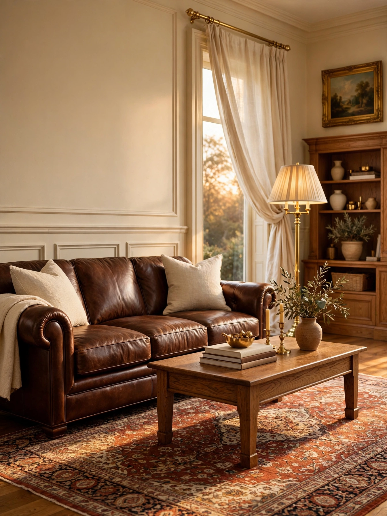
Why This Works:
- Brown is a warm neutral that grounds colorful art and rugs
- Dark leather hides wear, pet hair and kid marks better than any fabric
- Chocolate pairs with cream, brass, green and rust in one palette
- A leather sofa is a 15 to 20 year purchase, the definition of color commitment that pays
Buy full-grain aniline or semi-aniline leather 1.0 to 1.2 mm thick; avoid bonded leather, which peels in 3 to 5 years. An 84 to 96 inch sofa suits a 15×17 ft room; keep walls light (LRV 65+) so the dark sofa does not cave the space. Condition every 6 months and keep 3+ feet from radiators. Avoid chocolate leather with gray walls; the cool-warm clash muddies both. Industry standard: quality leather carries a 5-year frame warranty and 1-year leather warranty minimum.
Families and pet owners who want one indestructible anchor piece should start here. In small rooms under 150 square feet, choose a chocolate leather chair instead of a full sofa. Price: $1,800 to $3,500 quality; $700 to $1,200 bonded (not recommended). One sacrifice is summer cool: dark leather shows dust and absorbs summer heat; a throw solves the second.
Pro Tip: Soften a new leather sofa’s look with a cream throw and two light pillows; the contrast keeps brown from feeling heavy.
Crisp White Trim
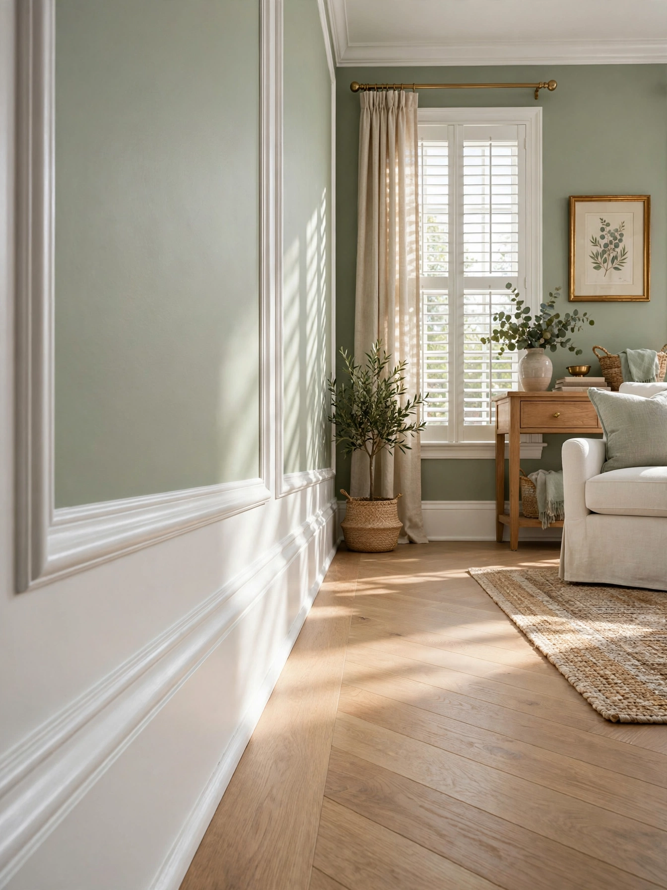
Why This Works:
- White trim frames colored walls like matting frames art
- Semi-gloss trim reflects light, brightening the room’s edges
- Crisp trim makes even budget paint look professional
- One trim color through the house creates the flow buyers notice
Use a dedicated trim white (LRV 88 to 93) in semi-gloss enamel, 2 coats over primer; one gallon covers about 400 linear feet of standard trim. Caulk every joint and fill nail holes with spackle before painting; trim flaws show at 10 feet. Keep the trim white consistent house-wide, even when wall colors change room to room. Avoid flat paint on trim; it scuffs within months and cannot be wiped. Standard sizes: 3.25-inch baseboards and 2.5-inch casing suit 8 to 9 foot ceilings.
Colored walls that need a clean edge benefit most, though honestly every living room qualifies. Older homes with stained wood trim can paint it, but test one room first; the change is hard to reverse. Budget: $80 to $150 DIY per room. The flip side is prep time: 70% of trim painting is taping, caulking and sanding.
Pro Tip: Paint trim before walls and use a 2-inch angled sash brush; the angled bristles cut the crispest line at the wall joint.
Olive Green Drapes
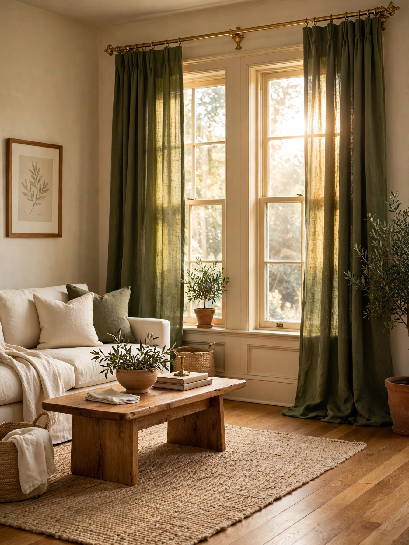
Why This Works:
- Olive is green with warmth, so it suits both warm and cool rooms
- Colored drapes frame windows like art, a bigger impact than colored walls
- Floor-length panels in color draw the eye up, adding perceived height
- Drapes are swappable color: one afternoon changes the room’s mood
Set rods 4 to 6 inches over the frame and 8 to 12 inches beyond it per side; panels should total 2 to 2.5 times the window width. Choose a muted olive (not army bright) in medium-weight linen, 5.5 to 7 oz per square yard. Hem to kiss the floor or puddle 1 to 2 inches. Avoid olive drapes with green walls; one green surface per room is the rule. Standard hardware: 1 to 1.25 inch brass or black rods suit olive’s earthy tone.
Cream and beige rooms needing one color move are the target, and renters who can hang rods qualify. In dark rooms, olive can read muddy; choose a lighter sage instead. Budget: $80 to $200 per pair ready-made; $350+ custom. What you give up is crisp formality: linen wrinkles, which suits the relaxed look but not formal rooms.
Pro Tip: Steam drapes while hanging; gravity plus steam removes wrinkles in 20 minutes with no ironing board.
Dusty Rose Rug
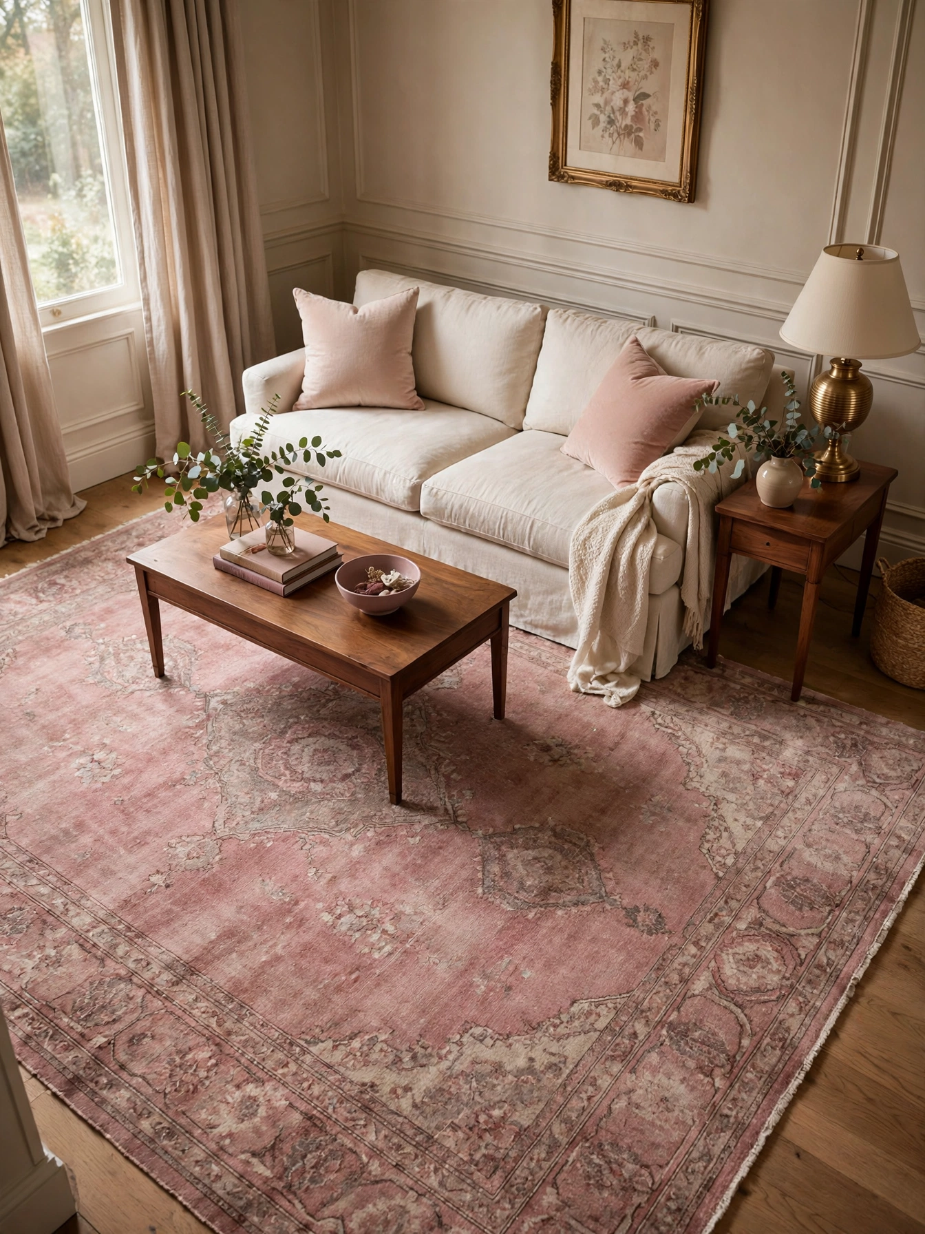
Why This Works:
- A rug in dusty rose warms the floor without repainting a single wall
- The 8×10 ft size grounds a full seating group in one color move
- Muted rose hides traffic wear better than cream or white rugs
- Vintage-style patterns in rose pair with both modern and traditional furniture
Size it 8×10 ft for a standard sofa plus two chairs, with front legs of all seats on the rug. Choose low-pile wool or wool-blend (0.4 to 0.5 inch) for easy chair movement and vacuuming. Look for dusty, muted rose with gray undertones; bright pink rugs date fast. Pair with cream walls and one deeper accent (charcoal pillows) so the rose reads sophisticated. Standard practice: a 1/4 inch felt pad underneath prevents slipping and adds 3 to 5 years of rug life.
Warmth underfoot without a paintbrush is the promise, which renters especially appreciate. Pet owners should choose patterned over solid rose to hide hair. Budget: $300 to $800 for 8×10 wool-blend; vintage $500 to $1,200. One caveat is palette lock-in: rose commits the palette’s warm direction, so future cool-gray purchases will clash.
Pro Tip: Rotate the rug 180 degrees every 6 months; sun-facing halves fade noticeably within a year if left static.
Warm Wood Tones
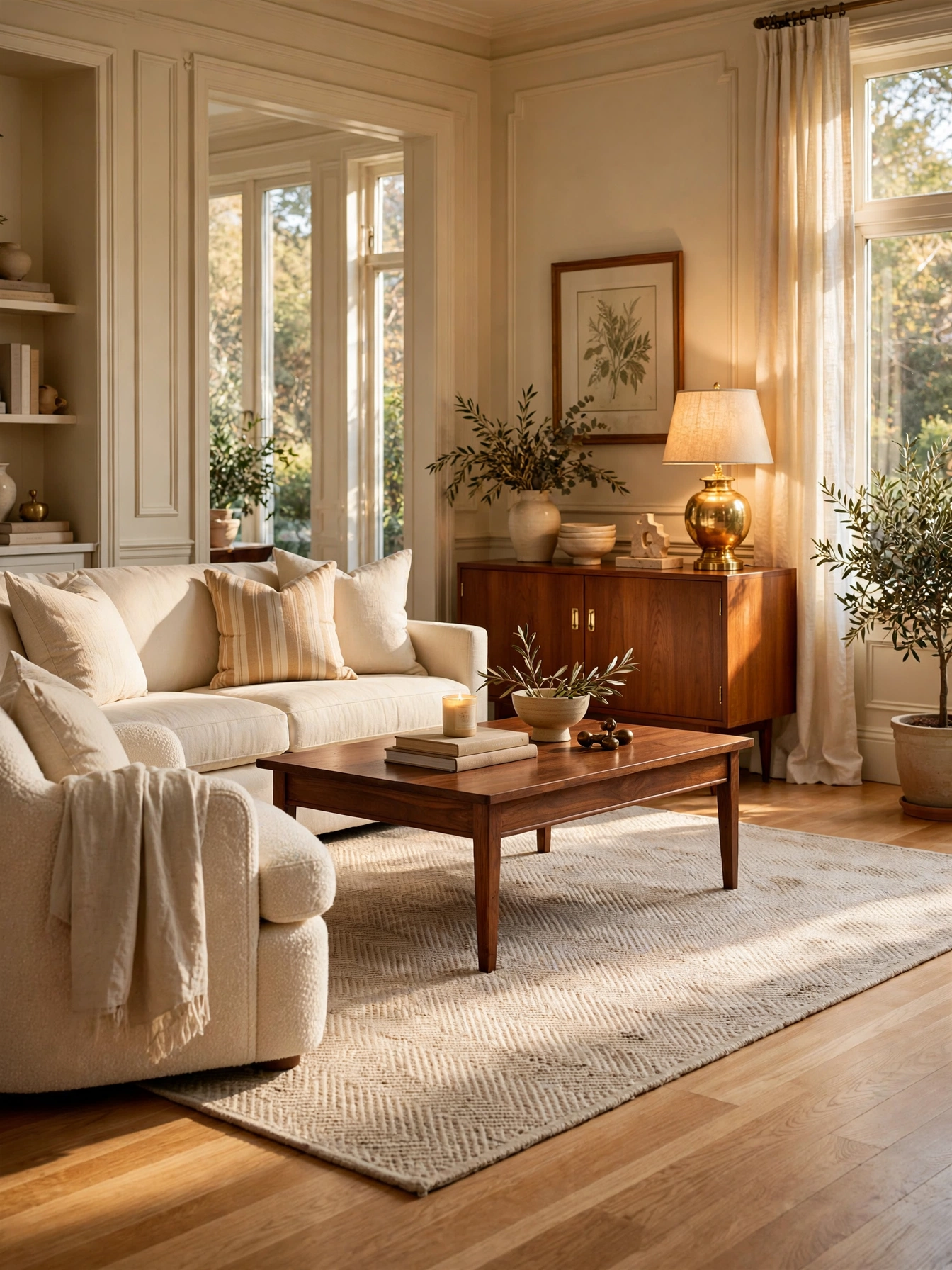
Why This Works:
- Wood is a color too: warm tones add hue without a single painted surface
- Mixing 2 to 3 wood tones (not one, not five) looks collected and rich
- Warm woods balance cool wall colors like nothing else
- Wood tones never need repainting, the ultimate low-maintenance color
Repeat each wood tone at least twice in the room: walnut table plus walnut frames, oak floors plus oak stool. Keep tones within one warmth family; mixing orange pine with gray-washed oak creates the classic clash. Standard guidance: 2 to 3 distinct wood tones maximum, with one dominant (usually the floor). Avoid matching every wood exactly; perfect matches look like a furniture set, varied tones look designed. Finish consistency matters more than species: all matte or all satin reads calmer than mixed sheens.
Cold-feeling cool-gray rooms are the prime candidates, along with anyone who prefers natural color over paint. Small rooms should keep the dominant wood light (white oak) to avoid heaviness. Cost: $0 if you work with existing pieces, just rearrange. One caveat is lighting: very dark woods in dark rooms need strong lighting to avoid a cave feel.
Pro Tip: Photograph your woods together in daylight; the camera exposes undertone clashes your eye has learned to ignore.
FAQs
What are the easiest living room color ideas for beginners?
Start with the 60-30-10 rule: 60% one wall color, 30% upholstery, 10% accents. Test 3 sample boards for 3 days before buying gallons. Match undertones (all warm or all cool) across every swatch. These three steps prevent 90% of color mistakes and cost under $40 in samples.
How do I choose a living room paint color that will not date?
Pick warm neutrals with LRV between 55 and 70: greige, warm white or soft taupe. These shades have 20+ year track records in interiors. Add personality through swappable textiles, not wall color. A $200 pillow and throw refresh updates the room yearly without repainting.
Which living room color ideas make a small room look bigger?
Paint walls and trim one light color (LRV 70+) to erase boundaries, and carry it into the hallway. Use a 5×8 ft light rug and one mirror 30+ inches wide opposite a window. The Spruce notes unbroken light color is the fastest enlarger for rooms under 150 square feet.
Should the living room ceiling be white or colored?
White (LRV 88+) suits 8-foot ceilings and dark rooms, bouncing light downward. A pale tinted ceiling (powder blue, soft peach at LRV 70+) works in rooms with 9-foot+ ceilings and good daylight. Houzz design guides note tinted ceilings add character only when the room has the height to carry them.
How many colors should a living room have?
Three to five total: one dominant, one secondary, one to three accents. Count wood tones and metals as colors. Fewer than three feels flat; more than five feels chaotic unless you are an experienced maximalist. Photograph the room and count distinct hues to audit yourself honestly.
Conclusion
These clever living room color ideas share one principle: color works when it is planned, not guessed. Your three biggest takeaways: test paint on big boards for 3 days, match undertones across every surface, and use the 60-30-10 rule to keep proportions balanced. Your first action is simple: order 3 sample pots this week and tape the boards up tonight. Follow HomelyCrafter on Pinterest for more ideas. Save this to your Pinterest boards so you can refer back to it!

Muhammad Israr is a home decor enthusiast and the writer behind Homely Crafter. He spends his days researching paint colors, layouts and budget-friendly styling ideas, then breaks them down into practical, easy-to-follow guides so you can decorate with confidence.