
Repainting a full cabinet run costs thousands of dollars, so the color pair has to be right the first time. Kitchen color combinations ideas matter because two colors that work together beat repainting later, and a wrong pair shows up every morning at the coffee maker. The National Kitchen and Bath Association notes that kitchens are planned around fixed clearances and work zones, which means color choices sit on top of measurements that cannot move.
The 22 pairings below name real paint colors, finishes, hardware sizes and the measurements that keep each pair balanced, with honest notes on upkeep and the rooms where each pair struggles. Every idea gives the cabinet style, the finish worth asking for, and the small detail that stops two colors from fighting each other.
Navy White Pairing
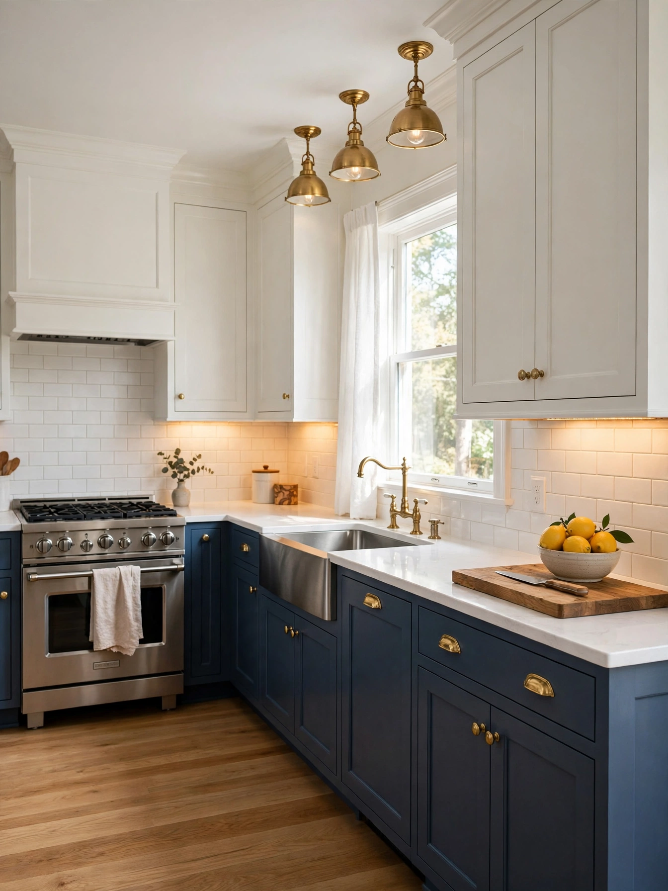
Why This Works:
- Navy lowers ground the room and white uppers keep the light
- Satin paint wipes clean with a damp cloth
- Warm brass pulls heat up the cool navy tone
- Dark lowers hide everyday scuffs
Start with navy on the lower cabinets, in a tone such as Benjamin Moore Hale Navy or Sherwin-Williams Naval, over maple doors 3/4 inch thick. Keep upper cabinets white or cream so the room keeps its brightness, and set uppers 18 inches above the 36 inch countertop, which is the National Kitchen and Bath Association guideline for clearance. A satin or semi-gloss finish rated for kitchen use holds up best here, since flat paint absorbs grease and marks within weeks, and a bonding primer layer underneath gives it the grip it needs. A satin finish hides small flaws under kitchen lighting, so use satin on the full navy run.
Daily cooking leaves few visible marks on navy lowers, and the contrast reads calm with a white quartz countertop 3 centimeters thick. Quartz resists stains and wipes clean after cooking. Natural marble carries a one-off veined pattern. Budget paint by the gallon: a full base-cabinet repaint takes about 2 gallons plus primer, at roughly 350 square feet of coverage per gallon. Test the navy on a 2 foot by 2 foot board and view it at morning and evening light before committing, since navy that looks rich at noon can read almost black by evening.
Sage Cream Duo
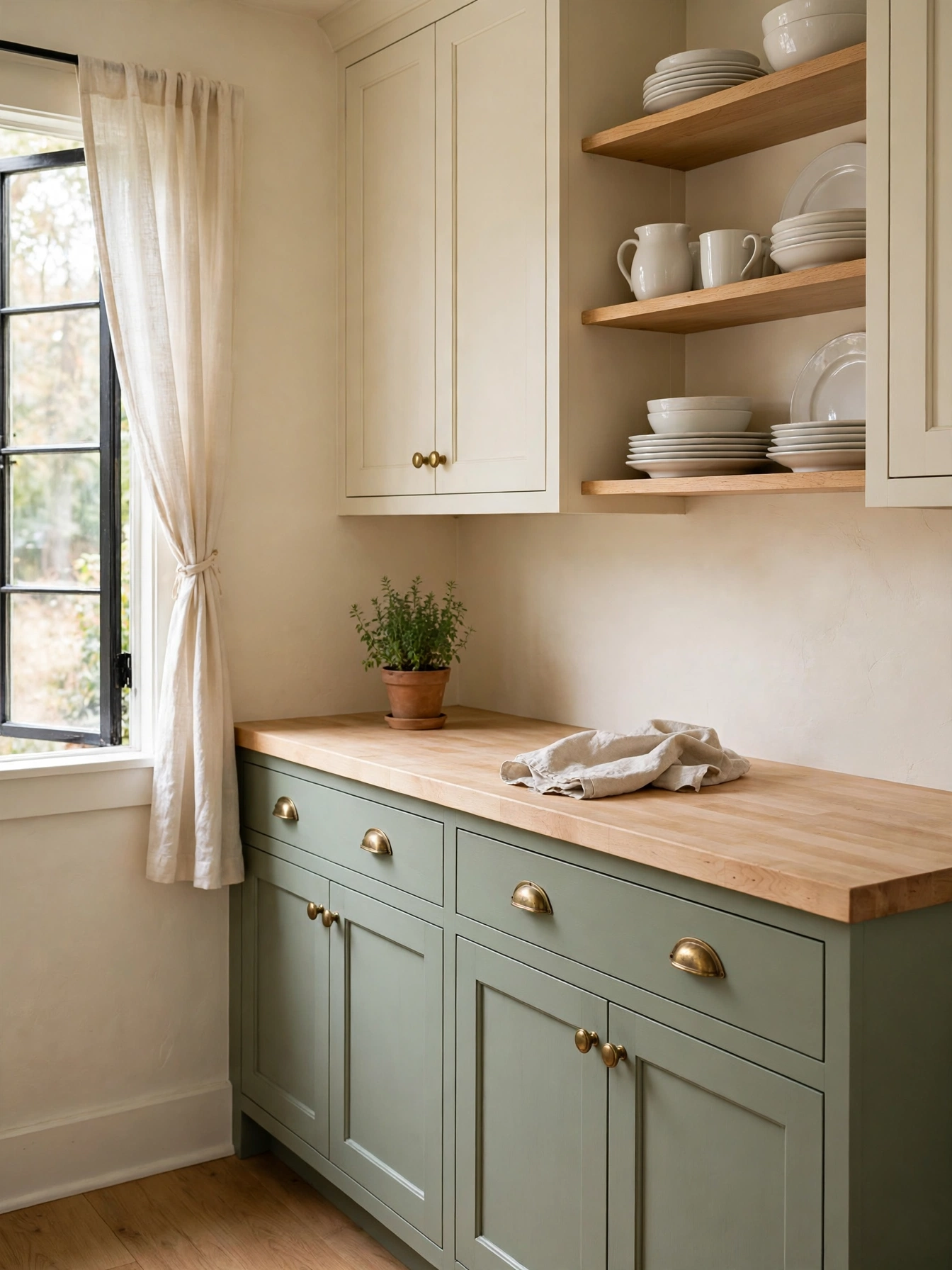
Why This Works:
- Pale sage lifts a small kitchen without glare
- Cream uppers keep the ceiling line soft and bright
- Light green works with pale oak and cream
- Soft color hides dust well between wipes
A muted sage such as Benjamin Moore Saybrook Sage calms the lower cabinets in a satin acrylic enamel, especially in a room with one small window. Keep the upper cabinets cream, so the contrast stays gentle, and set uppers 12 inches deep with an 18 inch gap above the 36 inch counter. The backsplash should be white subway tile 3 by 6 inches across an 18 inch band, which gives the pale green a clear edge. A dark forest green on uppers starves a one-window room of light, since the color absorbs what little daylight arrives and the cabinets look gray by evening.
Fit 2700K strips under the cream uppers, and the warm light flatters the pale green below. A butcher block counter adds warmth beside the sage, and a 15 minute oil rub every 3 months keeps the board from drying out. Slim bar pulls 5 inches long keep the hardware in scale with the doors, and brushed nickel belongs with the cool green. Choose a pale oak floor to keep the light this small room needs.
Charcoal Timber Contrast
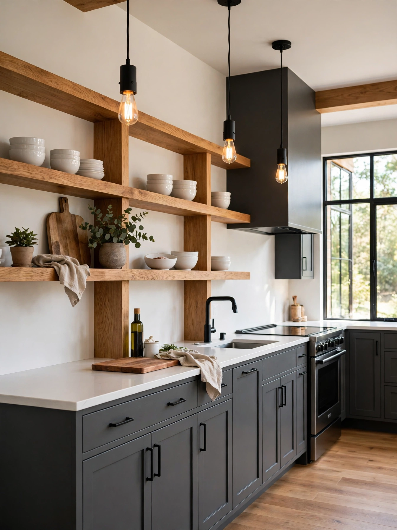
Why This Works:
- Charcoal lowers add depth without turning the room black
- Natural oak shelves warm the cool gray below
- White counters calm the dark and wood pairing
- Black pendants give the warm pairing a clear edge
Charcoal lowers anchor a kitchen when the wood stays natural and pale, so the timber reads as fresh against the gray. Use a charcoal such as Sherwin-Williams Iron Ore on maple doors in a satin finish, with 2 coats over primer, and pair it with white oak shelves 12 inches deep and 1.5 inches thick. Set the white quartz countertop at 36 inches high, and leave 42 to 48 inches of walkway on the island side, the clearance the National Kitchen and Bath Association gives for a working kitchen. Avoid a dark walnut stain with charcoal, because the heavy wood and cool gray fight each other and the room feels muddy.
Oak shelves warm the charcoal from above, so the gray reads grounded. White oak shelves take a clear matte oil coat that stops the pale wood yellowing under kitchen light. Oil the wood island top once every 3 months so the board keeps its warm color, and wipe the counter after cooking so crumbs never sit overnight. Black bar pulls 5 inches long sit on the drawers, and the plain white tile backsplash gives the charcoal lowers a clean pale edge.
Navy Island Warm White Pairing
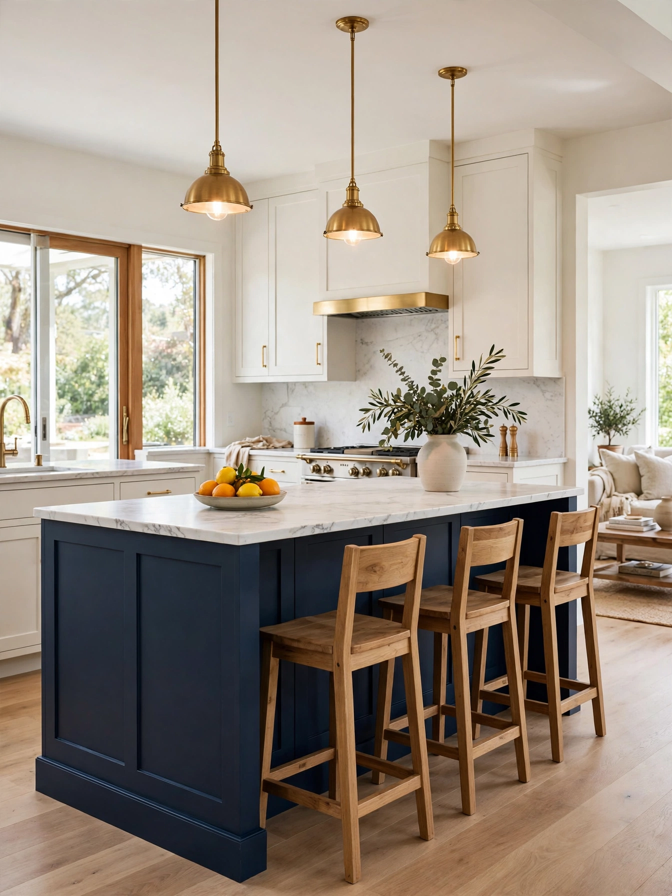
Why This Works:
- A navy island adds color without touching the walls
- Warm white perimeter cabinets lift the whole room
- A 12 inch overhang lets stools tuck under the counter
- Brass pendants warm the island from above
Two colors carry a kitchen best when one of them stays small, and a navy island with warm white perimeter cabinets is the clearest version of that rule. An island 72 to 96 inches long gives three or four stools room to sit. Keep it 36 inches wide, with a 12 to 15 inch overhang and 24 inches of width for each stool. Keep 42 to 48 inches of walkway on every side, which is the National Kitchen and Bath Association clearance, and hang pendant lights 30 to 36 inches above the countertop, spaced 24 to 30 inches apart. An island under 60 inches long needs a quiet color, since a small painted surface reads as a stray accent.
Painting only the island changes the room in a weekend, and a satin finish on maple doors keeps the color smooth. Mornings gather at the island for breakfast and talk. The perimeter walls hold the real cooking. A stone waterfall edge adds drama, so a simple eased edge keeps the island looking calm. A durable satin finish on the island base stands up to daily kicks, and the warm white perimeter cabinets sit 18 inches above the 36 inch counter.
Terracotta Cream Warmth
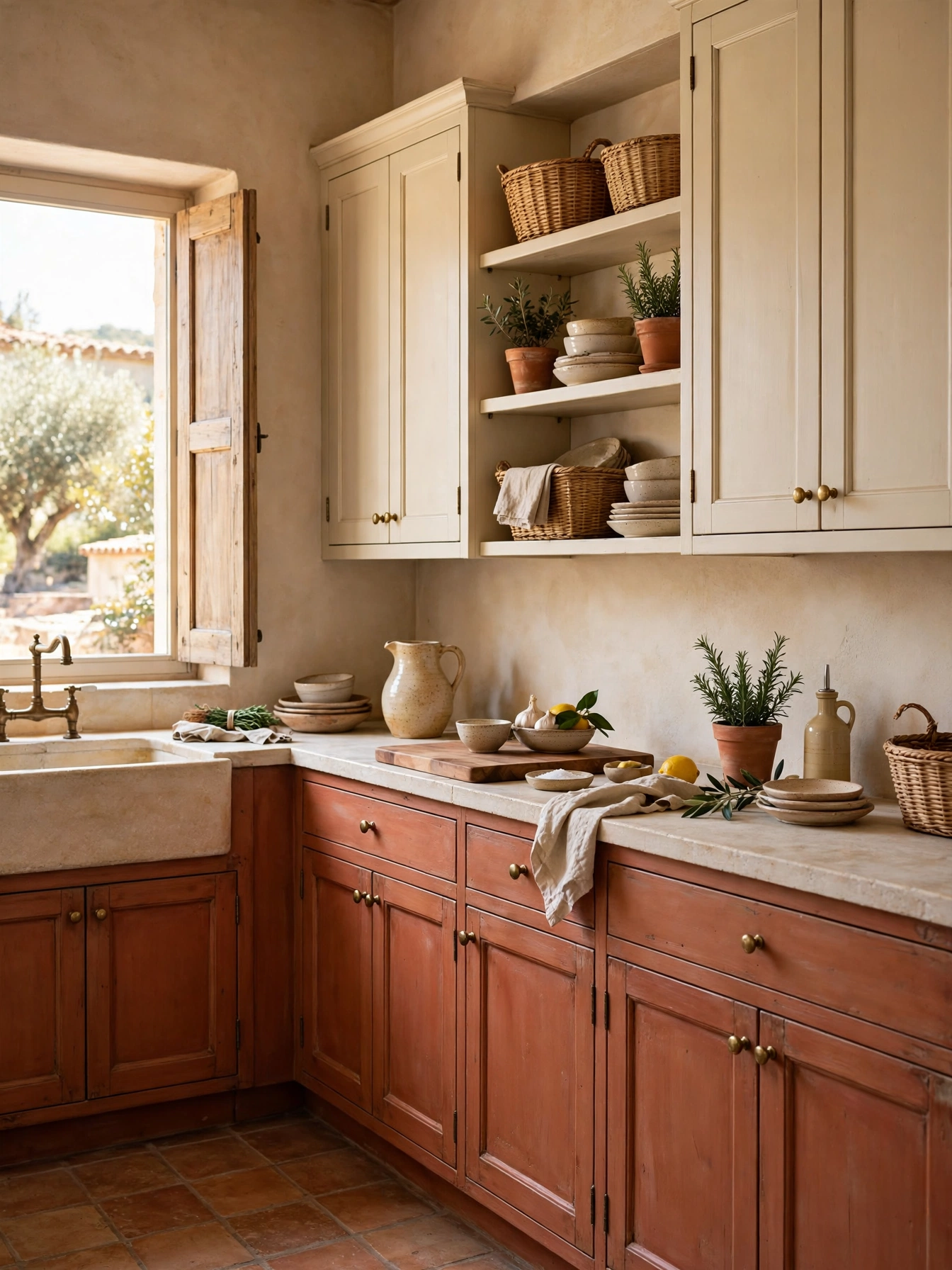
Why This Works:
- Terracotta warms the room like late afternoon sun
- Cream uppers stop the earthy tone feeling heavy
- Pale stone counters cool the warm cabinets
- Woven texture adds a natural layer to the shelves
A clay-soft terracotta on the lowers warms the kitchen with an earthy glow, and the muted tone keeps it calm. Paint lowers in a muted terracotta satin finish on maple doors, with a primer coat underneath, and keep uppers cream with an 18 inch gap above the 36 inch counter. Choose a pale stone countertop 3 centimeters thick, and keep the backsplash simple cream tile 3 by 6 inches across the 18 inch band. A busy patterned tile fights terracotta, so keep the tile plain and let the warm clay carry the pattern.
For a terracotta lower run, plan on 2 gallons plus primer, since one gallon of good cabinet paint covers around 350 square feet. Plan on resealing limestone once a year, a Saturday-morning job with a foam brush and a rag. Aged brass hardware echoes the warm clay, and a pale stone counter keeps the terracotta from feeling heavy. Aged brass hardware needs only a soft cloth wipe to keep its tone.
Forest Brass Elegance
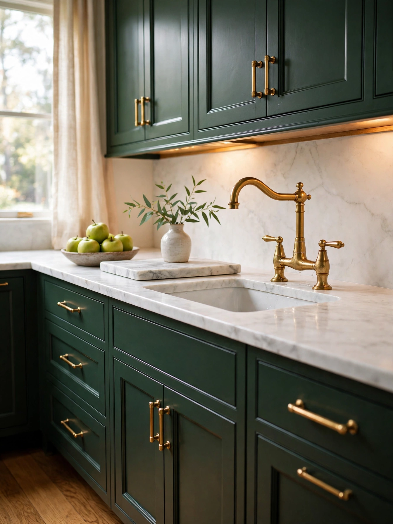
Why This Works:
- Deep green reads rich without turning the room dark
- Brass hardware glows against the green paint
- White marble lightens the dark cabinet run
- Gray veining picks up the cabinet tone
Benjamin Moore Essex Green deepens maple doors 3/4 inch thick, and the true green holds its depth in a room with steady daylight. Keep the countertop white marble 3 centimeters thick, with a 4 inch backsplash or a full-height slab behind the range, and fit brass bar pulls 5 inches long on drawers wider than 24 inches. Set uppers 18 inches above the 36 inch counter, and use knobs 1.25 inches in diameter on doors, so the hardware stays in scale. Brass reads best against green with a warm undertone, so test the chip beside a brass pull before ordering.
Lemon juice or vinegar etches marble if it sits more than a few minutes, so plan the sealer before the white marble meets forest green. A quart of cabinet paint runs 45 to 70 dollars, and a medium kitchen needs about 2 gallons plus primer for two coats. A marble remnant suits a small run, and the stone yard often cuts a 3 centimeter slab to size. Wipe spills at once, and keep a trivet near the range for hot pans, since heat and acid mark stone within minutes.
Slate Sky Balance
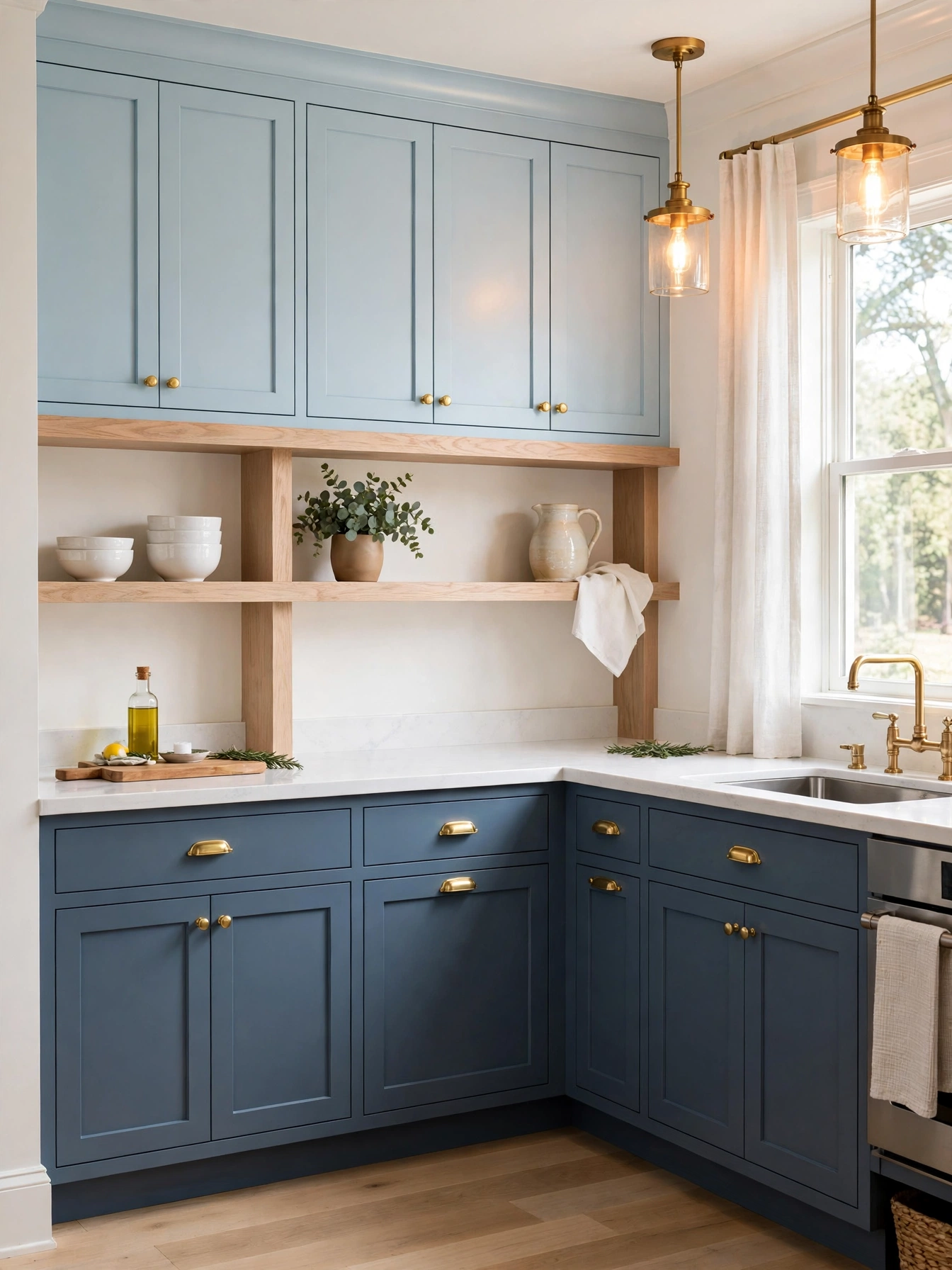
Why This Works:
- A cool two-blue scheme adds depth from one color family
- Slate lowers shrug off kicks and scuffs at floor level
- Pale uppers lift the ceiling line
- One paint brand holds both tones together
On one paint card, slate below and sky blue above should sit at least 3 steps apart for this cool two-blue pairing. Give both tones the same satin sheen, so light moves across the room without a visible break. Set the darker slate island low on the floor, and keep the countertop and backsplash white so the blues set the scheme. Blues only 1 step apart read as a painting mistake, so keep the gap at 3 steps or more.
The split puts the dark tone low, where it grounds the room, and the uppers can change later without touching the base run. A professional spray finish leaves no brush marks on flat slab doors, so the finish method decides the look. Match the pulls and knobs across both blues, using 5 inch bar pulls on drawers and knobs on doors, so the two tones read as one plan. The Spruce notes that light cabinet colors reflect daylight well, which matters when the uppers carry the pale tone.
Blush Walnut Softness
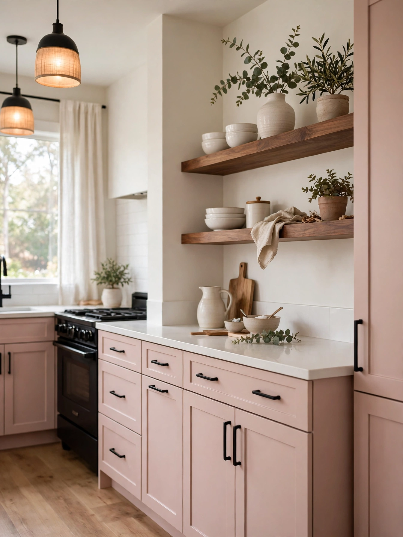
Why This Works:
- Blush pink softens a modern kitchen without sweetness
- Walnut shelves add a rich wood layer above the pale color
- A quartz countertop keeps the pink and wood balanced
- Black hardware outlines the soft pairing
A dusty muted rose keeps the room gentle, and the finish softens the pink further. Pair it with walnut shelves 12 inches deep and 1.5 inches thick, mounted on steel brackets rated for 50 pounds per shelf and fixed into wall studs spaced 16 inches apart. Keep shelves 18 inches above the counter, which matches the usual upper cabinet gap, and use matte black bar pulls 5 inches long on drawers. Keep heavy cast iron in a closed cabinet, because loaded shelves bow under the weight and sag within months.
Walnut shelves add the rich layer the pale pink needs, and the room feels warm around them. Walnut darkens a little with age, and the deepening color suits the blush more each year. Open shelves collect dust every week, and the tidying turns into a chore for anyone who prefers closed storage, so two shelves are the limit here. Plain white tile 3 by 6 inches runs behind the blush lowers, and the pale tile edge gives the pink a clear line against the walnut shelves.
Emerald Marble Drama
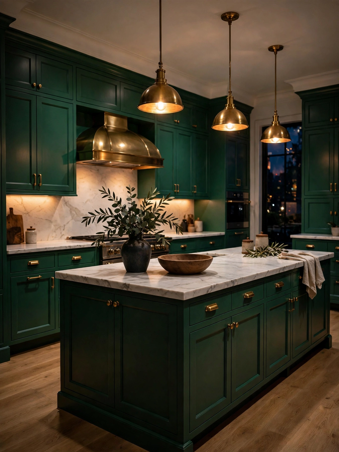
Why This Works:
- Emerald green adds drama without turning the room black
- Warm pendant light stops the dark tone feeling cold
- Pale marble counters add a bright layer to the green
- Brass bar pulls glow against the dark paint
Warm light makes emerald green dramatic, so set pendant lights and under-cabinet strips to 2700K to keep the color soft. Paint maple doors in a satin finish, primed first for grip, using a deep emerald, and pair it with a white marble countertop 3 centimeters thick. A pale oak floor reflects light around the room, and brass pulls warm the dark cabinets. Skip emerald in a kitchen with no window and only one ceiling light, because the cabinets read as black and the room feels small after dark.
Adding new pendant circuits is a job for a licensed electrician, since a new circuit and dimmer need proper wiring and a permit check in many areas. A dark cabinet repaint shows dust within days, so a weekly wipe with a damp cloth matters here. A marble counter takes a 30 minute seal twice a year, so mark the calendar for spring and autumn. Keep the backsplash light, with white or cream tile, to frame the dark cabinets and stop the green closing the room in.
Butter Yellow Freshness
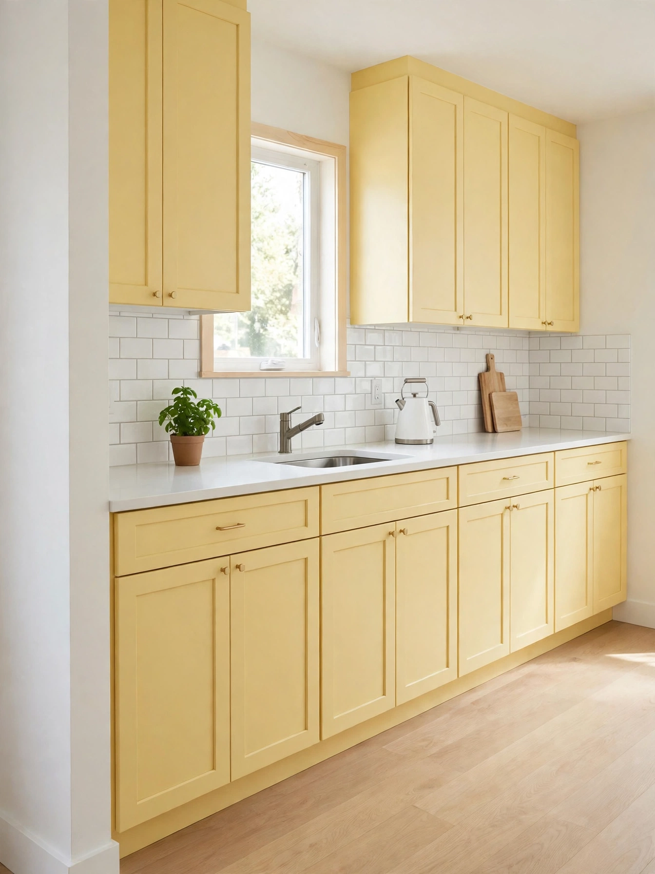
Why This Works:
- Butter yellow opens a small kitchen visually
- White tile keeps the pale color from looking washed out
- Light oak floors add warmth under the yellow cabinets
- Slim hardware keeps the small doors in scale
A soft butter such as Benjamin Moore Hawthorne Yellow, with enough pigment to stay yellow, lifts a small kitchen in a satin finish and keeps the pale walls from looking washed out. Set uppers 12 inches deep and 18 inches above the 36 inch counter, with slim 3 inch bar pulls sized to the small doors. A white subway tile backsplash 3 by 6 inches frames the pale yellow and stops it washing out. Skip a very pale yellow with white counters and white walls together, because the three pale surfaces merge and the cabinets vanish.
Small kitchens gain the most from butter yellow, since the color adds interest without shrinking the room, and the pale tone reflects daylight well. A pale yellow with white counters and good light makes a small kitchen feel larger, a point Better Homes and Gardens makes about pale cabinet colors. A pale oak floor reflects plenty of light into the small room. A repaint of a small kitchen takes about 4 days with drying time, allowing 24 hours between coats.
Pewter Oak Calm
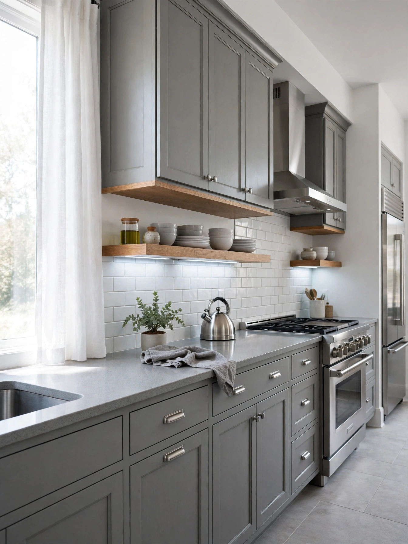
Why This Works:
- Pewter gray bridges blue cabinets and gray counters
- Steel appliances keep the cool gray calm
- Gray tile keeps the palette in one family
- The muted tone hides dust and water spots
A warm gray pewter such as Benjamin Moore Boothbay Gray, without a green cast, steadies a kitchen and lets the steel and stone around it stay calm. Pair it with gray quartz counters and stainless steel appliances, and keep the hardware in brushed nickel, which fits the cool palette. Cabinet doors should measure 3/4 inch thick, with soft-close hinges, so the muted color still feels solid. Check the pewter chip in a north-facing room at 3 PM, since a green undertone turns murky there by afternoon.
The blend works well in a modern kitchen with gray floors and white walls, and the muted tone forgives daily wear. Keep citrus off the marble counter, and wipe the stone after cooking so the gray stays clean. Keep the backsplash gray subway tile 3 by 6 inches, and keep the oak shelves pale so the wood warms the gray without adding a second dark tone. A dimmer on the 2700K to 3000K under-cabinet strips lets evening light drop without changing the gray tone.
Burgundy Cream Richness
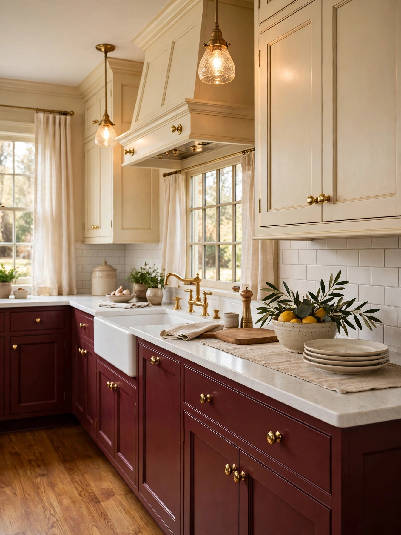
Why This Works:
- Burgundy adds warmth without the brightness of red
- Pale cream above keeps the deep tone from feeling heavy
- Brass knobs repeat the warm tone across the room
- White counters give the rich pair a clean frame
Maple lowers in wine-soft burgundy add depth at once, and the deep red warms the whole room. Keep uppers cream and set them 18 inches above the 36 inch counter, with a white quartz countertop 3 centimeters thick between the two colors. Doors take knobs 1.25 inches across, drawers wider than 24 inches take 5 inch bar pulls, and the faucet matches the same single brass tone. Lay a pale oak floor under burgundy lowers to keep the light in the room.
The deep red suits a kitchen with a table in the room, and the cream uppers keep it from feeling heavy. Satin brass knobs show few touch marks in daily use, and the finish holds its tone without a polish. A full brass hardware set for a medium kitchen asks for a drill template and about 2 hours to fit, and solid brass lasts for years in daily use. The cream tile backsplash runs 18 inches high behind the burgundy lowers, matching the upper cabinets without adding a third color.
Teal Brass Energy
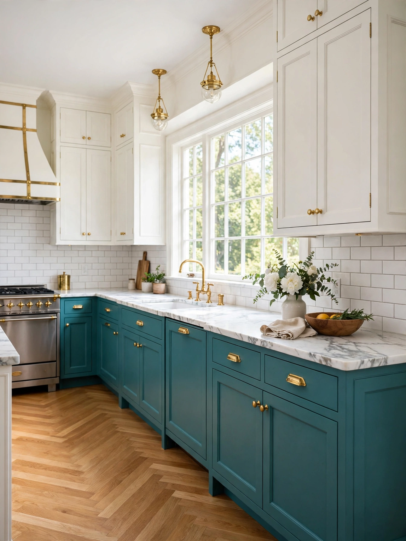
Why This Works:
- Teal adds energy without the loudness of bright blue
- White uppers keep the bold tone from closing the room in
- Brass hardware warms the cool teal
- Pale marble gives the bold pair a bright frame
A deep teal lower run brings energy into the room, and the color holds well into the evening. Keep uppers white and set them 18 inches above the 36 inch counter, with a white marble or quartz countertop 3 centimeters thick. Use the same teal on the island base to anchor the floor, and fit brass bar pulls 5 inches long on drawers. Do not paint a full teal kitchen in a room under 10 feet by 12 feet with one small window, because the color closes the room in and the cabinets look dark after sunset.
Teal hides scuffs well, and the color still looks deliberate years after painting. A full repaint takes about 5 days for a medium kitchen, with doors removed and sprayed off site for the smoothest finish, and spraying leaves a smooth coat on flat doors. Marble etches where lemon juice sits, so wipe the counter after squeezing citrus for a recipe. Keep the backsplash white subway tile 3 by 6 inches, so the teal has a bright frame and the room stays open.
Black Island Warm White Pairing
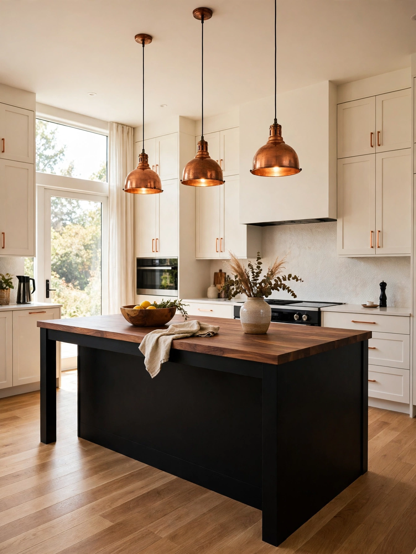
Why This Works:
- A black island adds drama to the middle of the room
- Pale cabinets keep the bold island from feeling cold
- Walnut counters add a rich wood layer to the black
- Copper pendants warm the dark island tone
Keep the bold color to the island and let warm white carry the walls, and the black centerpiece reads deliberate. A 72 to 96 inch island fits three or four stools, and a 36 inch width leaves knees a 12 to 15 inch overhang with 24 inches for each stool. Leave 42 to 48 inches of walkway on every side, the National Kitchen and Bath Association clearance, and hang the copper pendants 30 to 36 inches above the countertop. A bold island shorter than 60 inches reads as a small accent, so keep the length generous.
One weekend of painting turns the island black, with 2 coats of satin paint over primer on maple doors. A walnut island top warms the black below, and the wood grain stops the dark island from feeling flat. A simple eased edge keeps the black island calm. The warm white perimeter cabinets carry the wall run in satin, and a plain white tile backsplash runs behind the walnut island top.
Graphite Copper Edge
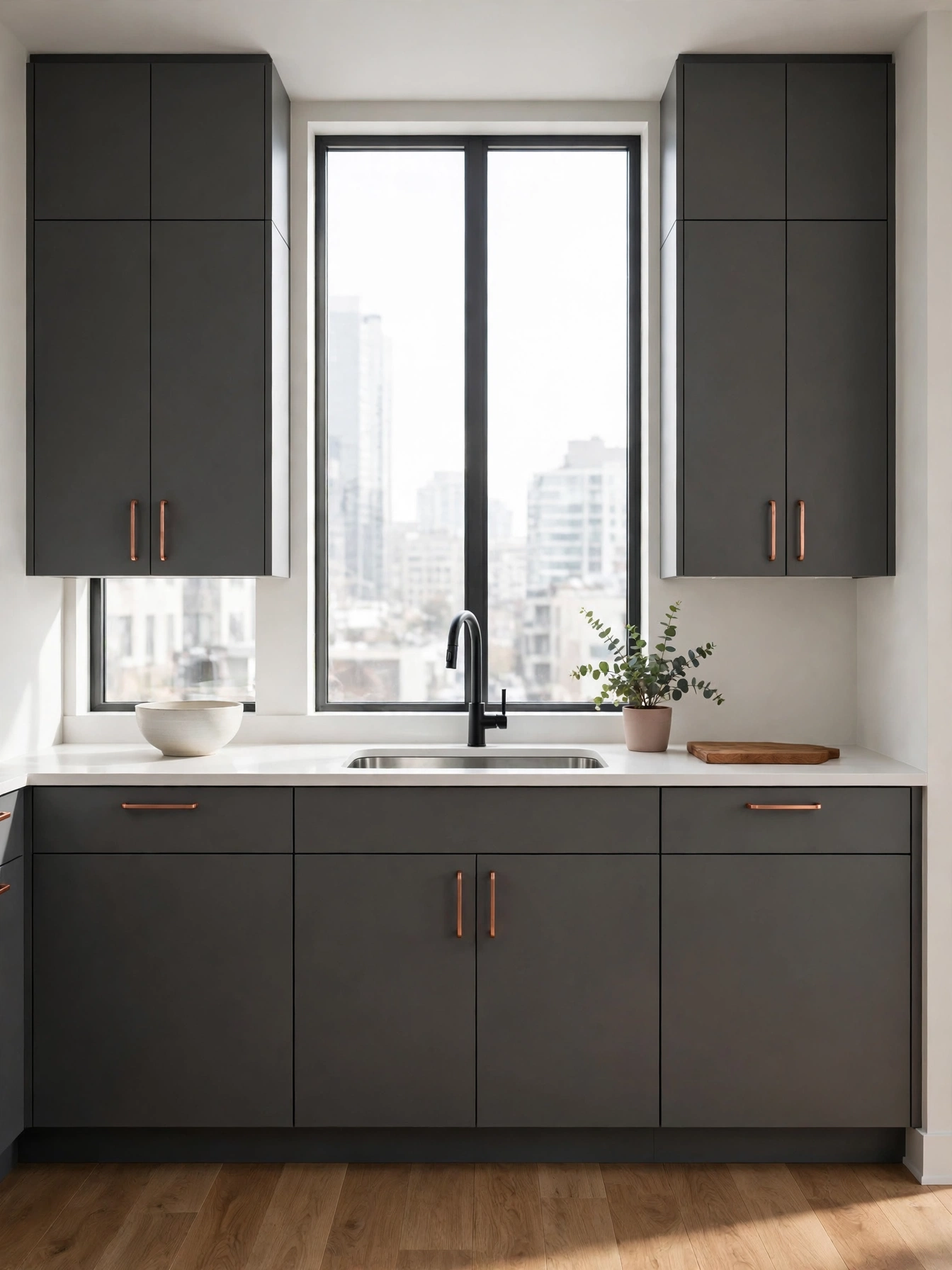
Why This Works:
- Graphite gray sharpens a modern flat door
- Copper handles warm the cool gray face
- A pale quartz top frames the gray without pattern
- Flat panels keep a handleless kitchen clean
On a flat door, every flaw shows, so graphite needs a sprayed paint finish. Spray satin enamel onto MDF slab doors 3/4 inch thick, and fit push-to-open latches rated for 100,000 cycles. Keep the graphite mid-dark gray, so the flat face reads as a deep color in daylight, and fit copper edge pulls so hands never touch the painted face. The countertop should be white quartz 3 centimeters thick, with an eased edge, and the backsplash a single slab of the same quartz. Brush marks show across a whole slab face under kitchen light, so leave the brush out of this job.
The handleless look suits a modern flat with slab doors, and the copper edge pulls add the only warm note. Slab doors suit a modern room, so the door style decides the look. Push latches wear out after years of daily use, and a replacement latch is a small fix that takes 10 minutes to fit. Keep the floor pale oak, which warms the modern gray without adding pattern.
Olive Linen Freshness
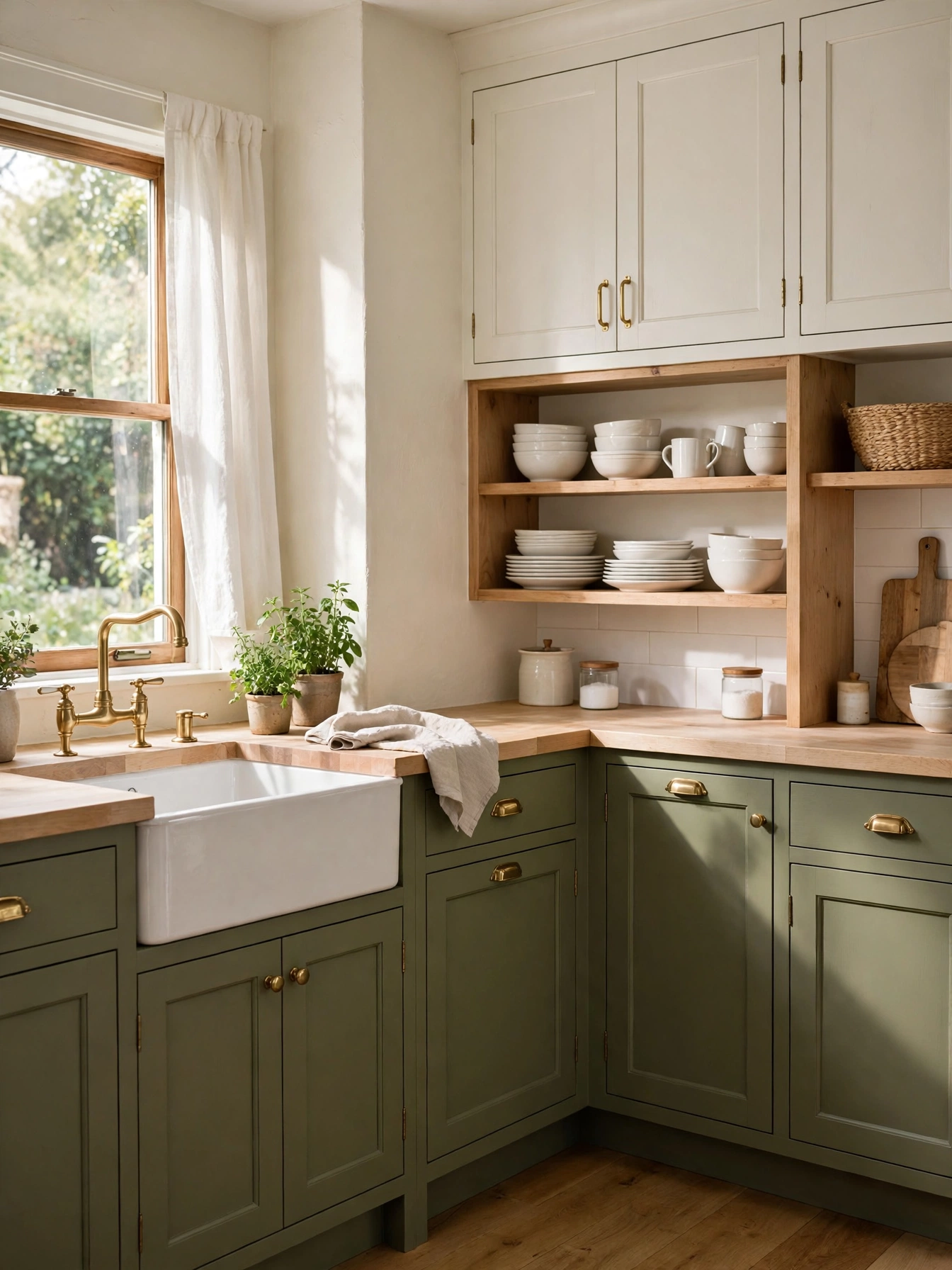
Why This Works:
- Olive green adds an earthy note without darkness
- Linen white uppers brighten the ceiling line
- Light wood counters warm the green below
- Soft green hides dust well in daily use
Olive in a soft yellow-green settles across the lower cabinets, bringing the garden indoors without darkening the room. Keep uppers linen white and set them 18 inches above the 36 inch counter, with a pale wood countertop that warms the green. Use slim bar pulls 5 inches long on drawers and knobs 1.25 inches in diameter on doors, and keep one metal finish across the room. Avoid an olive with a strong brown undertone in a north-facing room, since the color turns muddy by afternoon.
Use a cutting board at the sink run so knives never score the pale wood, and wipe the counter dry after washing up. Keep the olive to the lowers, and the linen uppers carry the light above them. Keep the backsplash simple, with white subway tile 3 by 6 inches across the 18 inch band, so the olive keeps its earthy presence. Houzz notes that green cabinets remain one of the most requested color choices, because the tone flatters many room styles without dating fast.
Coral White Brightness
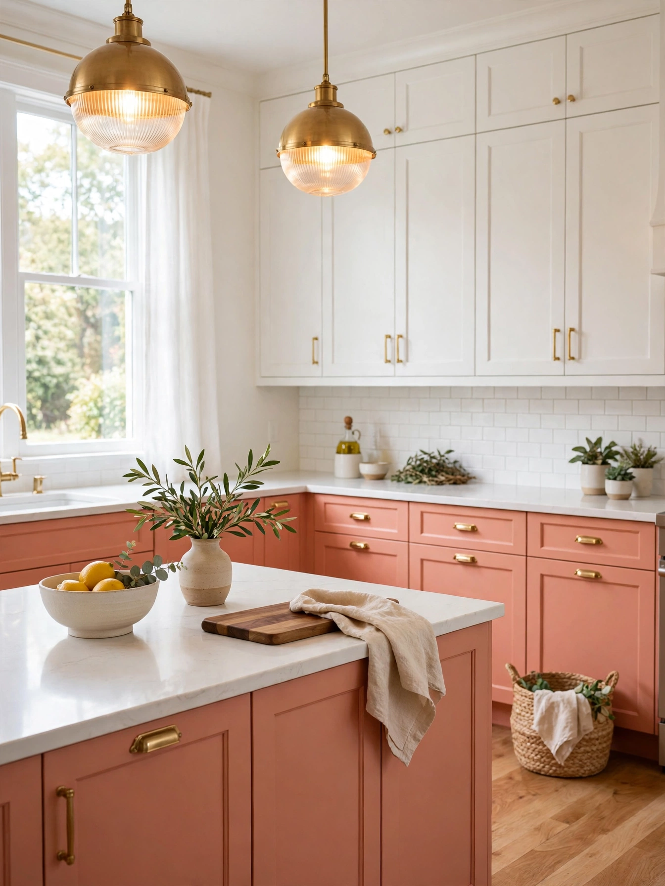
Why This Works:
- Coral wakes up a plain white kitchen
- White uppers stop the warm tone feeling loud
- Brass pulls pick up the warm tones in the coral
- A pale quartz counter gives the bright pair a clean frame
Soft coral wakes the lowers with a warm pulse, and the satin finish keeps the color gentle. Keep uppers white and set them 18 inches above the 36 inch counter, with a white quartz countertop 3 centimeters thick. Fit brass bar pulls 5 inches long on drawers wider than 24 inches, and keep the backsplash plain white tile 3 by 6 inches so the coral carries the bright color. A bright red floor or a patterned counter fights coral, so keep floors and counters quiet.
Two gallons plus primer cover a coral lower run, with each gallon of quality paint going about 350 square feet. A satin finish keeps the coral bright without glare, and the white counter stops the color from feeling loud. Hold the coral to the lowers, and the white uppers keep the bright color from taking over the room. Keep the hardware in aged brass, which warms the coral.
Denim Brass Classic
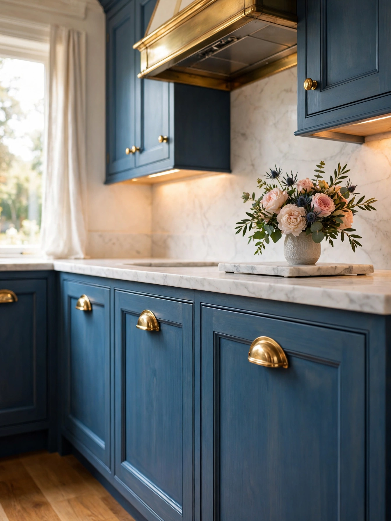
Why This Works:
- Denim blue reads classic without feeling formal
- Cup pulls suit drawers that open dozens of times a day
- Brass on the hood matches the cup pulls
- Medium blue keeps the brass from looking too formal
Mid-blue denim holds a classic look, and a satin sheen keeps the room relaxed. Fit cup pulls on drawers 24 inches wide or more, with the pull centered and 2.5 inches from the top edge, and knobs 1.25 inches in diameter on doors. Doors 3/4 inch thick with soft-close hinges hold up under heavier brass hardware, which would otherwise pull a door out of square. Cup pulls in brass sit well on a mid-blue door, where the warm metal reads classic against the paint.
Swapping hardware changes the feel of blue cabinets fast, and the swap takes about 2 hours with a drill template. Solid brass cup pulls hold up through years of daily pulls, and the warm metal suits the mid-blue doors in daylight and lamplight. A lacquered brass finish keeps its shine through daily hand contact, and the coating stops the metal darkening where hands touch it most. Leave the countertop white, and the blue and brass set the tone.
Plum Gold Depth
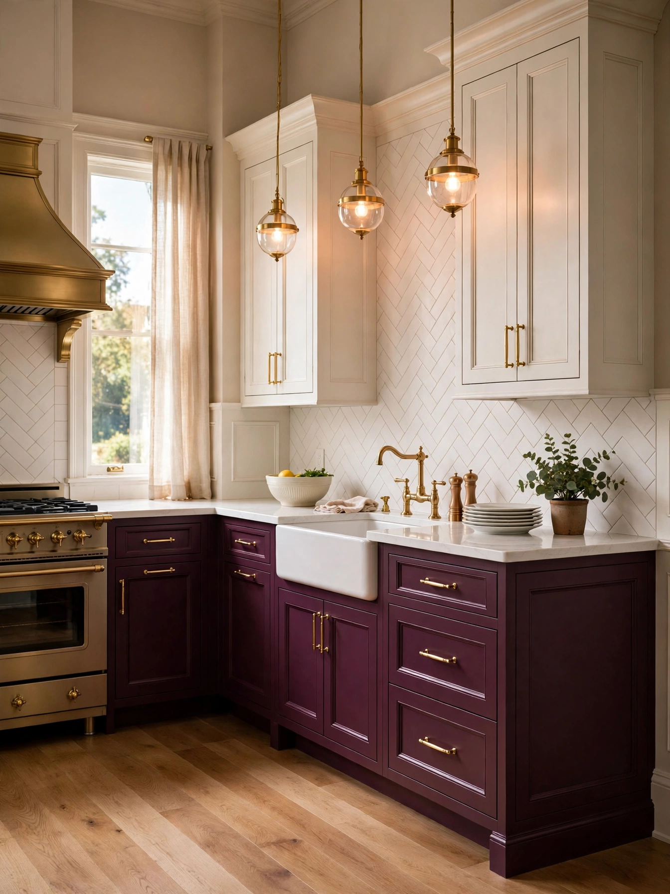
Why This Works:
- Plum adds depth without the darkness of black
- Warm white uppers keep the deep tone from feeling heavy
- Gold hardware glows against the plum paint
- A quartz top gives the rich pair a clean frame
A muted plum in wine-soft tones gives maple lowers a rich depth that reads warm in daylight and dramatic after dark. Keep uppers warm white and set them 18 inches above the 36 inch counter, with a white quartz countertop 3 centimeters thick between the two colors. Fit gold bar pulls 5 inches long on drawers wider than 24 inches, and keep one gold tone across pulls, knobs and faucet so the metals never fight. Keep the floor in pale oak, and the light boards stop the deep purple from closing the room in.
The gold hardware glows against the deep purple, and the warm white uppers keep the room bright. Satin gold hides touch marks and needs no weekly wipe. A marble top needs its seal renewed every 6 months, so put the date on the kitchen calendar when the counter goes in. A cream tile backsplash 3 by 6 inches sits behind the plum lowers, and the tile surface needs only a wipe each morning to stay bright.
Mint Marble Airiness
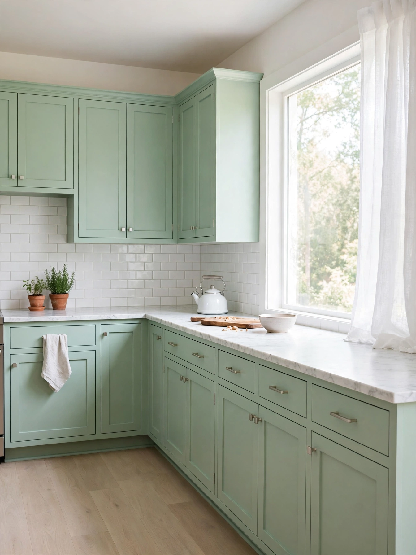
Why This Works:
- Mint green cools a bright kitchen without coldness
- White marble adds natural pattern to the pale color
- White tile keeps the mint from looking washed out
- Pale oak floors add warmth under the cool cabinets
Soft mint with enough pigment to stay green cools a sunny kitchen and keeps it feeling airy. Keep the countertop white marble 3 centimeters thick, with a 4 inch backsplash or a full-height slab behind the range, and set uppers 18 inches above the 36 inch counter. The backsplash should be white subway tile 3 by 6 inches, which gives the pale mint a clear edge. A very pale mint with white counters and white walls together merges into one pale surface, and the cabinets vanish.
A marble counter shows crumbs and coffee rings, so a quick wipe after breakfast keeps the white stone bright. Keep mint on the lowers only, and let the white marble counter carry the pattern above them. A washable satin formula on mint cabinets near the sink cleans with a damp cloth after cooking, and the pale green stays true under kitchen light. Brushed nickel or white hardware suits the pale mint.
Rust Navy Balance
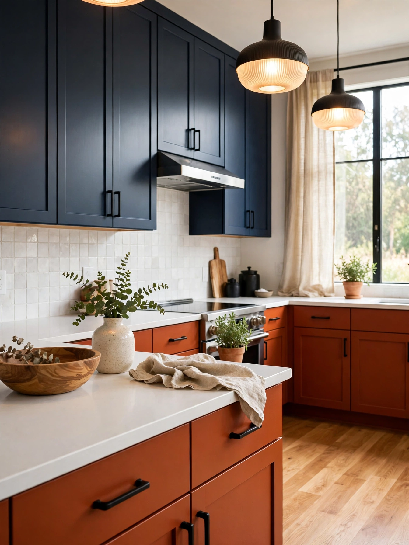
Why This Works:
- Rust orange warms the room like autumn light
- Navy uppers ground the warm tone below
- A white countertop keeps the two bold colors balanced
- Black hardware frames the warm pairing
Rust in a clay-soft tone warms the lower cabinets, giving the room an autumn glow that navy uppers ground. Keep uppers navy and set them 18 inches above the 36 inch counter, with a white quartz countertop 3 centimeters thick between the two colors. Fit matte black bar pulls 5 inches long on drawers wider than 24 inches, and set the plain white tile backsplash 3 by 6 inches behind the rust lowers. A bright red floor fights rust, so let the two colors carry the room on their own.
Paint the rust lowers in satin, and the soft sheen keeps the bold orange from glaring under kitchen lights. A pale oak floor warms the room under the rust and navy, and the white counter keeps both colors in balance. A rust lower run drinks about 2 gallons plus primer, because quality cabinet paint covers close to 350 square feet per gallon. Black hardware frames the rust lowers against the navy uppers, and the dark metal suits the autumn tone of the rust.
Stone Sage Quiet
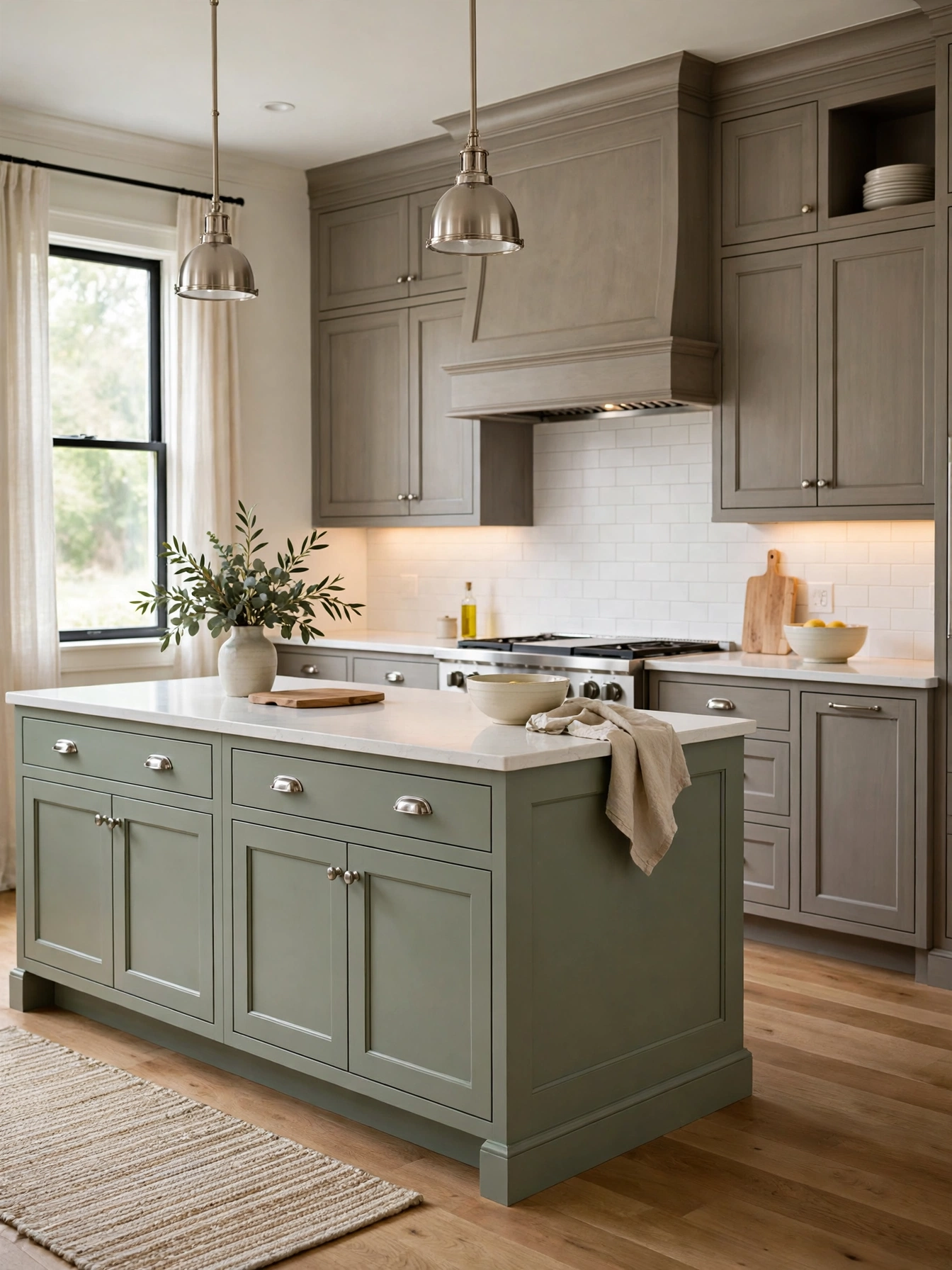
Why This Works:
- Stone gray quiets a busy kitchen without coldness
- A sage island adds a soft green note to the gray
- White quartz keeps the muted pair bright
- Brushed nickel suits the cool palette
Warm stone gray, without a blue cast, quiets the room and lets the sage island carry the only strong color. Keep the island sage green to add one soft color note, and set uppers 18 inches above the 36 inch counter, with a white quartz countertop 3 centimeters thick. Fit brushed nickel bar pulls 5 inches long on drawers and knobs 1.25 inches in diameter on doors, and keep one metal finish across the room. A stone gray with a strong green undertone turns murky by afternoon in a north-facing room, so choose one without it.
The muted pair forgives daily wear, and the sage island keeps the gray from feeling flat. A quartz counter wipes clean with a damp cloth, and the white surface keeps the muted pair bright. Keep the island 72 to 96 inches long and 36 inches wide, with 42 to 48 inches of walkway on every side, which is the National Kitchen and Bath Association clearance. The Spruce notes that muted cabinet colors photograph well and suit many styles, so the pair suits resale too.
FAQs
Which kitchen color combinations ideas suit a small kitchen best?
Light pairs suit a small kitchen best, since pale walls bounce daylight and stop the room closing in. Keep uppers 12 inches deep, leave 18 inches above the 36 inch counter, and hold the palette to two colors plus white, so the room gains interest without feeling crowded or dark.
How many colors should a kitchen palette include?
Three colors give the clearest structure: one dominant color on about 60 percent of the room, one secondary color on 30 percent, and one accent on the remaining 10 percent. Houzz notes that this 60-30-10 split keeps a palette balanced, while a fourth color often makes the room feel busy.
Which kitchen color combinations ideas hold up best at resale?
White, navy, sage and wood hold up best at resale, because buyers read them as classic, not trendy. Keep bold color to a 72 inch island, and leave the main run pale or mid tone so the kitchen photographs well for listings.
How do I test kitchen color combinations ideas before painting?
Brush each color onto a 2 foot by 2 foot sample board, prop both beside the countertop, and look at them in morning, midday and lamplight before deciding. Colors shift as the light changes, so a pair that charms at noon can look muddy by evening.
How much does it cost to repaint kitchen cabinets in two colors?
A two-color repaint of a medium kitchen runs 3,000 to 6,000 dollars sprayed, against 400 to 700 dollars for paint and primer in a do-it-yourself job. Better Homes and Gardens notes that prep decides the result, so degreasing, sanding and priming matter more than the paint brand.
Conclusion
Kitchen color combinations ideas work best when one color leads, one color supports, and the measurements stay fixed at 36 inch counters, 18 inch upper gaps and 42 to 48 inch island walkways. Start with a 2 foot by 2 foot board in each color, check the pair at 7 AM and 7 PM, and commit only when both still look right in your own light. Paint the island first if the pair feels bold, since one painted island shows the whole idea without touching the full cabinet run. Follow HomelyCrafter on Pinterest for more ideas. Save this to your Pinterest boards so you can refer back to it!

Muhammad Israr is a home decor enthusiast and the writer behind Homely Crafter. He spends his days researching paint colors, layouts and budget-friendly styling ideas, then breaks them down into practical, easy-to-follow guides so you can decorate with confidence.