
A paint chip looks right in the store and wrong on the cabinet, and the gap is usually the undertone, not the color itself. A white with a blue undertone turns gray in a north facing kitchen, a green with a yellow undertone turns lime by afternoon, and the fix costs nothing more than reading the chip before the brush comes out. The 24 kitchen color ideas below start from that check, with a paint name and a finish for every color, so the color you pick is the color you live with.
The 24 ideas below pair each color with a paint name, a finish, and the measurements that keep it balanced, from the 36 inch counter height to the 18 inch gap above it. Every section names what to avoid, how the color holds up to cooking and cleaning, and where a lighter or darker version works better. Pick one color to test first, paint a full door or a 2 foot by 2 foot board, and let daylight decide before you buy gallons.
Warm White Base
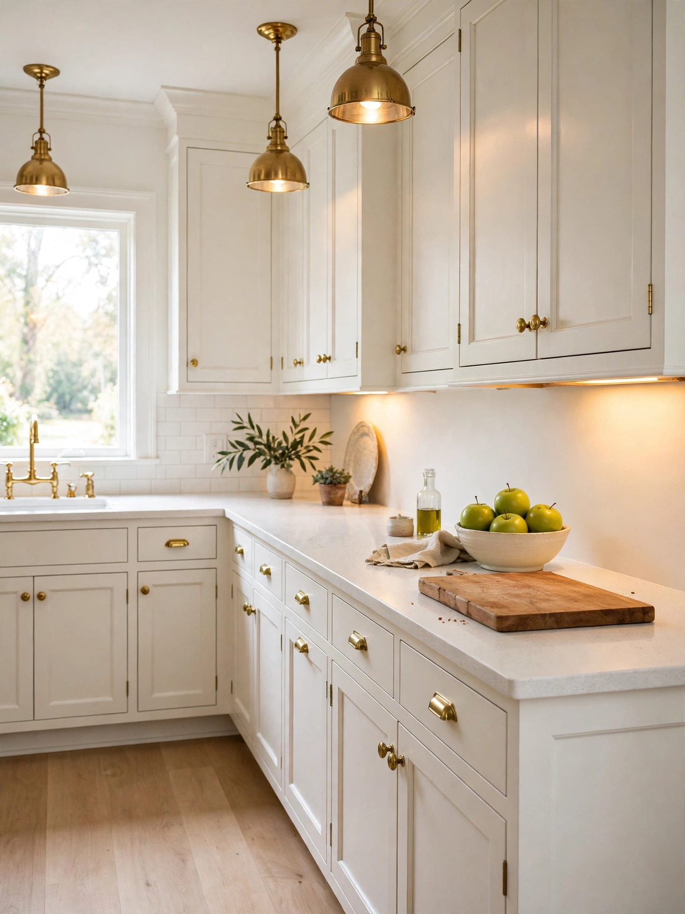
Why This Works:
- Warm white walls bounce daylight into corners without glare
- Cream undertones soften stainless steel and black hardware
- One pale palette makes a 10 foot by 12 foot room read larger
- White Dove OC-17 shares a room easily with oak, walnut and brass
A warm white base in White Dove OC-17 stays bright without turning stark. A primer coat plus two satin top coats gives the pale paint a washable skin, so grease near the range comes off with a damp cloth. Counters sit at 36 inches, uppers sit 18 inches above them, and a white backsplash 18 inches high keeps the pale wall from looking unfinished. Avoid a cool blue white in a north facing room, because the light turns it gray by late afternoon. Benjamin Moore lists White Dove as a warm white with a light reflectance value near 85, which explains why it holds warmth under both daylight and 2700K bulbs.
Morning light spreads evenly across warm white walls, and the room looks tidy even when the counters hold a cutting board and a kettle. Cooking splashes reach the pale base near the range. Soapy water after dinner takes them off before they dry. Matte paint shows marks near the sink within days. Satin paint holds its sheen through weekly cleaning. One wood tone and one metal are enough; a second wood or a second metal turns the pale room into a patchwork.
Deep Navy Walls
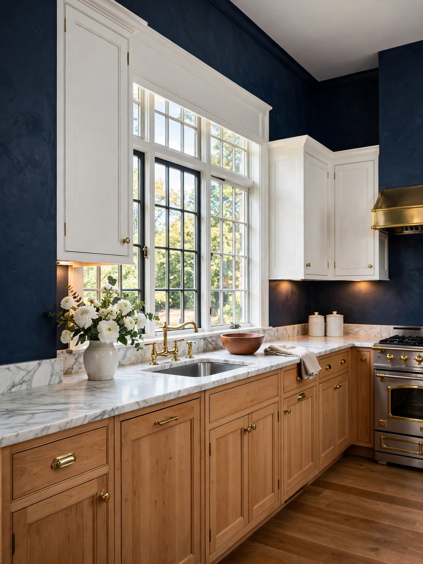
Why This Works:
- Navy walls add depth behind white cabinets
- Dark paint hides scuffs near the doorway
- Brass fixtures glow against a deep blue ground
- White counters stop the dark wall feeling heavy
Hale Navy HC-154 gives a kitchen a deep blue anchor wall, and the white cabinets beside it stop the room turning dark. Roll a primer coat and two satin top coats onto a smooth wall, and choose a washable finish because a dark wall shows every splash near the sink. Leave the ceiling white, set pendants 30 to 36 inches above the island, and let that pool of warm light keep the dark wall from feeling flat. Avoid navy on all four walls in a room under 10 feet by 12 feet with one small window, since the color closes the space and reads almost black after sunset. The National Kitchen and Bath Association recommends 42 to 48 inches of clear walkway around an island, and that open floor matters even more when a dark wall sits nearby.
Navy walls suit households that cook most evenings, because the dark tone hides the small marks that show on white paint. The navy wall takes its warmth from the floor and the stools: oak underfoot, walnut at the seats, brass at the pulls. Cool gray tile and chrome taps would pull the blue toward cold instead. The dark surface needs 2700K lighting to stay blue, and under cabinet strips at the same temperature keep the counter readable. A navy wall makes every speck of dust visible, so keep a damp microfiber cloth in the drawer beside the sink.
Warm Kitchen Color Ideas
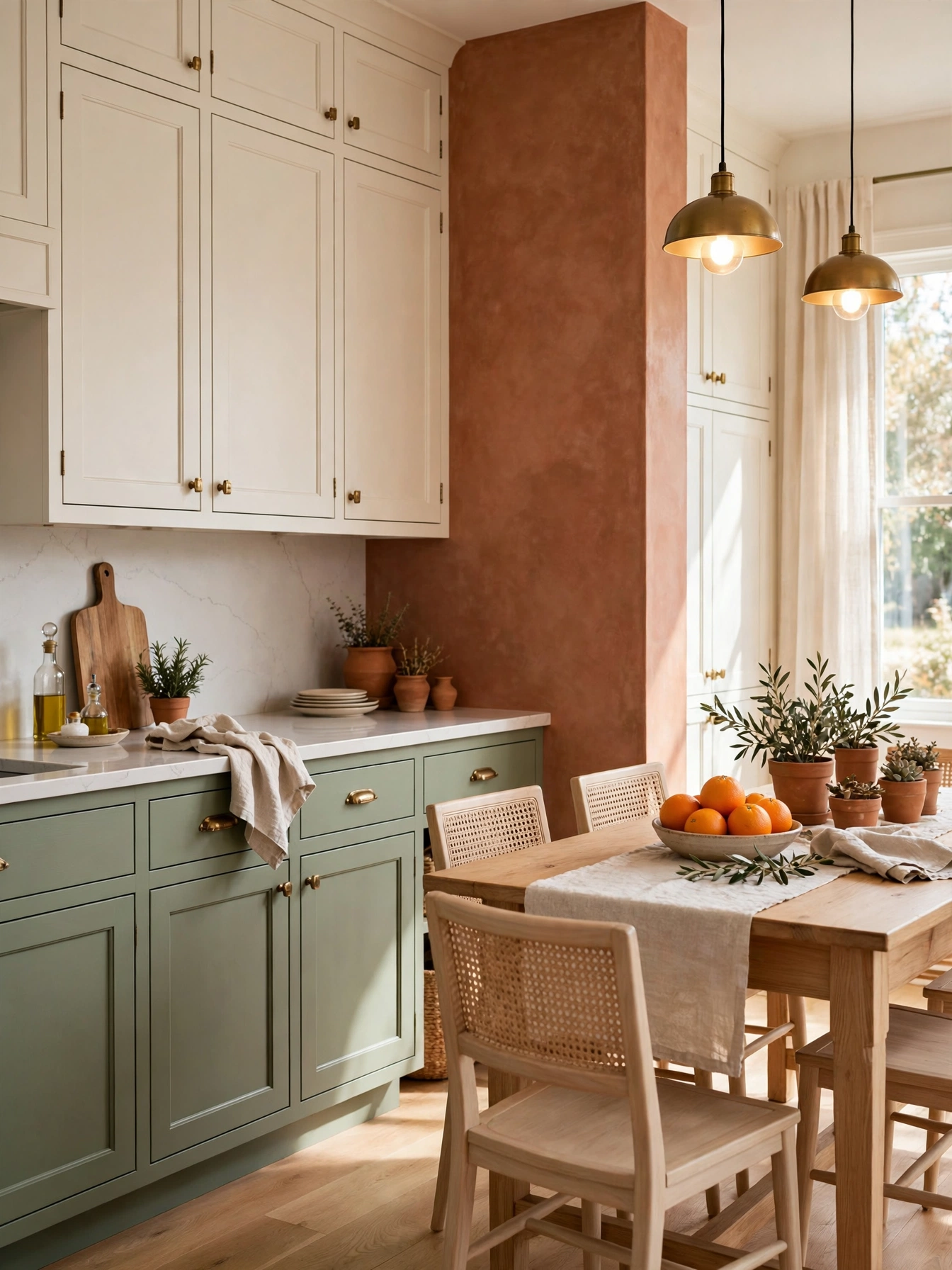
Why This Works:
- A 60-30-10 split keeps three colors from competing
- Warm neutrals carry the room and one accent adds lift
- Paint names and finishes stay listed beside each color
- Testing on a board stops a costly full room repaint
A 60-30-10 split sets a clear structure for warm kitchen color ideas, with 60 percent dominant color, 30 percent secondary and 10 percent accent. Start with warm white on 60 percent of the surfaces, add wood or sage on 30 percent, and reserve a single accent such as terracotta or mustard for the remaining 10 percent. Let the color blocks follow the room, with the backsplash band running 18 inches high between counter and uppers. Avoid three strong colors at equal strength, because the eye finds no resting place and the room looks busy. Better Homes and Gardens notes that a dominant neutral with one accent keeps a kitchen feeling settled, and the 60-30-10 rule gives that advice a number to follow.
Planning the split on paper first saves a repaint, and a small swatch board for each of the three colors shows how they sit together in daylight. Brass, black and wood hardware suit warm neutrals on cabinets. A cool accent takes brushed nickel or chrome hardware. The accent color fades fastest near a sunny window, so a washable satin finish helps it hold up to cleaning. A swatch board with all three colors, checked in daylight, settles the split before any paint is ordered.
Sage Green Cabinets
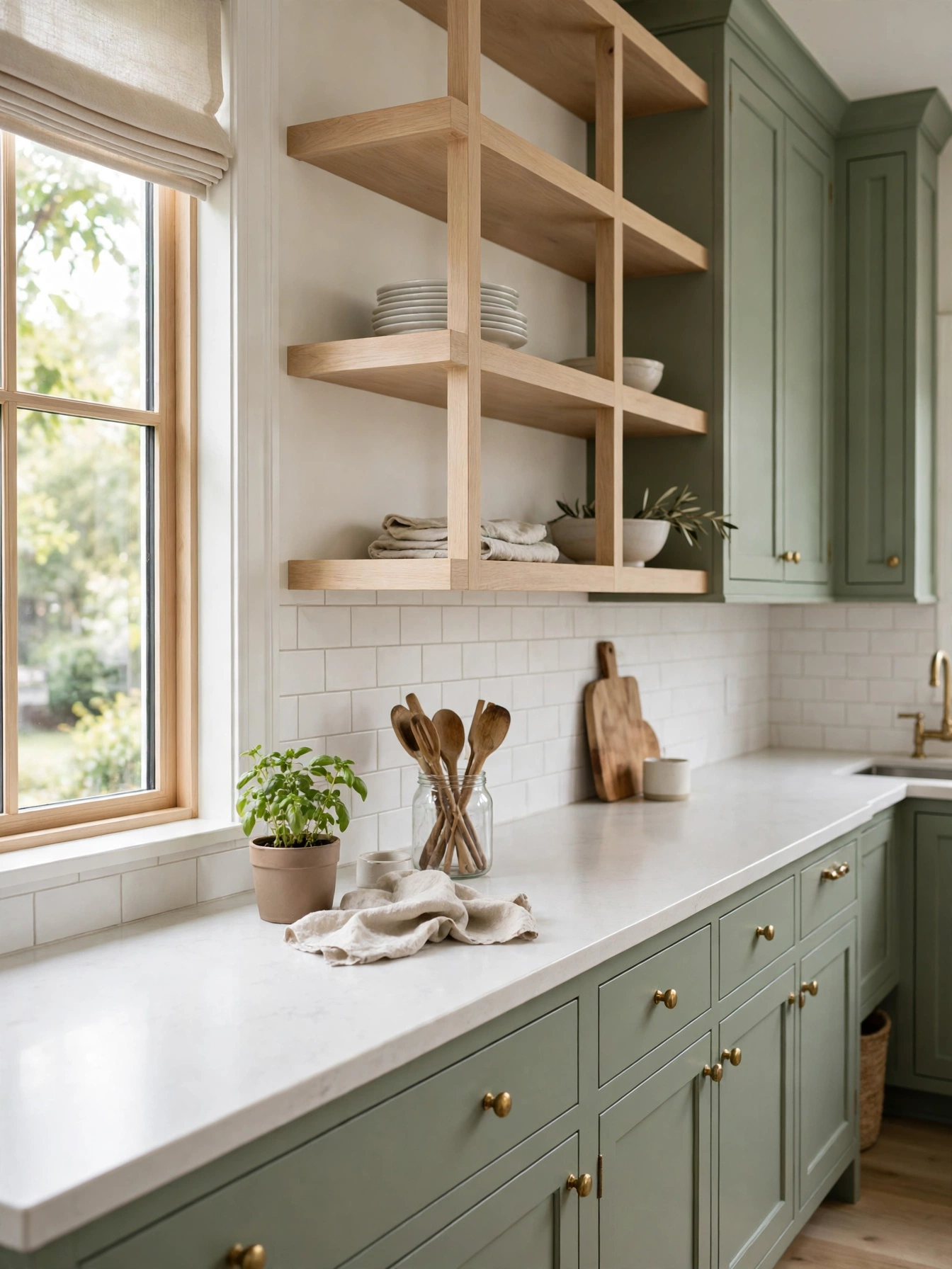
Why This Works:
- Sage green softens a kitchen without reading gray
- Pale wood counters warm the cool green tone
- Brass knobs add a quiet contrast to muted doors
- A satin finish wipes clean after daily cooking
A muted green in a satin finish keeps sage cabinets calm in both morning and evening light. Choose a color such as Sherwin-Williams Evergreen Fog SW 9130 for maple doors 3/4 inch thick, and pick a washable satin sheen for the stretch near the range. A white backsplash 18 inches high keeps the green from feeling heavy, with the standard gap between counter and uppers left clear. Avoid a sage with a strong yellow undertone in a south facing room, because afternoon sun pushes it toward lime. A pale oak counter beside sage doors shows the warm-wood pairing at work in a small kitchen.
Daily cooking leaves few visible marks on sage, and the color pairs with cream walls, oak shelves and brass pulls without a second accent. Dust barely shows on the muted tone. Frying leaves a film on the sage doors by the range, and a damp cloth right after cooking clears it before it sets. Laminate doors clean with a quick wipe. The edges tend to chip after a few years of use, and painted maple takes a small brush touch up when a corner gets nicked. Slim 5 inch bar pulls on wide drawers put the pale doors first, not the hardware.
Terracotta Accent Wall
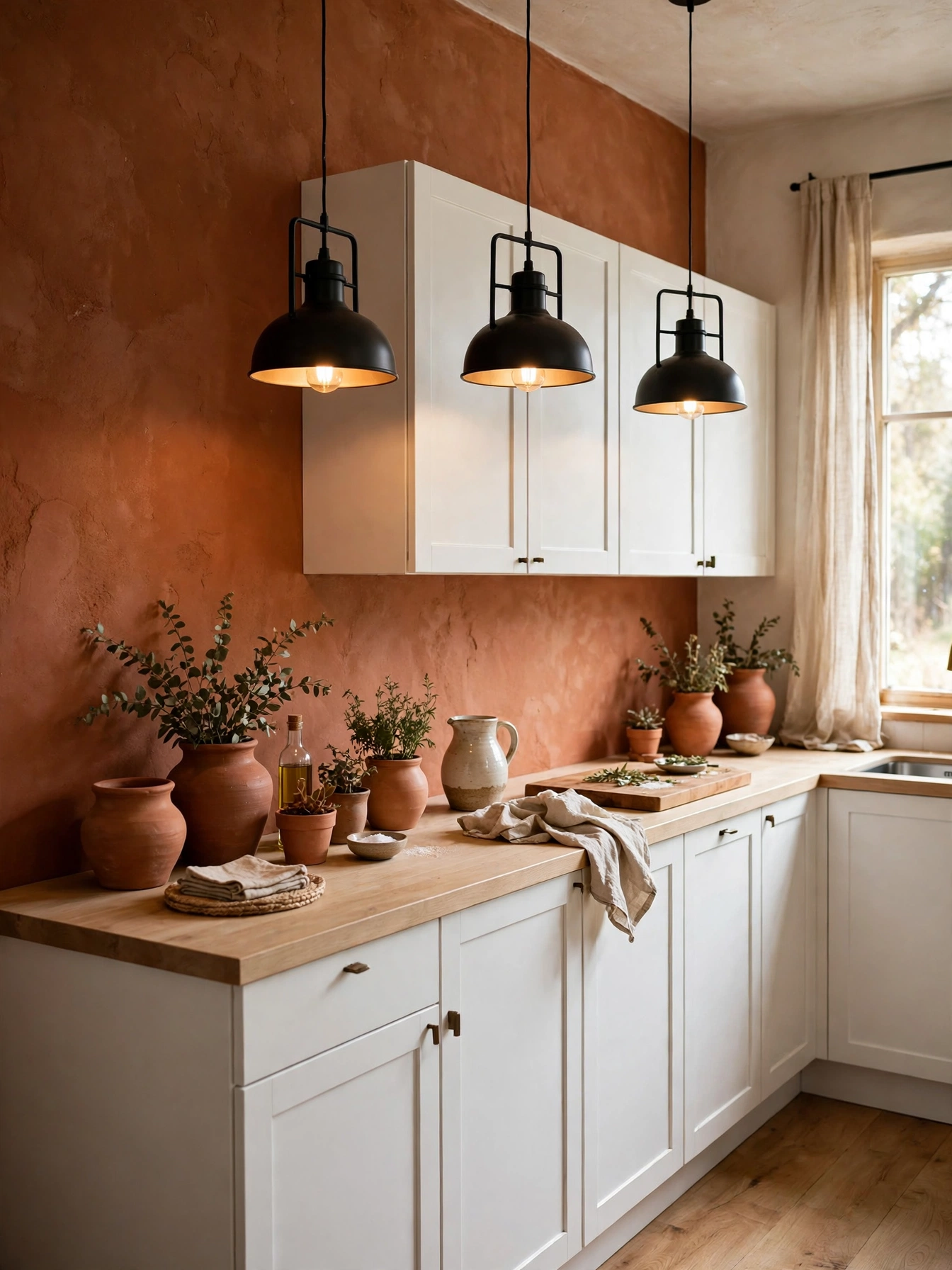
Why This Works:
- Terracotta warms a white kitchen in one bold sweep
- One accent wall changes the room without repainting cabinets
- Clay tones work beside cream, oak and black iron
- Warm color makes a north facing room feel brighter
Terracotta on a single 10 foot wall brings clay warmth into a white kitchen without repainting the cabinets. Use a warm clay paint in a satin finish, lay it over primer with a short-nap roller, and keep the wall smooth so the color reads even under kitchen light. A 3 foot by 6 foot section of tile can break the color near the range, with the backsplash band 18 inches high. A gallon of quality paint covers about 350 square feet and typically sells for 45 to 70 dollars, so one accent wall stays under 200 dollars in paint and primer. One terracotta wall is the dose. The orange undertones in wood floors double the clay color, and a second clay wall would push the room past warm into heavy.
Clay walls pair with cream cabinets, oak open shelves and black pendant lights. Cool gray counters and chrome heavy fittings belong in a cooler scheme. The warm tone makes a north facing kitchen feel brighter at breakfast, and it holds its color under 2700K bulbs in the evening. Scuffs near a doorway stand out on terracotta, so a washable finish matters where people pass with bags and coats. A single clay wall carries the whole focal point; the pale surfaces around it do the quiet work.
Charcoal Island Contrast
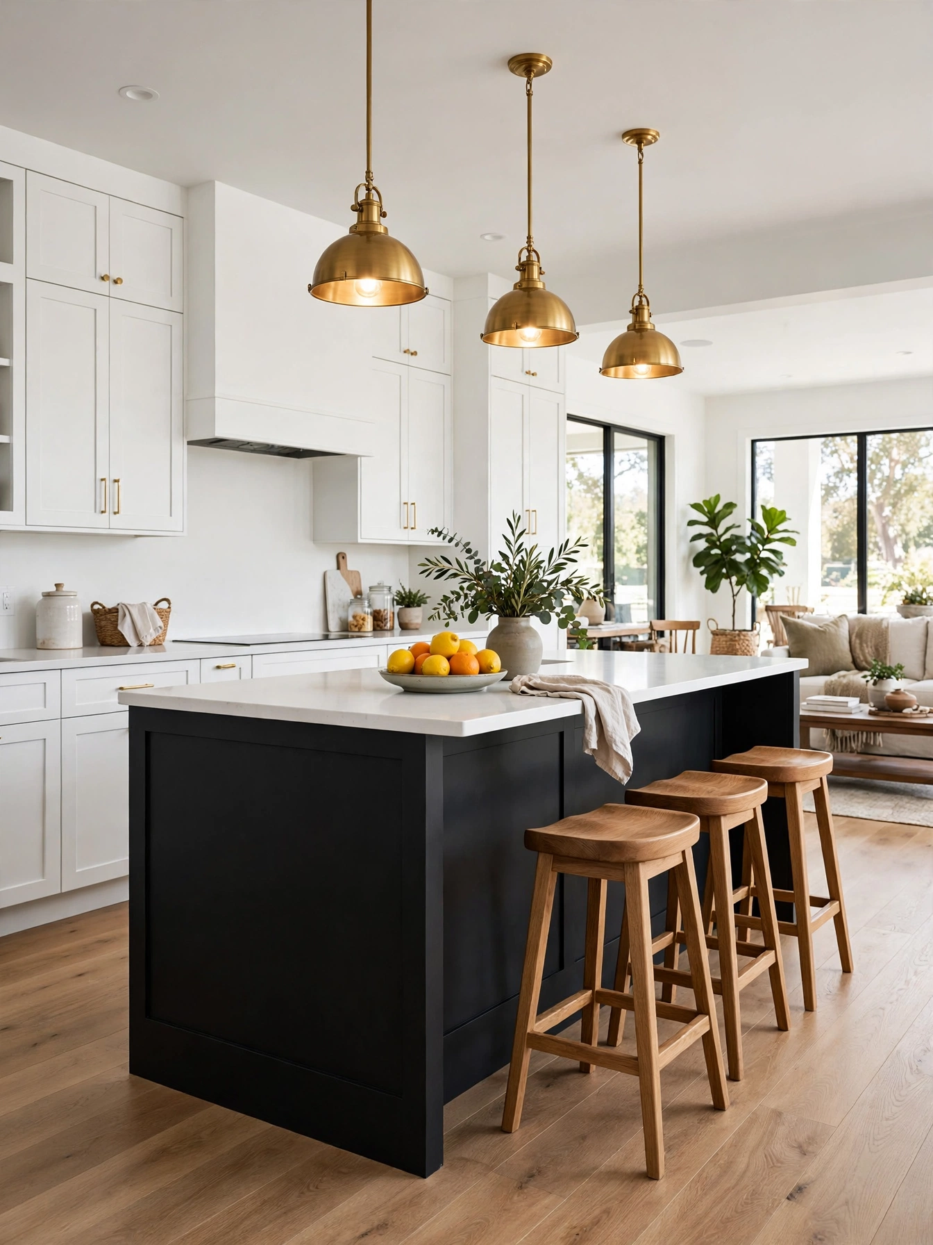
Why This Works:
- Charcoal island anchors a pale kitchen floor
- Dark base hides kicks and scuffs at floor level
- White perimeter cabinets keep the room bright
- Brass pendants link the dark island to the room
A charcoal island anchors a pale kitchen without painting the whole room. Size the island between 6 and 8 feet long and 3 feet wide, allow 12 to 15 inches of knee space on the seating side, and give each stool 2 feet of elbow room. Keep 42 to 48 inches of walkway on every side, which is the National Kitchen and Bath Association clearance for a working kitchen, and the pendants work best at 30 to 36 inches above the counter. Paint the island in a washable satin over a primed base, since island bases take daily kicks from shoes and stools. Avoid an island under 60 inches long in charcoal, because the dark color reads as a small patch on the floor.
Cooking traffic flows around a dark island easily when the walkway stays clear. The charcoal base leans on its neighbors: a white quartz top, oak stools, brass lights above. Together they tie the dark island to the pale room. Dust stands out on a dark island base under the pendant lights. A quick pass with a dry duster restores the depth in under a minute. A stone waterfall edge adds drama to the island. A simple eased edge leaves the color as the focus. White perimeter cabinets do the brightening, and the island keeps its dark color without closing the room.
Buttery Yellow Cabinets
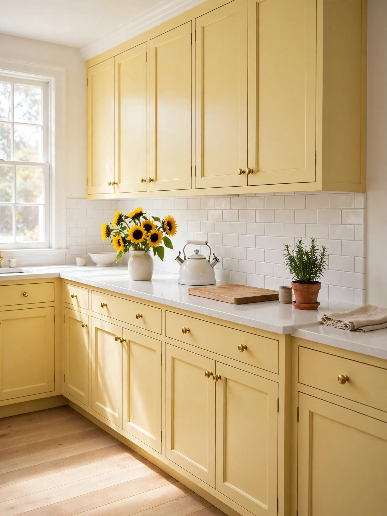
Why This Works:
- Buttery yellow adds sunshine without glare
- Pale yellow looks at home with white counters and oak floors
- Warm tone brightens a kitchen with one small window
- Cream walls keep the yellow from feeling loud
Buttery yellow at a light reflectance near 70 keeps cabinets sunny yet soft under kitchen light. Choose a pale yellow paint in a satin finish, prime maple doors 3/4 inch thick and finish them in a washable satin, and keep the hardware slim so the color stays the focus. A white subway tile backsplash 3 by 6 inches gives the pale yellow a clear edge above the worktop. A bright lemon yellow belongs on a swatch, not on every cabinet: it tires the eye by midday and turns warm wood floors brassy. HGTV notes that pale yellows reflect daylight well, which matters in a room with one small window and a north facing wall.
Yellow cabinets lift a kitchen at breakfast, when daylight is soft and the room needs warmth most. Grease near the range stands out on pale yellow, so cleaning that stretch right after frying keeps the cabinets looking new. White counters and pale oak floors carry the yellow without competing, and cool gray tile is the single mismatch in the room. Cream walls sit behind the yellow, and the color holds its sunny tone from breakfast to evening.
Blush Pink Touches
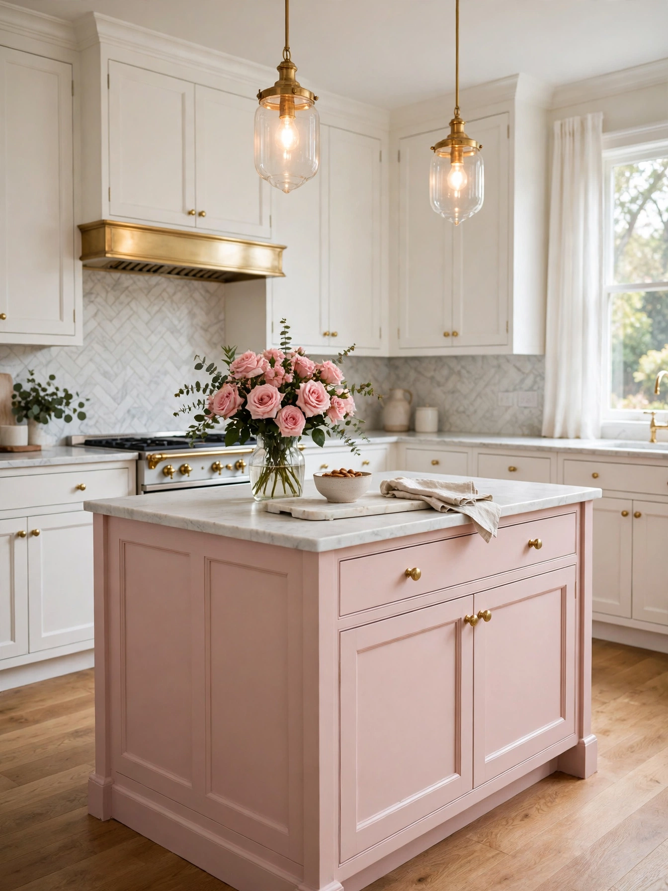
Why This Works:
- Blush pink softens a kitchen without turning sweet
- Brass, marble and pale oak are the natural partners for pale pink
- Small pink accents test the color before a full commitment
- Warm pink warms a cool white cabinet run
Blush pink works best as a single quiet note, on lower cabinets or one island, where its soft warmth can show without taking over the room. Use a muted pink paint in a washable satin finish, prime first. A dusty pink reads as a neutral in daylight. The island needs a 12 inch overhang for seating, so knees fit comfortably beneath the counter. Bubblegum pink on every cabinet is a short-lived look, and stainless steel beside it only sharpens the clash. Houzz calls muted pink a warm neutral beside marble and brass, and a pale pink island beside white perimeter cabinets shows the idea in a real room.
The island and the lower cabinets are where the pink lives, and white marble, brass pulls and pale oak shelves share the room without crowding it. The pink doors sit beside the range, so splashes hit them first. The washable satin finish lets a sponge lift them off without scrubbing. A single pink island stays easy to live with and easy to repaint later, even after a year of daily use. Guests notice the island first, then the marble; the pink never has to carry the room alone.
Forest Green Perimeter
Why This Works:
- Forest green adds depth to a full cabinet run
- Dark green hides wear on lower cabinets
- Brass hardware glows against the deep green doors
- A pale marble worktop lightens the long green run
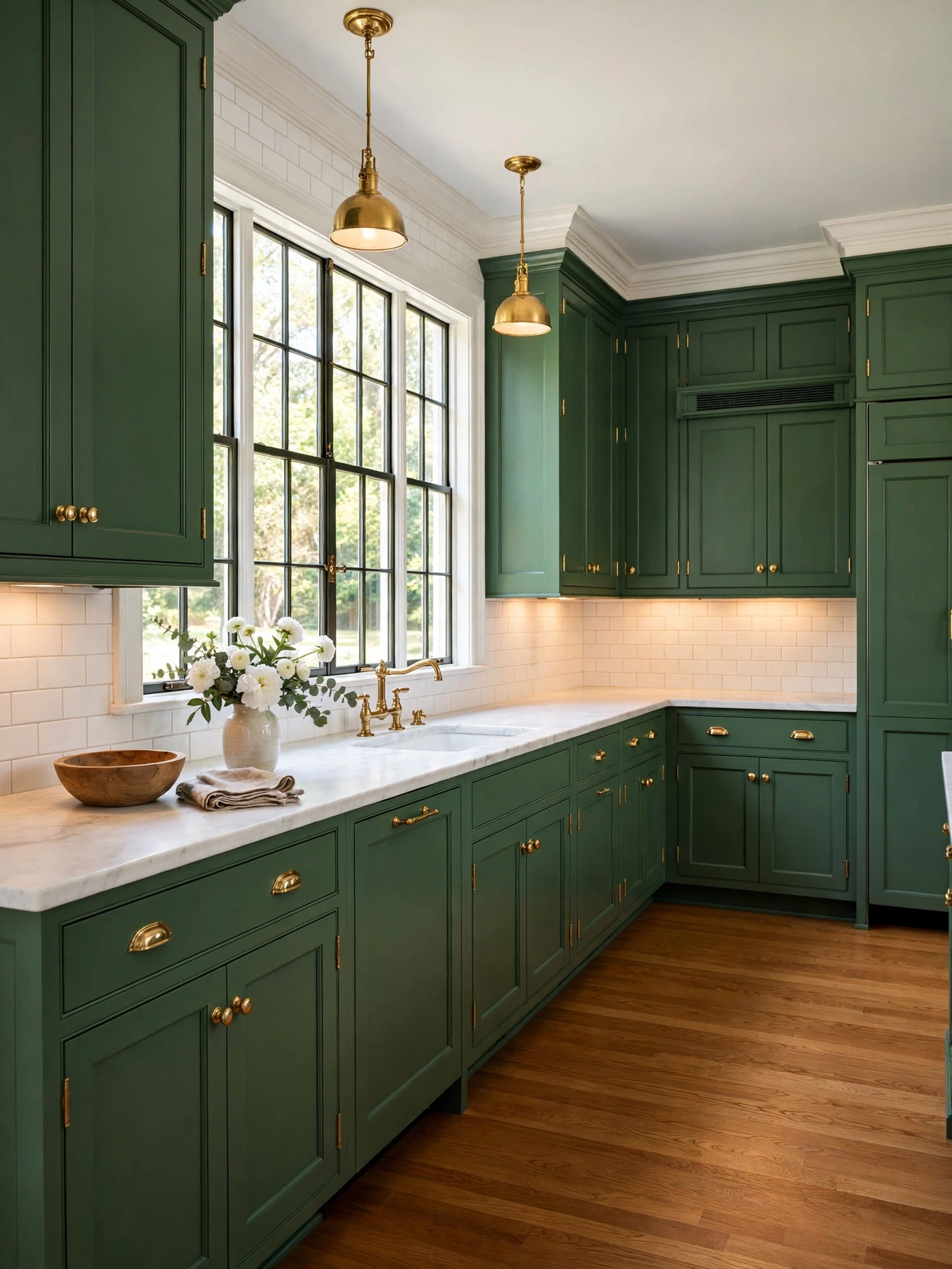
A deep forest green around the full perimeter still reads classic beside white counters. Paint maple doors in satin, two coats over a primer base, and choose a deep green so it holds up under 2700K lighting. Counters sit at 36 inches, uppers sit 18 inches above them, and a white backsplash 18 inches high frames the dark run. Avoid forest green in a room under 10 feet by 12 feet with one small window, because the color closes the space and reads almost black after sunset. Warm under cabinet LED strips at 2700K to 3000K keep a dark green readable after dark, so choose that temperature for the strips.
Forest green fits households that want a bold color without repainting every year, because the deep tone stays classic beside brass and marble. Oak floors and walnut stools put wood against the deep green, and the brass pulls catch the light the dark cabinets absorb. Plan on about 5 days for a full repaint of a medium kitchen. Doors come off and get sprayed in a shop, which leaves the smoothest coat. Quartz needs no sealing at all, and marble asks for a fresh seal every 6 months and stains when citrus sits on it, so the counter material decides how much upkeep the kitchen asks for.
Two Tone Cabinets
Why This Works:
- A dark base and a pale top give the room layers from one paint card
- Dark lowers hide kicks and scuffs at floor level
- Light uppers keep the ceiling line bright
- One paint brand keeps both tones in the same family
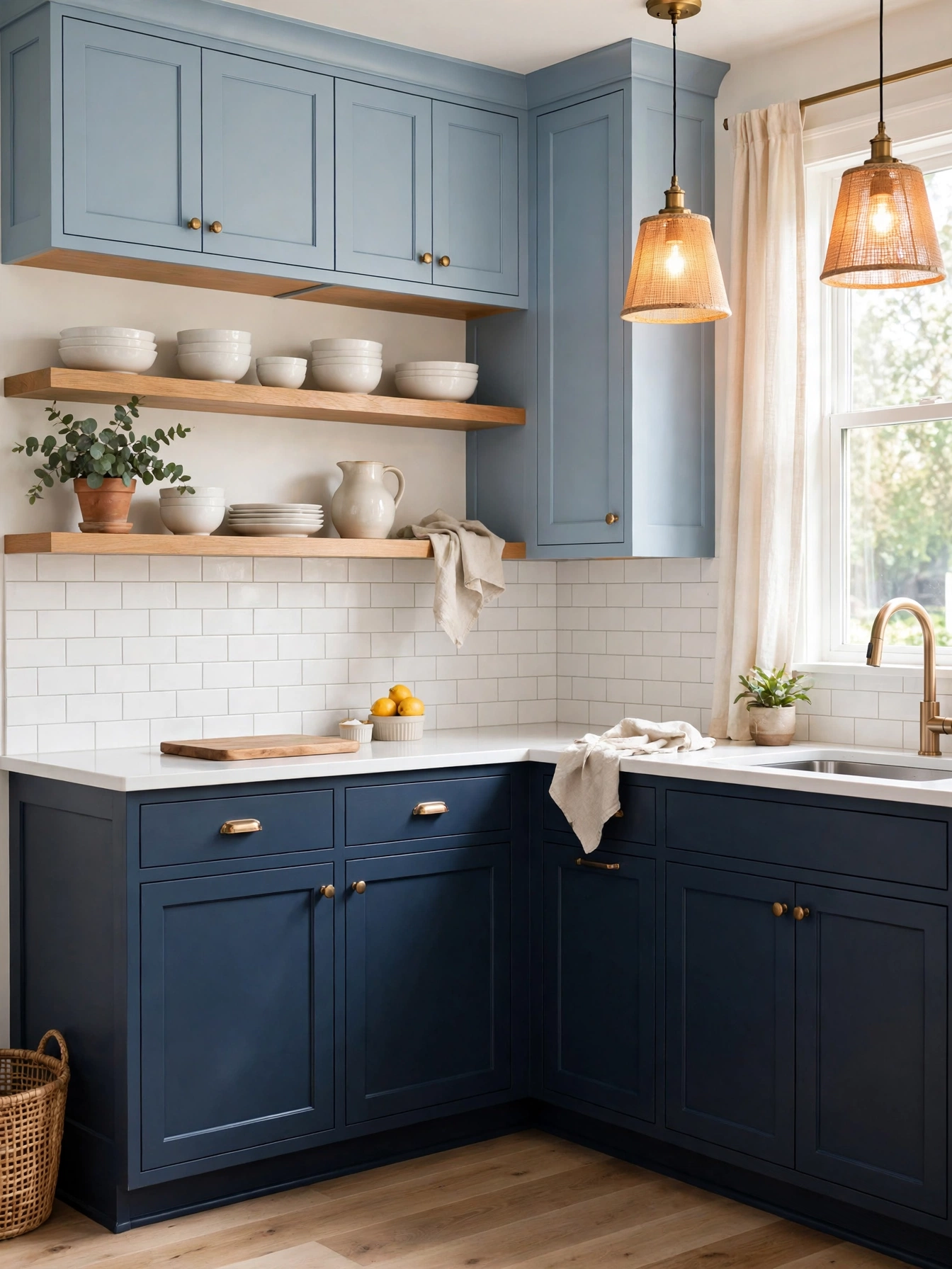
For two tone cabinets, pick shades at least 3 steps apart on the same paint card, such as navy below and powder blue above. Give lowers and uppers the same satin sheen, primed and finished with two coats each, so light falls evenly across the room. Let the darker tone anchor the floor on the island, with a white countertop and backsplash, so the two blues hold the attention. A 12 inch deep upper leaves room for a coffee maker below, and the backsplash band fills the space between counter and uppers. Shades only 1 step apart look like an unfinished paint job to the eye, so keep a clear gap between the two tones.
Changing only the lowers refreshes the room with far less work, and the uppers can follow later without any work on the base run. A professional spray finish leaves no brush marks, which matters on flat slab doors. A sprayed coat dries to an even sheen across the whole slab. Use one hardware style across both tones, 5 inch bar pulls on drawers and knobs on doors, so the two shades read as a single plan. The split keeps the dark color at floor level, where it hides scuffs. The pale uppers carry the ceiling line at full brightness.
Soft Gray Palette
Why This Works:
- Soft gray bridges warm and cool kitchen colors
- Gray cabinets hide dust and water spots
- Stainless steel matches the cool tone of the blend
- White walls keep the muted palette from feeling flat
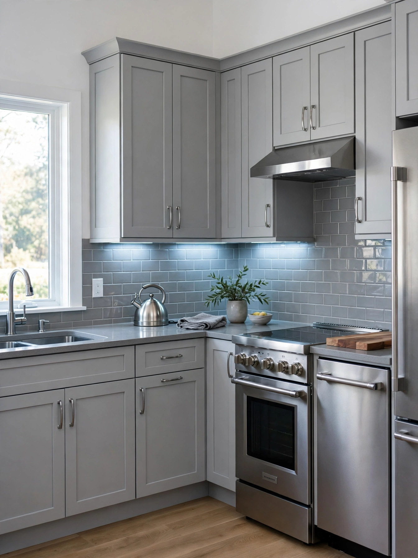
A muted soft gray base on cabinets sits comfortably between warm wood and cool steel. Choose a gray such as Sherwin-Williams Agreeable Gray SW 7029, prime maple doors 3/4 inch thick and choose a washable satin sheen near the sink. A gray subway tile backsplash 3 by 6 inches keeps the palette in one family across the whole run. A gray with a strong green undertone turns murky by afternoon in a north facing room, so pick a warmer gray there. Better Homes and Gardens notes that warm grays suit kitchens with wood floors. Pick the gray by the floor material: wood floors take a warm gray, and steel and white tile take a cool gray.
Gray cabinets sit quietly behind daily cooking, and oak shelves, white counters and brushed nickel pulls belong in the same quiet register as the soft gray. The color hides dust well on cabinet doors. Water spots show near the sink, so wipe them off after washing dishes. A gray repaint needs the same prep as any cabinet color, with degreasing, sanding and priming deciding the result. White or cream walls behind the gray stop it sliding toward blue in afternoon light.
Bold Kitchen Color Ideas
Why This Works:
- Bold color on one wall makes a clear focal point
- A strong island color adds drama without a full repaint
- Brass and white marble steady the deep tones
- One bold move carries the whole room
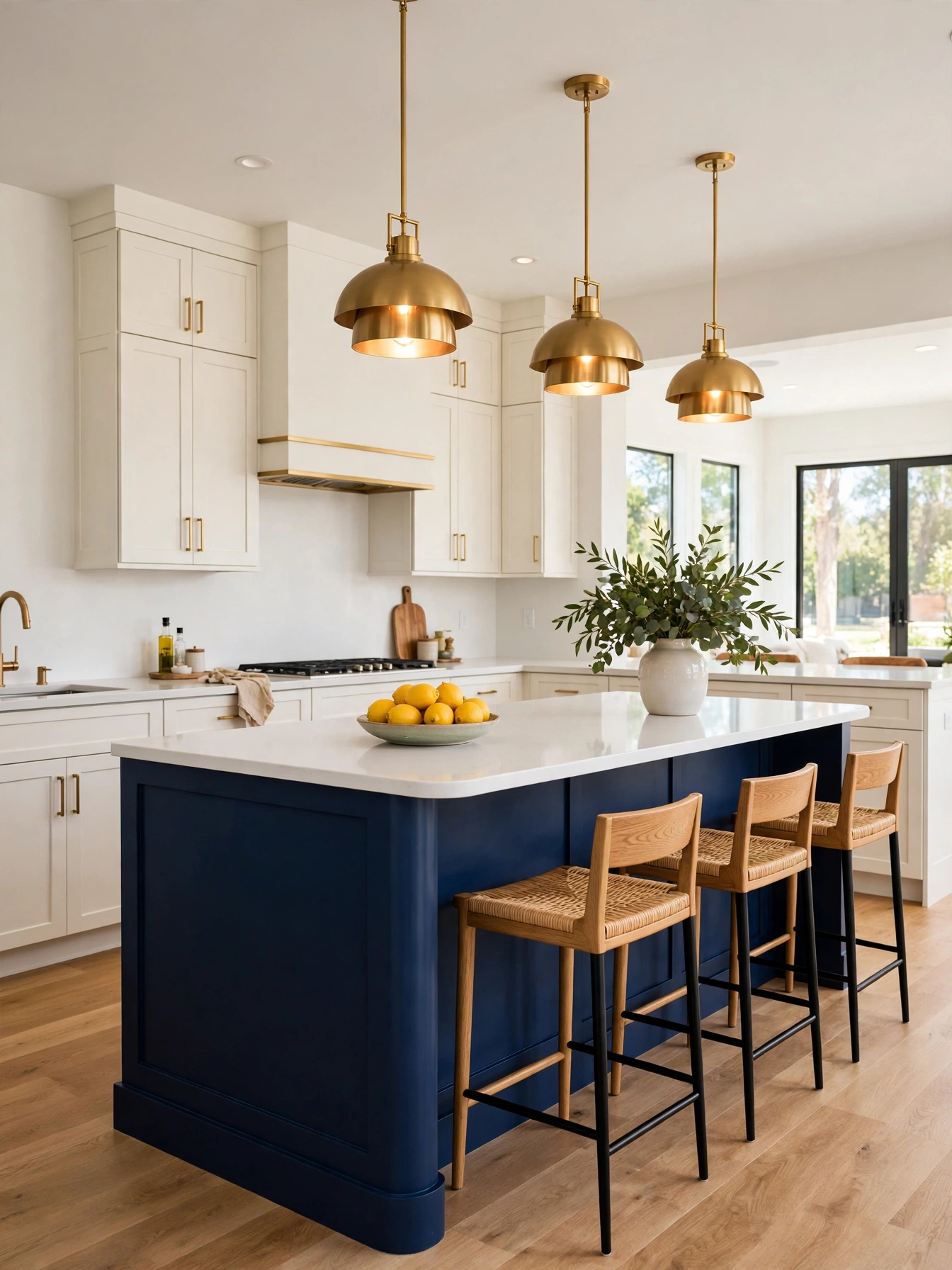
Bold kitchen color ideas start with one strong move, such as a navy island, a forest green wall or a terracotta range hood surround. Pick one bold surface, prime it and finish it in satin with two coats, and keep the remaining cabinets warm white so the bold color has room to breathe. The gap between the pendants and the island top runs 30 to 36 inches, and 42 to 48 inches of walkway keeps the bold island from blocking traffic. Avoid three bold colors at once, because the room loses its focal point and the colors compete. The Spruce calls one strong color with pale neutrals intentional, and several strong colors unfinished.
Breakfast and conversation gather at the bold island, and the pale perimeter stays the cooking zone. Dust lands first along the bold island’s dark top edge. A sponge with warm soapy water clears it in one pass. Dark paint needs 2700K lighting to stay true in the evening, and under cabinet strips at the same temperature keep the counter readable. Breakfast gathers at the island, and the bold color earns its keep every morning.
Cream And Brass
Why This Works:
- Cream cabinets warm a kitchen without yellow glare
- Brass pulls add a quiet glow to pale doors
- Marble counters cool the warm cream tone
- Pale wood floors repeat the warm cream palette
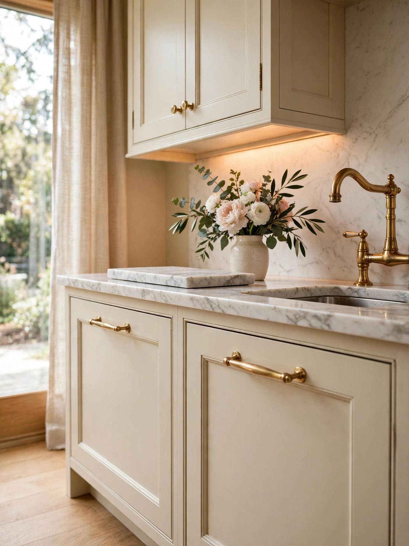
A soft base in cream, such as Sherwin-Williams Alabaster SW 7008, never reads stark on cabinets. Prime maple doors 3/4 inch thick and finish them in satin, and keep the sheen washable so the pale doors wipe clean after cooking. Brass bar pulls 5 inches long suit wide drawers and repeat the warm metal across the room. Avoid cream beside a cool gray counter, because the warm paint and cool stone clash and the room feels unsettled. A cream kitchen with oak floors is the warm-white-and-brass pairing in its simplest form.
Marble counters, brass faucets and oak shelves match the cream cabinets in warmth, and chrome fittings with blue gray tile are the combination that unsettles the room. Splashes from cooking settle on the cream doors beside the range. The satin sheen holds them on the surface, where a paper towel takes them off. A lacquered finish keeps brass bright for years, and an unlacquered one darkens where hands touch it, so choose by how much patina feels welcome in the room. Three materials carry the room: cream paint, brass metal and one wood tone.
Black Range Hood
Why This Works:
- Black hood adds a graphic focal point above the range
- Dark metal frames a white backsplash cleanly
- Matte black hides cooking splashes on its flat surface
- Black hardware repeats the hood tone across the room
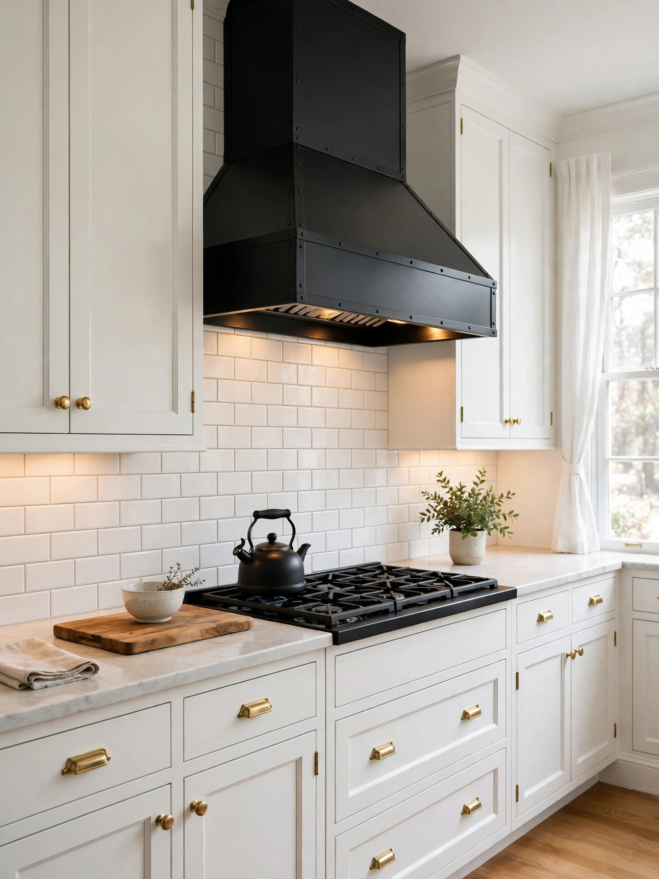
Black on the range hood creates a graphic focal point above the stove, and the white tile around it frames the dark shape cleanly. Choose a matte black hood 30 inches wide for a 30 inch range, mount it 24 to 30 inches above the cooktop, and keep the duct 6 inches in diameter for proper airflow. The backsplash runs 18 inches high behind the range, and a black hood needs a white tile surround so the dark shape reads cleanly. Avoid a glossy black hood in a small kitchen, because high gloss shows every splash and fingerprint under range lighting. A licensed electrician should handle new wiring or a new circuit for the hood, since range hood wiring sits close to heat and grease.
Cooking steam rises straight into a hood that sits at the right height, and white subway tile, brass pulls and oak shelves set the black finish off against the pale wall. Dust is easy to see on the flat matte surface in the range light. A soft rag with warm water brings the crisp black back. A recirculating hood installs with no duct work at all. It filters the air and sends it back into the room. A ducted hood vents steam outside through the 6 inch duct. Black hardware elsewhere in the room ties the hood in; without it, the hood floats alone above the range.
Dusty Blue Island
Why This Works:
- Dusty blue island adds color without repainting the room
- White perimeter cabinets keep the kitchen bright
- Oak stools warm the cool blue island base
- Brass light fixtures over the island pick up the warm metal on the cabinet pulls
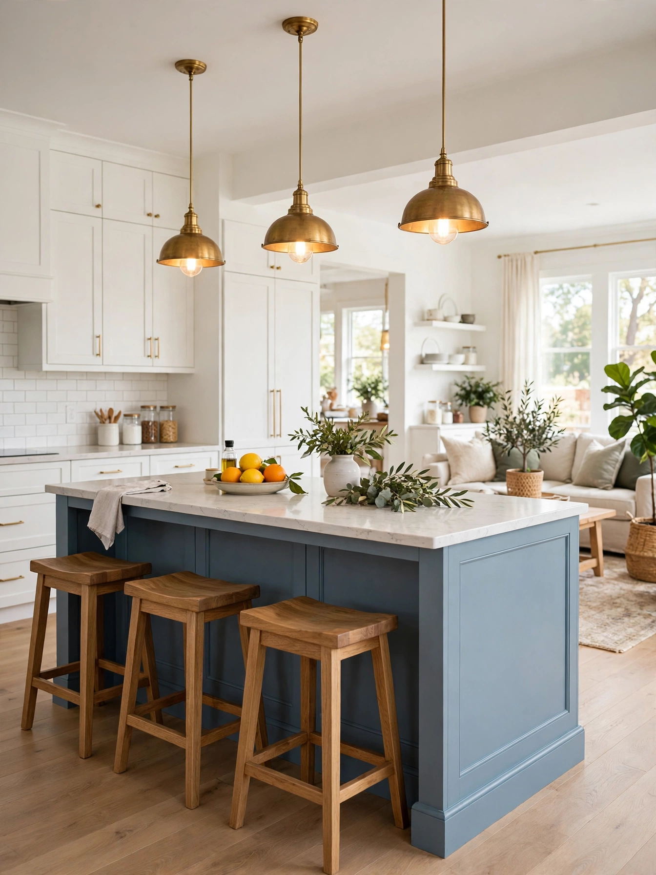
A dusty blue island brings color into a white kitchen, and the pale perimeter keeps the blue calm. Paint the island in a washable satin over primer, and pick a dusty blue so it reads calm beside white quartz. Make the island 6 to 8 feet long, keep 42 to 48 inches of walkway on every side, and leave 30 to 36 inches between the pendants and the counter. A 12 to 15 inch overhang gives knees room at the stools. A bright royal blue island breaks the calm of the white perimeter, and the color shows its age within a couple of years.
Breakfast, homework and conversation gather at a blue island. The white perimeter holds the cooking zone. The island base takes daily knocks from shoes and stools, so a durable satin finish matters here. Choose a plain eased edge for the island top, and the dusty blue stays the focus. Oak stools and brass pendants sit at the island, and their warmth keeps the blue from turning cold.
Warm Wood Tones
Why This Works:
- Warm wood tones soften white and gray cabinets
- Oak shelves repeat the island top tone
- Natural wood adds texture to a painted kitchen
- Pale oak reflects light well into the room
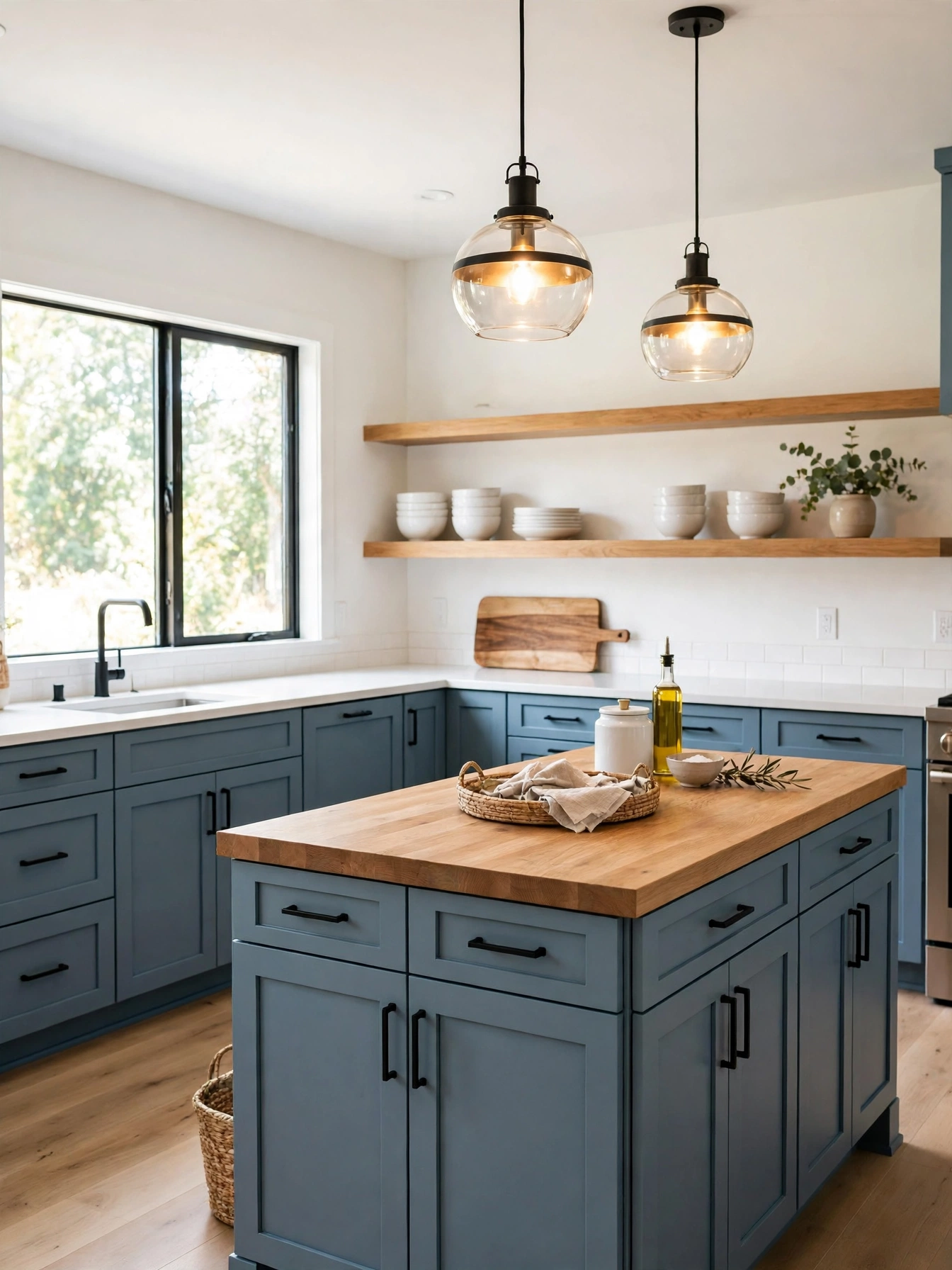
Warm wood tones on shelves and an island top add a natural layer to a painted kitchen that paint alone cannot add. Use white oak for shelves and the island top, finished with a clear matte oil, and pair it with dusty blue or sage cabinets in a satin finish. Make the island top 1.5 inches thick, level with the perimeter counters, with a 12 inch overhang for seating. Oak shelves 12 inches deep sit 18 inches above the counter, clear of the work surface. Avoid a dark walnut stain with dusty blue, because the heavy wood and cool paint fight each other.
Wood shelves hold daily dishes within reach, and white counters, brass pulls and muted cabinet colors share the wall with pale oak. The wood sets the tone for the whole wall. Oil the wood island top every 3 months, and the quartz perimeter asks for nothing in return, so warmth sits where hands rest and easy care stays where cooking happens. White oak stays pale and suits blue. Red oak turns orange over time. Simple black hardware disappears against the wood, and the oak island top is the warmest surface in the room.
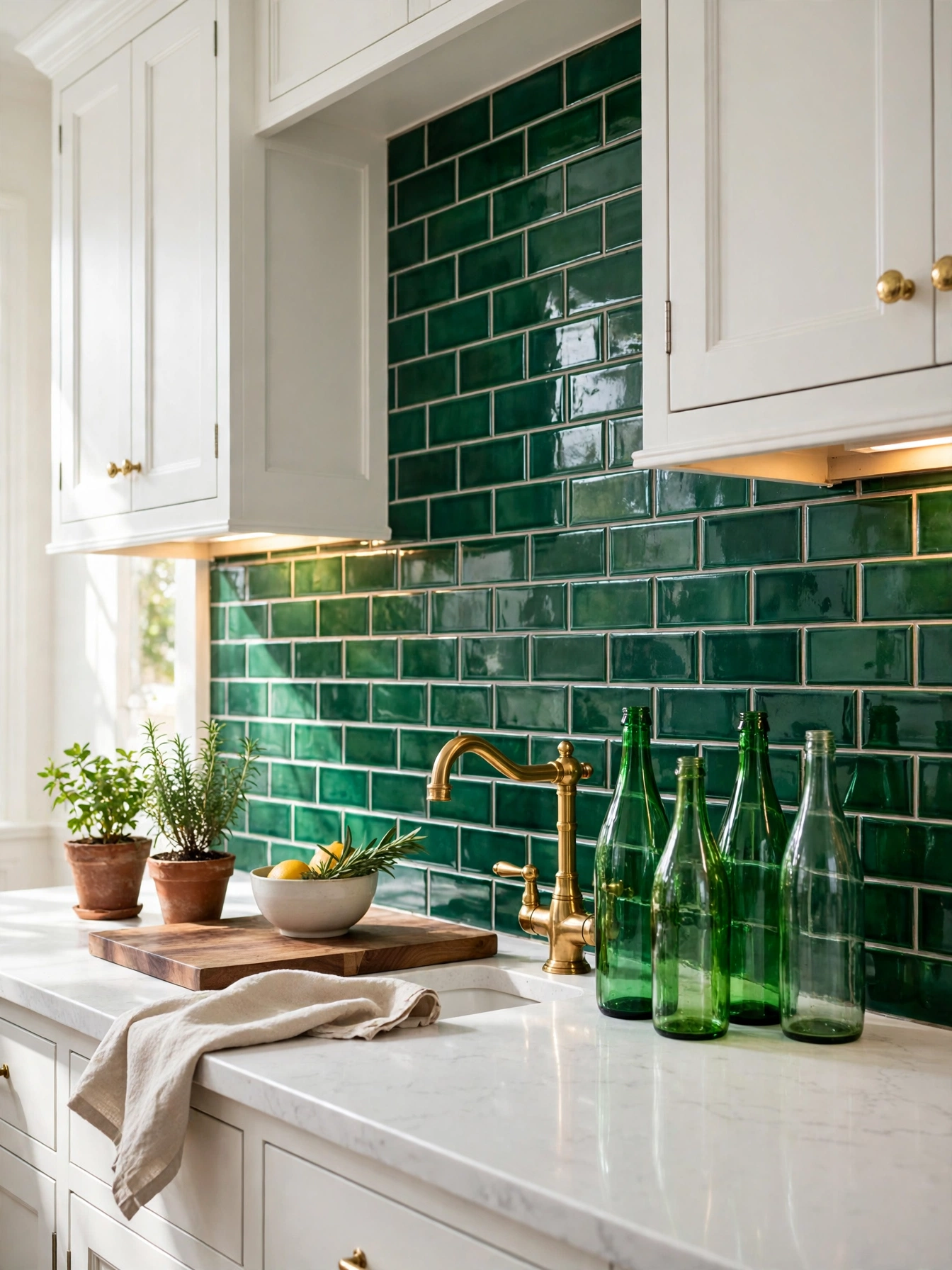
Emerald Backsplash Pop
Why This Works:
- Emerald tile adds jewel color behind the range
- White cabinets and brass let green tile lead
- A single tile band changes the room without paint
- Glossy tile reflects light into a dark corner
Emerald tile on the backsplash puts jewel color behind the range, where a white kitchen needs one lively band most. Pick glossy ceramic tile in 3 by 6 inch or 4 by 4 inch pieces, run the band 18 inches high between counter and uppers, and choose a pale gray grout that hides stains. A full height slab behind the range makes the emerald band a focal point above the worktop. Avoid emerald tile with emerald cabinets in the same run, because the two greens compete and the room loses its balance. White quartz beside the emerald band lets the color stay lively.
Tile behind the range takes daily splashes. A glossy finish sheds grease on contact, so the tile itself needs little care. Brass faucets, white cabinets and oak shelves let the emerald band hold the spotlight, and patterned counters would only compete with it. Grout absorbs grease near the range, so a grout sealer every 12 months keeps it from staining. Emerald belongs on the backsplash alone, with pale counters and cabinets around it.
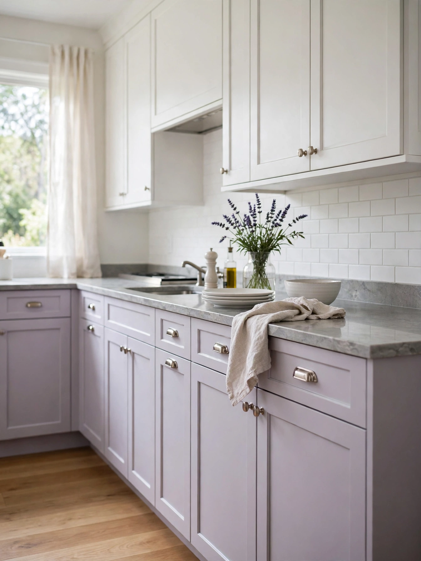
Pale Lavender Details
Why This Works:
- Pale lavender softens a white kitchen gently
- Lavender finds its footing with gray, white and brushed nickel
- Small lavender accents test the color safely
- Cool lavender balances warm wood floors
Pale lavender suits a single wall or a set of lower cabinets, where its cool softness can lift a white kitchen gently. Use a muted lavender paint in a washable satin finish, prime first, and keep the lavender pale so it reads as a neutral in daylight. A white backsplash 18 inches high keeps the lavender from feeling heavy against the pale counters. Bright purple across a whole kitchen is too much color in one temperature. Wood floors turn orange beside it, and stainless steel goes hard and cold. A lavender island beside a gray counter is the cool-neutral pairing at work, with no bright purple anywhere near it.
The lavender makes itself known on one wall, and brushed nickel pulls, white marble and gray tile share its cool register, holding the room to one temperature. Splashes near the range show up first on the lavender doors. The washable finish means a splash never has time to stain. One lavender wall is easy to live with for years, and repainting one wall is a small job when tastes change. One lavender wall is the whole idea; a second one would turn a cool accent into a color scheme.
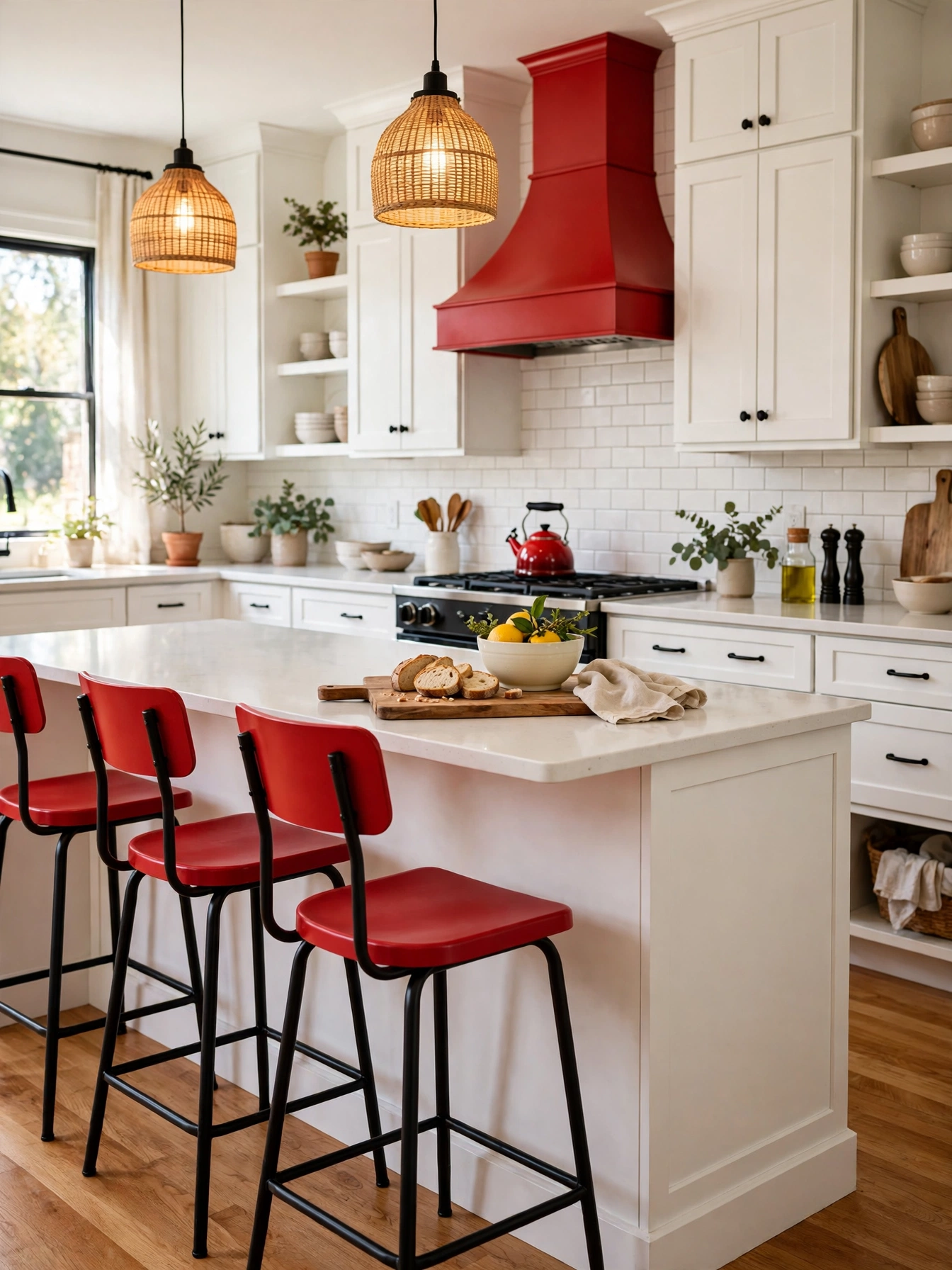
Red Accent Pieces
Why This Works:
- Red accents add energy to a neutral kitchen
- Small red pieces test the color without paint
- White, black and warm wood give red its stage
- A single red range hood makes a clear focal point
Red works as energy in small doses, on stools, a kettle or a hood, and the neutral cabinets around those pieces keep it lively rather than loud. Choose a muted brick red for bar stools, a kettle or a range hood, and keep the red to 2 or 3 pieces so the color reads as an accent. The backsplash runs 18 inches high, and a red stool needs 24 inches of elbow room and a 12 inch overhang at the island. Bright cherry red works in small doses: a stool, a kettle, a hood. A full run crowds a small room, and the red doubles against oak floors. One red hood beside white cabinets is the accent version that earns its place; a full red run would not.
The island is where the red gathers: stools, kettle, and a hood above. White counters, black hardware and oak shelves give the warm red its boundaries. Powder-coated steel stools list for 120 to 180 dollars each, about half the price of solid wood versions, so the accent stays easy to change later. Dust collects on bright red stools, on the seat and the rungs. A damp sponge takes it off the steel in moments. Warm white walls behind the red let the stools and kettle carry the energy, and nothing else has to shout.
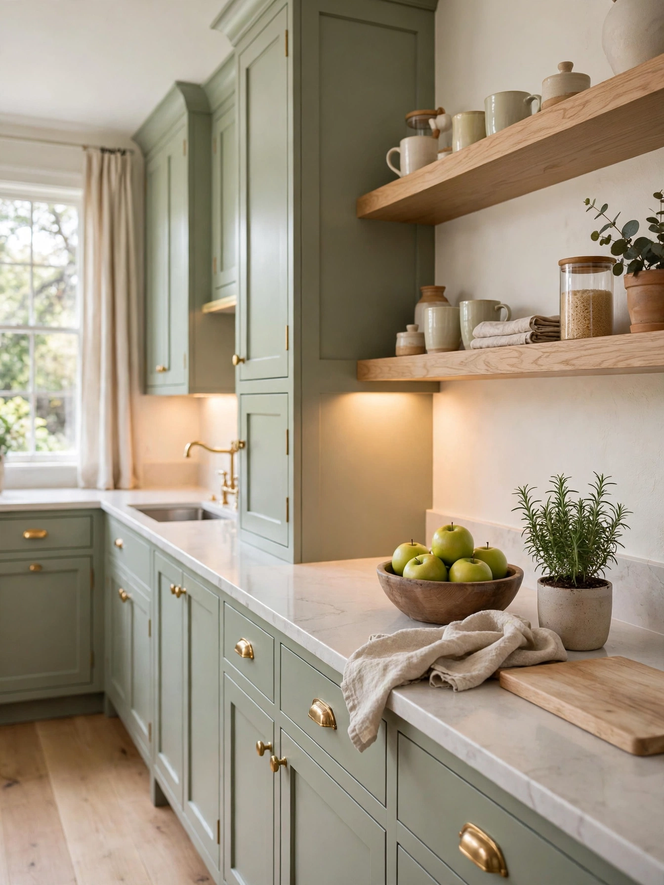
Calm Kitchen Color Ideas
Why This Works:
- Calm colors use muted tones, not stark white
- Soft blues and greens lower the visual noise
- Warm wood and brass settle in beside pale walls
- One muted palette keeps the room restful
Calm kitchen color ideas use muted tones that lower visual noise, such as soft sage, dusty blue and warm gray. Pick one muted color for the cabinets, keep walls warm white, and repeat the muted tone on the island or the backsplash so the room reads as one plan. At 2700K, pendants lowered to 30 to 36 inches above the island cast soft light over the muted cabinets. Avoid three muted colors at equal strength, because the room turns flat and no surface leads the eye. A sage kitchen with oak shelves is the calm palette in one picture: muted color, warm wood, soft light.
Muted cabinets hide dust on their doors, and cream walls, oak floors and brass pulls give the muted cabinets a warm setting to sit in. Grease near the range is easy to spot on muted cabinets, so wiping that area after cooking keeps the calm palette clean. A muted repaint needs the same prep as any cabinet color, with degreasing, sanding and priming deciding the result. One muted color, warm white walls and one wood tone: that trio is the entire palette.
Monochrome White Layers
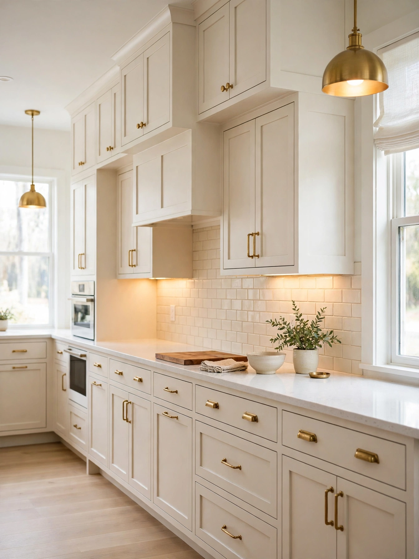
Why This Works:
- Layered whites add depth without a new color
- Cool white counters sharpen warm white cabinets
- Texture separates white cabinets, tile and counters
- Brass hardware stops layered white feeling flat
Monochrome white layers work when each white carries a different undertone, such as warm white cabinets, cool white counters and cream tile. Paint cabinets in White Dove OC-17, keep counters white quartz, and use a cream subway tile 3 by 6 inches for the backsplash 18 inches high. A satin finish on cabinets keeps the white washable through daily cooking. One flat white on every surface reads as unfinished, and the cabinets vanish into the walls, so give each layer a different undertone. The Spruce lists texture as the thing that makes layered whites work, and a mix of matte tile, satin paint and polished quartz supplies it.
White layers reflect daylight well, and an oak floor, brass pulls and a single wood shelf are the only warm notes in the layered whites, which is why the room needs all three. Cooking splashes mark the layered whites near the range. The glossy tile cleans up with one wipe after dinner. Matte tile picks up marks near the range fast. Satin cabinets wipe clean without dulling. Brass or black hardware gives the layered white its edge; without a dark metal, the whites blur together.
Olive Green Shelving
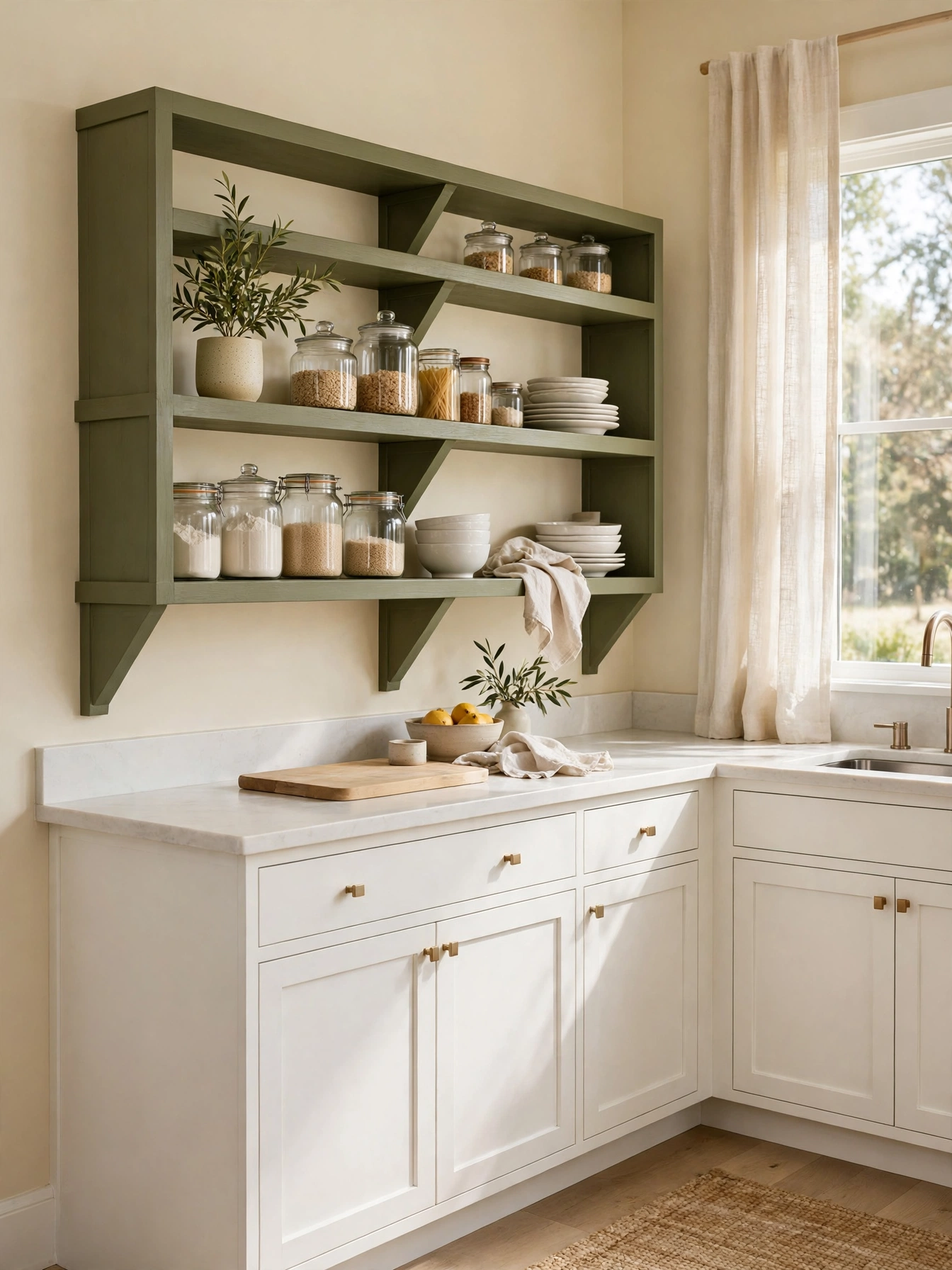
Why This Works:
- Olive shelves add earthy color above white counters
- Cream cabinets and brass keep green shelves grounded
- Plates and glasses sit out in the open, ready to grab at mealtimes
- Wood brackets warm the muted green shelves
Olive green open shelves put earthy color above a white counter, where dishes and glass jars can sit against a muted green ground. Mount oak brackets painted olive, or solid wood shelves in a muted olive stain, 12 inches deep and 1.5 inches thick, fixed into wall studs spaced 16 inches apart. Limit each shelf to one category, plates on one and glasses on the next, with the shelves set 18 inches above the counter. Brackets should hold 50 pounds per shelf, so heavy dishes stay safe. Cast iron pans belong in a lower cabinet, not on an open shelf. A loaded shelf bends at the brackets and dips in the middle within months.
Open shelves lighten a kitchen wall, and cream cabinets, white dishes and brass knobs give the olive shelves a pale backdrop, with the green staying earthy against it. Open shelves put dust on display with the dishes. A feather duster lifts it off before serving. Two shelves are the limit here, and any more pushes the wall out of balance. White dishes on olive shelves keep the color earthy and quiet; the shelf is a display first, a color second.
Teal Lower Cabinets
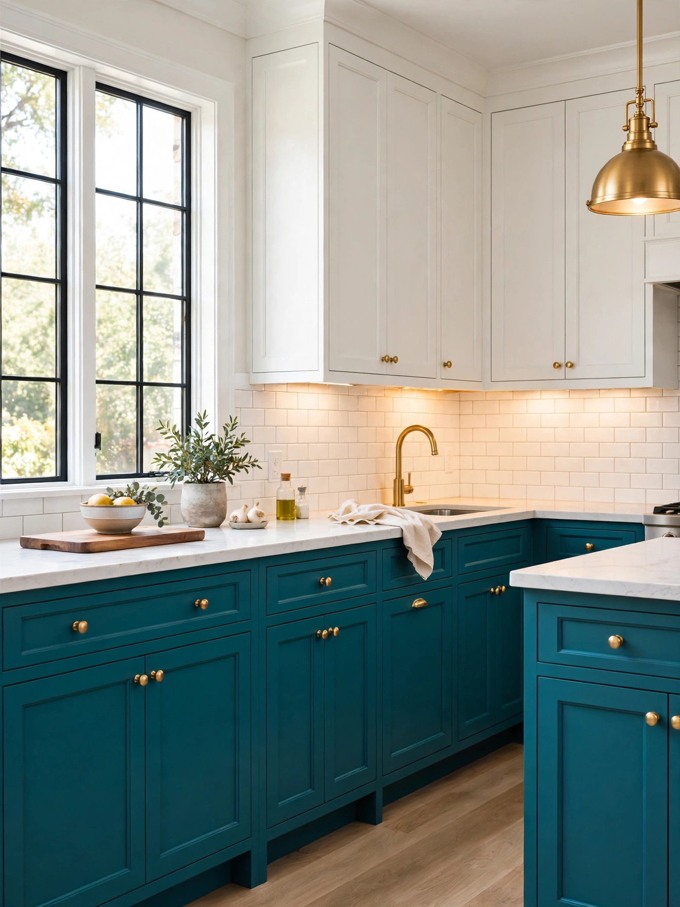
Why This Works:
- Teal lowers add jewel color at floor level
- Dark teal hides scuffs near the doorway
- White uppers keep the teal from feeling heavy
- Brass knobs glow against the deep teal doors
Teal lower cabinets bring jewel color to floor level. White uppers keep the room bright above them. Paint lowers in a washable satin on maple doors 3/4 inch thick, over a primed base. A deep teal holds its jewel tone beside white quartz. A white backsplash 18 inches high frames the teal run and lifts the dark lowers. In a room with one small window, teal on the uppers absorbs the little light available and the cabinets look gray by evening, so keep the dark color low. The National Kitchen and Bath Association recommends 42 to 48 inches of walkway when an island sits nearby, and that open floor keeps a dark lower run from closing the room.
Walnut stools and brass pulls are the warm notes in this kitchen, and the oak floor runs under all of it. Gray tile and chrome hardware would drain the jewel color toward cold. Scuffs barely show on the dark tone at floor level. Dust still settles on the teal doors, and a dry cloth wipes it away without streaks. A teal repaint in a medium kitchen runs about 5 days. The doors leave the house for spraying, and that shop coat is the smoothest finish available. White uppers lift the dark lowers; the brightness lives at eye level, where the white sits.
Golden Mustard Details
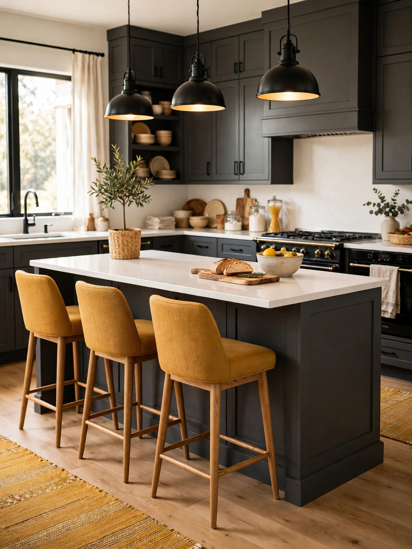
Why This Works:
- Mustard details add warmth to a gray kitchen
- Charcoal, white and oak make golden accents glow
- Small mustard pieces test the color safely
- Warm gold warms a cool north facing room
Golden mustard details warm a gray kitchen from the island outward, through stools, a runner or a pendant shade. Choose a muted mustard, not a bright yellow, and keep it to 2 or 3 details so the color reads as an accent. A mustard stool needs 24 inches of elbow room, while pendants at 30 to 36 inches above the island keep the light close to the worktop. Mustard belongs on details, not on every cabinet. The strong tone fills a small room fast, and warm wood floors beside it turn the whole kitchen yellow. A single mustard stool beside gray and charcoal is the accent at its best; the rest of the room does the quiet work.
The mustard gathers at the island, on stools and a runner. Charcoal cabinets, white counters and oak shelves set the gold against dark, pale and wood. Dust is easy to spot on mustard fabric and paint in daylight. The runner shakes out outside before the dust settles in. A mustard runner near the sink needs washing every 2 weeks. A mustard stool wipes clean in seconds, so pick the detail that fits the cleaning time you have. Pale walls behind the mustard let two or three golden details do all the talking.
FAQs
What are the best kitchen color ideas for a small kitchen?
Pale blue, sage and warm white open a small kitchen, because light surfaces bounce daylight around a tight room. Use 12 inch deep uppers, leave 18 inches above the counter, and keep the floor pale too, so the color adds interest without shrinking the space.
What paint finish lasts best on kitchen cabinets?
For cabinet doors, pick a satin or semi-gloss enamel over a 220-grit sanded, primed surface. A hard enamel skin shrugs off grease near the range and wipes clean with a damp cloth. Flat paint marks fast on doors that get daily use, so save it for walls.
How do I pick a kitchen color ideas scheme that stays calm for years?
Start with one muted color, such as sage or dusty blue, and keep walls warm white so the room stays restful. The Spruce notes that muted colors hold up well beside warm wood and soft light. Test a door at 2700K, and limit the accent to one island or wall.
What kitchen color ideas pair best with white kitchen cabinets?
Navy, sage and charcoal sit best with white cabinets, because a dark tone gives the pale room a clear anchor. Leave 42 to 48 inches of walkway around the island, keep counters at 36 inches, and add brass pulls so the dark color gains warmth without a second strong accent.
How much paint do I need for a kitchen color change?
A medium kitchen usually needs 2 gallons plus primer for cabinets, since one gallon covers about 350 square feet. Better Homes and Gardens advises testing paint on a large board in the room first, because light changes how paint reads. Buy a quart first and paint one door.
Conclusion
Kitchen color ideas work best when one color leads, a second color supports it, and a single accent adds lift. Start by painting a full door or a 2 foot by 2 foot board in the shade you like, checking it in morning and evening light, then commit to the finish and hardware that match how the kitchen is used each day. Test in daylight, keep the finish satin, and let brass hardware give the color its edge. Follow HomelyCrafter on Pinterest for more ideas. Save this to your Pinterest boards so you can refer back to it!

Muhammad Israr is a home decor enthusiast and the writer behind Homely Crafter. He spends his days researching paint colors, layouts and budget-friendly styling ideas, then breaks them down into practical, easy-to-follow guides so you can decorate with confidence.
3 thoughts on “24 Rich Kitchen Color Ideas That Transform Your Home”